Contrary to popular belief, the underpainting is not a preliminary sketch; it is the most critical structural and emotional decision in the entire painting process.
- The initial monochromatic layer establishes a permanent value architecture that dictates all subsequent color relationships.
- The specific hue of the underpainting (e.g., grey, green, or brown) creates the artwork’s “emotional DNA,” influencing the final mood and the perceptual vibrancy of skin tones and landscapes.
Recommendation: Stop treating the underpainting as a warm-up and start treating it as the foundational blueprint. A deliberate choice here preemptively solves issues of depth, harmony, and mood that are nearly impossible to correct later.
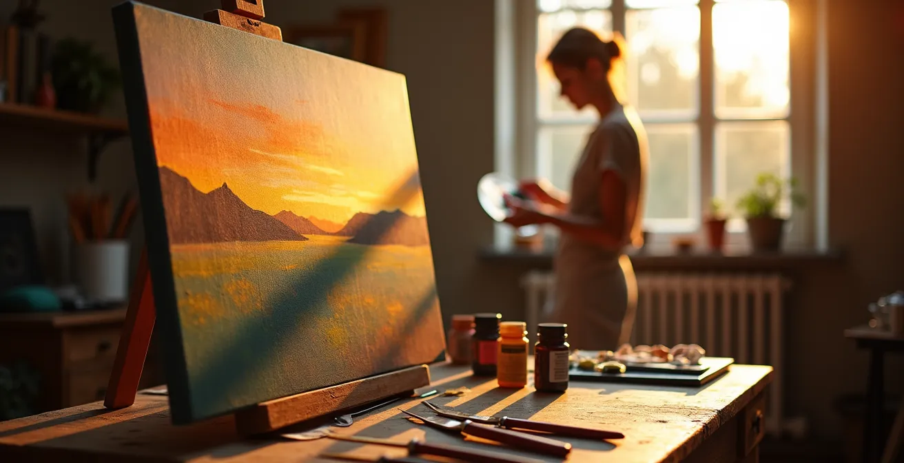
For many representational painters, a persistent frustration haunts the studio: a finished piece that, despite hours of meticulous work, feels flat, disjointed, or emotionally hollow. You’ve followed the advice—you’ve focused on accurate drawing, mixed your colors carefully—yet the final work lacks that cohesive, resonant depth seen in the masters. The common wisdom points to practicing more, but what if the problem isn’t in the final layers, but in the very first one?
The solution lies in a profound strategic shift: viewing the underpainting not as a mere preparatory sketch, but as the architectural blueprint and emotional DNA of your painting. While many artists use it to simply block in shapes, its true power lies in establishing an unchangeable foundation for value, color temperature, and texture. This is where the final mood is born. The choices you make in this initial, often-overlooked stage dictate the entire narrative of the piece.
This article moves beyond the “what” and dives deep into the strategic “why.” We will deconstruct how specific underpainting techniques are not just stylistic choices, but foundational decisions that ensure structural integrity and emotional impact. By understanding these principles, you can preemptively solve the very problems of cohesion and depth that have hindered your work.
This guide will walk you through the core strategies for transforming your underpainting from a simple step into your most powerful tool. Explore the sections below to build a rock-solid foundation for every piece you create.
Summary: Why Your Underpainting Color Determines the Final Mood of the Piece?
- Why starting with a Burnt Umber wipe-out saves 5 hours of color correction later?
- How to simplify complex scenes into 3 values during the underpainting stage?
- Grisaille vs. Verdaccio: Which underpainting creates more lifelike skin tones?
- The texture mistake in the underlayer that fights with your final details
- How to speed up the underpainting drying process without weakening the paint film?
- How to build a value scale from 1 to 10 using only one H pencil?
- Line convergence vs. Value shift: Which creates more depth in a landscape background?
- How to Apply Multiple Glazes Without Dissolving the Layers Beneath?
Why starting with a Burnt Umber wipe-out saves 5 hours of color correction later?
The traditional Burnt Umber wipe-out, or imprimatura, is often seen as a simple way to tone a canvas and eliminate the intimidating white. However, its strategic value is far more profound. This technique is a form of preemptive correction. By establishing a full range of values in a single color before any chromatic decisions are made, you create a robust value architecture that guides every subsequent brushstroke. This monochromatic map forces you to solve the most critical aspect of a painting—its light and dark pattern—first.
When the value structure is correct from the start, the process of applying color becomes dramatically simplified. Instead of simultaneously juggling hue, value, and saturation, you can focus solely on matching the local color to the pre-established value. Professional artist John Pototschnik found that this focus on value ensures stronger compositions and establishes the mood at the earliest stage. Getting the values right in monochrome can save countless hours of frustrating adjustments later, where you might find yourself endlessly trying to “fix” a color when the underlying problem was always the value.
This method builds a stable foundation, ensuring that as you add color, the painting’s structural integrity remains intact. You are no longer guessing; you are executing a plan. The umber underpainting acts as a reliable guide, preventing the common pitfall of creating a compositionally weak or emotionally confusing image. It is the first and most critical step in building a painting with intention and clarity.
How to simplify complex scenes into 3 values during the underpainting stage?
A complex scene can be overwhelming, presenting thousands of potential values. The key to taming this chaos is radical simplification. The Notan, a Japanese design concept focusing on the balance of light and dark, teaches us to see the world not in infinite gradations but in a few distinct masses. During the underpainting stage, this means distilling everything you see into just three core values: light, mid-tone, and dark. This is not about capturing every detail; it’s about building a powerful and clear value architecture.
This process forces you to make decisive choices about your light source and shadow patterns. Group all the brightest areas of your scene into one “light” family, all the darkest shadows into a “dark” family, and everything else falls into the “mid-tone.” You are essentially creating a blueprint for the painting’s form and rhythm. This simplified structure provides a powerful visual read and ensures the final painting has a strong, undeniable foundation rather than a muddled, confusing array of competing values.
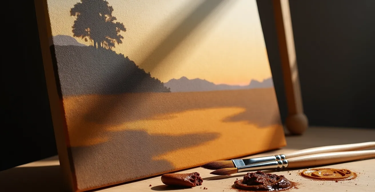
As the image above illustrates, this simplified three-value statement is more visually powerful and structurally sound than a timid attempt to capture every nuance from the start. Once this strong, simple underpainting is established and dry, you can begin to introduce more subtle value shifts within each of the three main masses. But the underlying strength of the initial three-value read will always anchor the painting, providing the cohesion and depth that many artists seek.
Grisaille vs. Verdaccio: Which underpainting creates more lifelike skin tones?
When the goal is lifelike portraiture, the choice of underpainting color becomes a critical strategic decision that defines the final “life” in the skin. The two most celebrated methods, Grisaille and Verdaccio, offer distinct pathways to achieving realism. Grisaille, an underpainting in shades of gray, creates a sculptural, classical effect. It excels at establishing a strong, high-contrast value map, but its cool, neutral base can sometimes lead to skin tones that feel chalky or cold if not handled with expert glazing.
Verdaccio, on the other hand, utilizes a greenish-gray base, traditionally made with terre verte and white. This choice is rooted in color theory: since green is the complement of red, the green underlayer subtly neutralizes the subsequent reddish layers of skin tones, preventing them from becoming too saturated or “fleshy.” This creates a perceptual color effect where the final skin tones appear more natural, vibrant, and full of life. The green undertone peeking through the warm glazes provides a visual complexity that mimics the subtle color variations in real skin.
The choice between them often depends on the desired lighting and mood. An analysis shows that while Grisaille is ideal for dramatic, high-contrast lighting, Verdaccio provides superior results for the soft, diffused light common in portraiture, giving the skin a warm, luminous quality. The following table breaks down their strategic applications. Many Old Masters even used a hybrid approach, using a grisaille for the initial value structure and then a thin verdaccio glaze to impart that vital, warm undertone before applying the final color layers.
| Technique | Color Base | Best For | Skin Tone Result |
|---|---|---|---|
| Grisaille | Shades of grey using black and white | High-contrast dramatic lighting | Creates cooler, more sculptural skin tones |
| Verdaccio | Green-grey mixture (terre verte base) | Soft, diffuse lighting conditions | Provides warm undertones preventing chalky appearance |
The texture mistake in the underlayer that fights with your final details
The underpainting is not just a color and value map; it is also the physical foundation of your paint film. A common but critical mistake is to apply this first layer too thickly or with too much texture. Heavy impasto or pronounced brushstrokes in the underpainting create a physical topography that will fight with the delicate details you try to add later. Instead of a smooth surface on which to render a subtle form, you’ll be fighting ridges and valleys that catch the light and disrupt your brushwork.
Another insidious problem is “sinking in.” This occurs when the oil from upper paint layers is absorbed into a more absorbent underlayer, causing the top colors to appear dull, matte, and patchy. This is particularly notorious with Burnt Umber due to its high oil content, which can cure in a way that leaches oil from subsequent layers. As noted in a study of this phenomenon, a contrast occurs between freshly varnished, rich areas and ‘sunk in’ patches that look lifeless. While this can be temporarily fixed by “oiling out,” the best solution is prevention.
To ensure excellent structural integrity, the underpainting must be thin, even, and lean. This provides a stable, non-absorbent, and smooth surface for all future layers. Using rigid supports like panels instead of flexible canvas can also prevent cracking, as the dry paint film will not be subjected to movement. Remember, the simpler and thinner the painting structure, the more permanent and stable it will be. Your goal is to create a foundation that supports, rather than competes with, your final vision.
How to speed up the underpainting drying process without weakening the paint film?
Patience is a virtue, but waiting weeks for an underpainting to dry can kill creative momentum. The desire to speed up the process is natural, but improper methods can compromise the structural integrity of your entire painting. Using forced heat, like a hairdryer, is a critical error. This “skin dries” the surface while the paint underneath remains wet, leading to wrinkling and a weak film that is prone to cracking. The key is to accelerate drying chemically and physically, not thermally.
The safest and most effective method is to use a modern alkyd medium. Alkyds are synthetic resins that accelerate the oxidation (drying) process of oil paints uniformly throughout the paint film. Mixing a small amount of an alkyd medium like Liquin into your underpainting colors can reduce drying time from weeks to as little as a day. Another strategy is pigment choice. Certain pigments are natural siccatives (driers). Raw Umber, for instance, is a much faster drier than many other colors and, according to a Gamblin analysis of oil content, is leaner than Burnt Umber, making it an excellent choice for this foundational layer.
Finally, the physical application matters. A lean underpainting should be applied in a thin, transparent layer. Thinner layers have more surface area exposed to oxygen and simply dry faster. By combining these three strategies—using an alkyd medium, choosing fast-drying pigments, and applying the paint thinly—you can safely and effectively shorten your waiting time without risking the long-term health of your artwork. This allows you to maintain momentum while still adhering to sound archival principles.
How to build a value scale from 1 to 10 using only one H pencil?
Before you can master value with paint, you must be able to see and control it in its purest form. A simple pencil drawing exercise is the ultimate training ground for this skill. The challenge of creating a full 10-step value scale, from pure white to near black, using only a single medium-hardness pencil (like an H or HB) forces you to understand that value is not about the tool, but about pressure and application. It divorces the concept of value from color, which is the exact mindset needed for a successful monochromatic underpainting.
To create the scale, you start with the lightest possible touch for value 1 and gradually increase pressure for each subsequent step. Using the side of the pencil lead creates soft, even tones for the mid-range values, while the sharp tip provides the dark, crisp marks needed for values 7 through 10. This exercise trains your hand and eye to recognize and produce subtle gradations, building a deep, intuitive understanding of the relationships between light, mid-tone, and dark.
This skill translates directly to painting. Professional artists often recommend keeping the underpainting within a compressed range of values. For instance, on a 0-10 scale, it is strategic to keep the undertones within values 4-7. This approach ensures the underpainting is not too dark, which could muddy subsequent color layers, and provides ample room to push values lighter or darker in the final stages. Mastering a value scale in drawing gives you the control and confidence to build a sophisticated and effective value architecture in your paintings.
Line convergence vs. Value shift: Which creates more depth in a landscape background?
Creating a convincing illusion of depth is a primary challenge in landscape painting. Artists have two powerful tools at their disposal: linear perspective (line convergence) and atmospheric perspective (value shift). Linear perspective, where parallel lines like roads or fences appear to converge at a vanishing point, is highly effective for creating depth in the foreground and midground. It provides a clear, geometric structure for the eye to follow.
However, as objects recede into the far distance, the power of linear perspective diminishes dramatically. At this range, atmospheric perspective becomes the dominant tool. This is the effect where the atmosphere—haze, dust, and moisture—causes distant objects to appear lighter in value, lower in contrast, and cooler in color. A strategic value shift, where the background mountains are painted with a significantly lighter and less detailed value than the foreground trees, will create a far more powerful sense of immense space than any forced linear element.
The masters understood this intuitively. In his interiors, Vermeer masterfully used value shifts to create depth in his seemingly simple compositions. He used umber mixed with black and a touch of white to render the shadows on his whitewashed walls. As noted by an analysis of his technique, the umber lends an air of naturalness and transparency to the shadows, preventing the black from looking flat and creating a subtle value shift that makes the walls recede. The most effective landscapes use a combination of both tools, relying on line in the foreground and embracing the power of value in the background.
Vermeer’s Wall Shadow Technique
Vermeer used umber mixed with black and a small quantity of lead white in the deeper shadows of white-washed walls appearing in many of his interiors – this mixture was widely used among genre painters as the presence of umber prevents the black from producing a sullen effect and lends an air of naturalness and transparency to those areas.
| Distance Zone | Line Convergence Effect | Value Shift Effect | Recommended Ratio |
|---|---|---|---|
| Foreground | 70% effectiveness | 30% effectiveness | Strong linear perspective |
| Midground | 50% effectiveness | 50% effectiveness | Balanced approach |
| Background | 10% effectiveness | 90% effectiveness | Atmospheric perspective dominates |
Key Takeaways
- The underpainting is not a sketch, but the architectural blueprint that determines value structure and emotional mood.
- Simplifying complex scenes into three core values (light, mid-tone, dark) creates a powerful and cohesive foundation.
- Verdaccio (greenish-grey) is strategically superior to Grisaille (grey) for creating lifelike, warm skin tones due to color theory.
- The physical properties of the underpainting—thin, lean, and on a rigid support—are crucial for the long-term structural integrity of the painting.
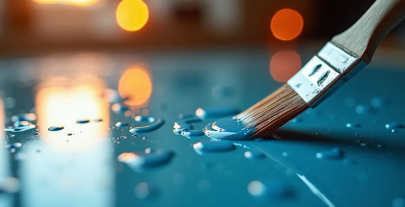
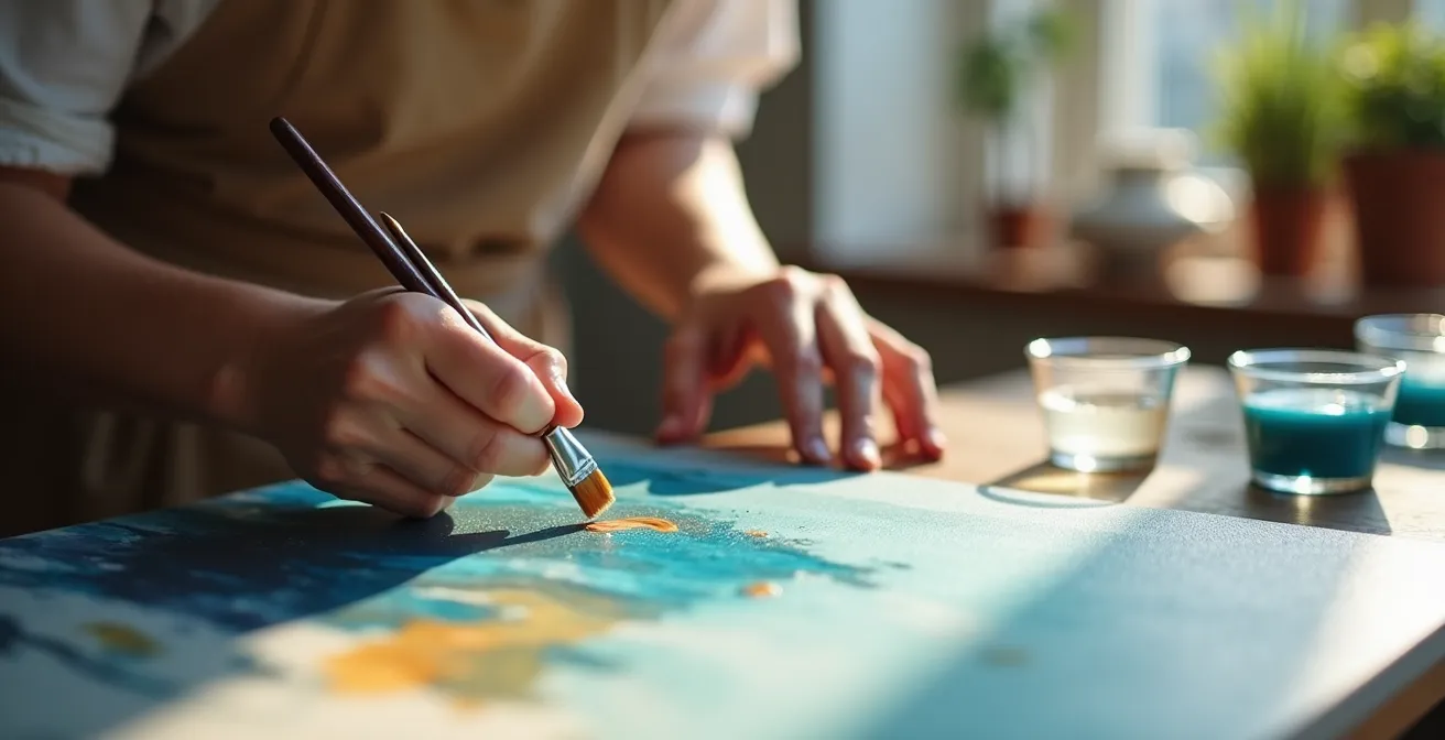
How to Apply Multiple Glazes Without Dissolving the Layers Beneath?
Once you have established a solid, dry underpainting, the final stage of bringing your painting to life begins: glazing. Glazing is the application of thin, transparent layers of paint that modify the colors beneath them. It is how you achieve the luminosity, depth, and subtle color transitions that are the hallmark of master oil paintings. However, this process is fraught with technical risk. Applying a new glaze can re-activate and dissolve the layer beneath it, creating a muddy mess and destroying hours of work.
The solution lies in a strict adherence to two principles: complete curing and the “fat over lean” rule. Firstly, a paint layer must be more than just “touch dry” before you can glaze over it. It must be sufficiently cured so that the solvent in your glazing medium won’t dissolve it. Using a fast-drying medium like Liquin in the underpainting can help ensure it’s ready for glazing the next day. Secondly, each successive layer of paint must be “fatter” (contain more oil) than the one beneath it. This ensures that the upper, more flexible layers dry slower than the lower, more brittle layers, preventing cracking.
A reliable glazing medium can be made from equal parts Dammar varnish (for hardness), bleached linseed oil (the “fat”), and an odorless solvent like turpenoid (the “lean”). The amount of medium you mix with your paint determines the transparency of the glaze. By meticulously following this protocol, you can build up dozens of transparent layers, each one contributing to the final effect, without ever compromising the structural integrity of your painting. It is a methodical process that rewards precision and patience with unparalleled depth and richness.
Your Action Plan: The Fat Over Lean Glazing Protocol
- Use a fast-drying alkyd medium (like Liquin) in your underpainting to ensure it is touch dry the next day for a solid foundation.
- Prepare a glazing medium using equal parts Dammar varnish, bleached linseed oil, and odorless turpenoid to control transparency and adhesion.
- Mix a small amount of glazing medium with your paint, adjusting the ratio to control the transparency of each layer as you build form.
- Wait for each glaze layer to be completely cured, not just touch dry, to prevent the new layer from dissolving the one beneath it.
- Ensure each subsequent glaze is progressively “fatter” (contains slightly more oil or medium) than the last to maintain flexibility and prevent cracking over time.
By shifting your perspective and treating the underpainting as the foundational blueprint, you are no longer just making a picture; you are engineering a work of art with structural integrity and deep emotional resonance. Begin applying these principles today to build paintings with the cohesion, depth, and mood you’ve always strived to achieve.