The vibrant, sun-drenched yellows of Vincent van Gogh’s “Sunflowers” are iconic. Yet, over a century later, those brilliant hues are slowly, inexorably, turning a murky brown. The common culprit cited is light exposure, a simple story of fading. But this explanation is incomplete. The real drama is happening at a molecular level, a fascinating and tragic tale of chemical instability that affects countless masterpieces. The issue isn’t just external damage; it’s a form of self-destruction, an inherent vice written into the very DNA of the pigments themselves.
For any art student or enthusiast, understanding this process is like learning the secret language of a painting. It moves beyond simple appreciation into the realm of color forensics. We begin to see that artists, from the Renaissance masters to the Impressionists, were constantly making complex trade-offs. They balanced the desire for a specific, brilliant color against its cost, its availability, and its chemical temperament. Sometimes, they used pigments they knew were fleeting, a conscious choice for short-term impact. Other times, they fell victim to chemical reactions they couldn’t have predicted, creating ticking time bombs on their own canvases.
This isn’t a story of failure, but of material reality. By exploring the specific chemical flaws of historical colors, we can understand why crimson glazes disappear, why certain greens turn black, and why one type of white can ruin a painting from the inside out. This article will dissect these chemical stories, revealing not just why colors decay, but how modern science can digitally reconstruct their former glory and how this knowledge of decay can, paradoxically, help us unmask a masterful forgery.
This guide delves into the specific chemical vulnerabilities of key historical pigments. We will explore the deliberate compromises of Renaissance painters, provide modern, non-toxic alternatives for dangerous materials, and reveal how predictable decay has become a crucial tool in art authentication.
Summary: Why Van Gogh’s Yellows Are Turning Brown and How to Slow It Down?
- Why did Renaissance painters use crimson lakes knowing they would fade?
- How to mix a modern equivalent of genuine Lead White without the toxicity?
- Ultramarine Ash vs. Synthetic Ultramarine: Is the price difference worth it?
- The layering mistake that turns copper-based greens black over time
- How to digitally color-correct photographs of faded paintings to see the original state?
- Zinc White vs. Titanium White: Which ruins a glaze mixture instantly?
- The chloride contamination error that turns your sculpture into green powder
- How to Spot a High-Quality Forgery of a 19th-Century Landscape?
Why did Renaissance painters use crimson lakes knowing they would fade?
It seems counterintuitive: why would masters dedicated to creating timeless art use a color notorious for its fleeting nature? The answer lies in a classic pigment trade-off between effect and permanence. Renaissance painters prized crimson lake pigments for their unparalleled transparency and depth, essential for rendering luxurious velvet and rich draperies. As Wikipedia contributors note in an article on the subject, “Red lakes were particularly important in Renaissance and Baroque paintings; they were often used as translucent glazes to portray the colors of rich fabrics and draperies.” There was simply no other pigment that could achieve this luminous, jewel-like effect.
The decision was also driven by economics and status. The most prized source for crimson was the cochineal insect, native to the Americas. This tiny bug produced a dye so potent and sought-after that, according to historical trade records, cochineal became the second-most valuable import from the New World, surpassed only by silver. Using a cochineal-based pigment was a declaration of wealth and sophistication, both for the patron and the artist. The fugitive nature of the color was a known, but accepted, drawback in the pursuit of breathtaking, immediate results and social prestige.
Painters did, however, attempt to mitigate the fading. They often used the crimson lake as a final glaze over a more stable, opaque underpainting of vermilion or red ochre. This provided an initial vibrancy while ensuring that as the crimson inevitably faded, a strong red form would remain. It was a pragmatic solution to a problem of inherent vice, a compromise that allowed them to capture the magnificent color, even if only for a few generations to fully appreciate.
How to mix a modern equivalent of genuine Lead White without the toxicity?
For centuries, lead white (or flake white) was the undisputed king of white pigments. Valued for its warm tone, rapid drying time, and uniquely ropy, flexible paint film, it was a staple on nearly every Old Master’s palette. However, its high toxicity makes it a dangerous and now heavily regulated material for modern artists. The challenge for today’s painter is to replicate its unique working properties without the health risks. Fortunately, modern chemistry offers a path forward.
The key is not to find a single replacement pigment, but to create a composite mixture that mimics lead white’s multifaceted personality. Titanium white (PW6) is intensely opaque but can be cool, chalky, and overpowering in mixtures. The secret is to temper its strength and modify its texture with additives. By combining titanium with ground calcite (whiting), you can introduce a similar particle structure and a subtle translucency that echoes the feel of traditional lead carbonate. This combination forms the foundation of a convincing, non-toxic alternative.
This paragraph introduces the complex texture of a modern lead white alternative. To better understand this, the image below provides a visual comparison.
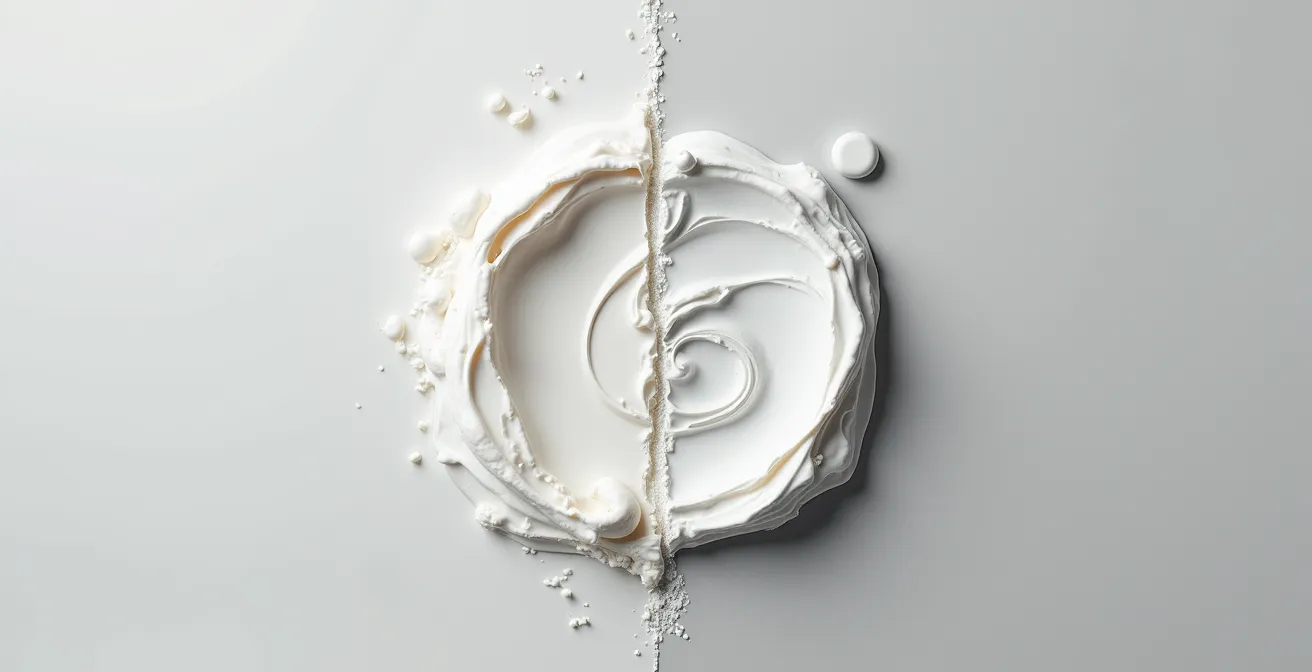
As you can see, achieving the right consistency is about more than just color. To complete the illusion, two final adjustments are needed. A minuscule drop of a transparent warm yellow or ochre pigment can counteract the cold, bluish tint of titanium. Furthermore, adding a small percentage of an alkyd medium can replicate lead’s fast-drying properties. The result is a safe, stable, and remarkably effective modern equivalent for your palette.
Action Plan: Crafting a Non-Toxic Lead White Alternative
- Mix a 1:1 ratio of calcite (Whiting) with rutile Titanium White (PW6) to achieve the desired opacity and texture.
- Add a single drop of a transparent warm yellow, such as PY150, to counteract Titanium’s naturally cool tint and warm the mixture.
- Incorporate 2-5% of an alkyd medium into your paint to replicate the fast-drying properties characteristic of traditional lead white.
- For advanced texture matching, consider adding baryte or fumed silica to mimic the specific particle structure of historical Cremnitz White.
Ultramarine Ash vs. Synthetic Ultramarine: Is the price difference worth it?
Ultramarine blue holds a mythical status in art history. Derived from grinding the semi-precious stone lapis lazuli, genuine ultramarine was once more valuable than gold. Its invention in a synthetic, affordable form in the 19th century was a revolution for artists. Today, painters face a choice between the modern, cost-effective Synthetic Ultramarine and a more subtle variant from the traditional process: Ultramarine Ash. The ash is a lower-grade byproduct of lapis lazuli extraction, less vibrant than the top-tier pigment, but is it worth its still-considerable price tag?
The justification for using the more expensive Ultramarine Ash lies in its unique physical properties. Unlike synthetic ultramarine, which has uniform, small particles, the ash contains a variety of particle sizes, including colorless matrix from the original stone. This diversity gives the paint a subtle, gritty texture and a delicate transparency that is impossible to replicate with the flat, opaque power of its synthetic cousin. It excels in creating gentle, atmospheric glazes and soft, smoky *sfumato* effects, especially in portraiture and landscape painting.
The following table breaks down the key differences, as detailed in a comparative analysis by Natural Pigments, to help determine which blue is right for your purpose.
| Property | Ultramarine Ash | Synthetic Ultramarine |
|---|---|---|
| Particle Size | Varied (including colorless matrix) | Uniform particles |
| Transparency | Subtle, ideal for glazes | Flat, opaque power |
| Best Use | Final glazes, sfumato effects | Opaque underpainting |
| Metamerism | Variable under different lights | More consistent appearance |
| Price Justification | Worth it for historical reproductions | Better value for general use |
Ultimately, the choice is a matter of intent. For general-purpose painting, underpainting, or achieving a bold, consistent blue, synthetic ultramarine offers unbeatable value. However, for an artist seeking to replicate the delicate luminosity of Renaissance glazing techniques or to achieve a specific atmospheric quality, the subtle complexity and historical authenticity of Ultramarine Ash justify the expense. It is a specialist’s tool, and for its specific purpose, it is irreplaceable.
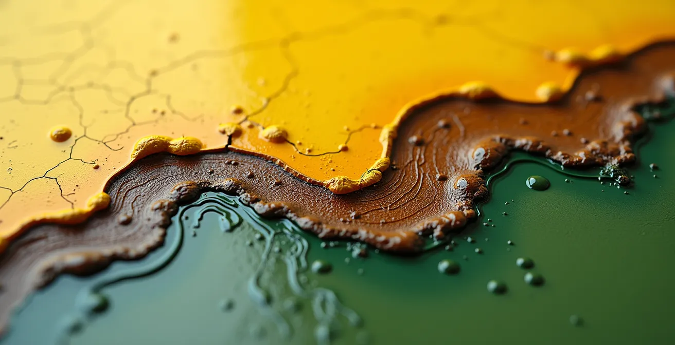
The layering mistake that turns copper-based greens black over time
Some of the most vibrant greens on Renaissance and Baroque palettes, like verdigris and copper resinate, were copper-based. They offered a brilliance that earth greens could not match. Yet, in many old paintings, areas that were once lush, green foliage or drapery have turned into dark, almost black patches. This is not random decay; it’s a specific chemical time bomb triggered by a common layering mistake: placing copper pigments in direct contact with lead-based pigments.
The science behind this transformation is a lesson in catalytic reactions. The critical error, as explained in studies on historical pigment interactions, is layering a transparent copper resinate glaze directly over or under an opaque layer containing lead, such as lead-tin yellow or lead white. The lead doesn’t just sit there; it actively participates in the destruction. It acts as a powerful catalyst, dramatically accelerating the oxidation of the copper resinate. Over time, this forced oxidation transforms the beautiful green copper acetate into a dull, black copper oxide.
The image below shows a microscopic cross-section, illustrating how this destructive interaction occurs between paint layers.
As the visual demonstrates, the damage is concentrated at the point of contact. To avoid this, historical painting manuals often advised artists to place an isolating layer of varnish or glaze between the copper green and any lead-containing layers. This barrier would prevent the two reactive chemicals from “touching,” thus de-arming the chemical time bomb. Artists who understood this chemistry, or simply followed the craft tradition carefully, were able to preserve their brilliant greens, while those who didn’t were left with paintings that slowly darkened over the centuries.
How to digitally color-correct photographs of faded paintings to see the original state?
Once a pigment has chemically changed, as with Van Gogh’s chrome yellow, the process is irreversible. You cannot simply add a chemical to turn the brown back into a brilliant yellow. However, modern technology offers a remarkable window into the past through a process of digital rejuvenation. By combining chemical analysis with advanced imaging, conservators can create a highly accurate digital rendering of what the painting looked like when it first left the artist’s easel.
The process begins with “color forensics.” As Ella Hendriks, a senior conservator at the Van Gogh Museum, explains, it’s a scientific investigation:
The idea is to figure out the chemical composition of the painting and its history: What pigments were used and in what binders were the colorful chemicals suspended?
– Ella Hendriks, Van Gogh Museum senior conservator
Scientists use non-invasive techniques like X-ray fluorescence spectroscopy to map the exact elements present across the canvas. The key to the reconstruction often lies in finding tiny, protected areas of original color. For example, research at the Van Gogh Museum demonstrates that digital conservation techniques can reveal original colors by analyzing non-faded pigment remnants found under the painting’s frame. These protected flakes act as a “Rosetta Stone” for the original color palette.
Once these original color values are identified, computer algorithms can be programmed to “correct” a high-resolution photograph of the painting. The algorithm digitally reverses the known chemical fading process, replacing the degraded color values with the original ones. This doesn’t alter the physical painting, but it creates a digital doppelgänger that shows, for the first time in centuries, the artist’s true intent and the original, dazzling impact of their work.
Zinc White vs. Titanium White: Which ruins a glaze mixture instantly?
When creating translucent glazes, the choice of white is critical. A glaze is meant to be a thin, jewel-like layer of color, and the wrong white can turn it into an opaque, chalky mess. While both Zinc White (PW4) and Titanium White (PW6) have their place, one of them is a notorious saboteur of delicate glaze layers: Zinc White. While it is beautifully transparent and cool in tone, its long-term chemical instability makes it a ticking time bomb, especially in oil glazes.
Titanium White’s primary characteristic is its immense tinting strength and opacity. Adding even a small amount to a glaze will quickly overwhelm the color and destroy its transparency. It’s an excellent pigment for creating opaque ground layers or strong tints, but for glazing, it’s generally too powerful. Zinc White, on the other hand, seems perfect at first. It has a much lower tinting strength and a lovely, clear transparency, allowing it to gently lighten a glaze without making it opaque.
However, this initial benefit hides a serious inherent vice. Zinc white has a destructive long-term reaction with oil binders. Over years and decades, it undergoes a process called saponification, or soap formation.
Case Study: Zinc Soap Formation in Van Gogh’s “The Woodcutter”
The destructive potential of zinc white is clearly visible in some of Van Gogh’s works. According to an analysis of his painting “The Woodcutter”, the zinc oxide in his white paint has reacted with the fatty acids in the linseed oil binder. This reaction creates zinc carboxylates, also known as zinc soaps. These soap formations cause the paint film to become extremely brittle, leading to delamination, chalkiness, and a pattern of micro-cracks known as “alligatoring,” where the paint literally flakes off the canvas.
This embrittlement is a catastrophic failure for a paint film, and it makes Zinc White a poor choice for any application where flexibility and longevity are required, especially in glazes which rely on a stable binder. For modern artists, the lesson is clear: for creating tints in glazes, a very, very small amount of Titanium White, or preferably a transparent mixing white made with inert pigments, is the far safer and more permanent choice.
The chloride contamination error that turns your sculpture into green powder
The concept of inherent vice extends beyond the painter’s canvas and into the three-dimensional world of sculpture. For bronze artifacts, the most feared chemical time bomb is known as “bronze disease.” It manifests as a fuzzy, light-green powder erupting on the surface, and if left unchecked, it will relentlessly eat away at the metal until the object is completely destroyed. This is not a biological process, but a vicious, self-sustaining chemical reaction initiated by one key contaminant: chlorides.
Chlorides, often found in soil, seawater, or even from the touch of human hands, react with the copper in the bronze alloy to form pale green copper (I) chloride. The real problem starts when moisture is introduced. The copper chloride reacts with water and oxygen to produce hydrochloric acid, which then attacks more of the bronze, creating more copper chloride. It is a devastating, cyclical reaction that will not stop until either all the chloride is removed or the metal is gone. The prevalence of this issue is startling; an analysis of bronze collections from the Haft Tappeh site revealed that a staggering 75% of excavated artifacts from sites with high soil moisture and chlorine contamination were severely affected by bronze disease.
For a conservator or collector, spotting these powdery green outbreaks is a call to immediate action. Treatment involves physically removing the powder and then using chemical means to neutralize the chlorides, often by immersing the object in a solution of sodium sesquicarbonate. After stabilization, the object must be sealed with a microcrystalline wax or lacquer to create a barrier against future moisture and chloride contamination. Finally, storing the piece in a low-humidity environment is crucial to prevent the reaction from ever starting again.
Key Takeaways
- Many historical pigments contain an “inherent vice,” a chemical instability that leads to predictable decay over time.
- Artists historically made trade-offs, choosing pigments for their brilliance or status, even when their lack of permanence was known.
- Modern analysis can identify these chemical time bombs, allowing for digital restoration and providing a powerful tool for authenticating artwork.
How to Spot a High-Quality Forgery of a 19th-Century Landscape?
Paradoxically, the predictable decay of historical pigments has given art historians and conservators a powerful tool for authentication. A forger can be a master of brushstrokes, style, and composition, but they often fail at replicating a century of chemistry. When examining a supposed 19th-century painting, the absence of expected degradation can be a more damning piece of evidence than any stylistic flaw. The painting might look too good for its age, a clear sign of a chemical anachronism.
Take, for instance, the chrome yellow so famously used by Van Gogh. We know it darkens over time due to a chemical reaction triggered by light. Therefore, as conservation research indicates that chrome yellow pigments in authentic 19th-century paintings show specific degradation patterns after more than a century, an expert would be highly suspicious of a “lost” Van Gogh where the yellows were still perfectly brilliant. The lack of browning would suggest the pigment is modern and hasn’t had 130 years to decay.
This principle of “color forensics” applies to many pigments. As a case in point, a forger might create a landscape in the style of Claude Monet and use a vibrant, stable chrome yellow. However, art historians know that by the 1890s, Monet and his contemporaries were beginning to abandon chrome yellow. As detailed in studies on anachronistic pigment detection, they started using the more expensive but far more stable cadmium yellow as soon as they could afford it, precisely because they hoped for better color stability. A painting supposedly from 1905 featuring a large amount of pristine chrome yellow would be a major red flag. The forger, in an attempt to create a perfect image, fails to replicate the imperfections of time, and in doing so, reveals their deception.
By understanding the inherent life cycles of these historical materials, we can read a painting not just as an image, but as a chemical story. The secrets it reveals, of both its creation and its authenticity, are written in the very molecules of its color. For those wishing to apply this knowledge, the next logical step is to build a palette based on modern, stable pigments that mimic these historical effects without their inherent flaws.