Contrary to the popular belief that Action Painting is just chaotic paint-flinging, this article reveals the profound science behind the apparent randomness. We explore how artists like Jackson Pollock were masters of physics and biomechanics, using fluid dynamics, kinetic energy, and even fractal geometry to create works that are as controlled and complex as they are emotional.
To the skeptical eye, a canvas by Jackson Pollock or a vast color field by Mark Rothko can seem maddeningly simple, even accidental. The common refrain, “My kid could do that,” echoes in galleries worldwide. It’s a sentiment born from viewing the finished piece as a static object, divorced from the incredible physical and intellectual process that created it. We tend to see chaos, not control; randomness, not rigor.
But what if we’ve been looking at it all wrong? What if, beneath the splatters and saturated hues, lies a world governed by the laws of physics, material science, and human neurology? The truth is, the studios of the Abstract Expressionists were less like playrooms and more like laboratories. These artists were not just flinging paint; they were conducting complex experiments in fluid dynamics, biomechanics, and perceptual psychology.
This article pulls back the curtain on the “accidents” of abstract art. We will dismantle the myth of randomness by revealing the science that underpins this revolutionary movement. From the physics of a Rothko that moves you to tears to the biomechanics of a Pollock that captures pure energy, you’ll discover that these monumental works are the result of a profound, intuitive, and often quantifiable mastery of the physical world. It’s time to see the method in the madness.
For those who prefer a visual guide, the following video offers a fantastic practical demonstration of the techniques and physical commitment involved in recreating a work in the style of Jackson Pollock, perfectly complementing the scientific principles we will discuss.
To navigate this exploration into the science of Abstract Expressionism, we will break down the key principles, techniques, and philosophies that define this powerful artistic movement. The following sections will guide you from the quiet intensity of color perception to the explosive energy of action painting.
Summary: The Method Behind the Abstract Madness
- Why a Rothko painting makes you cry only when viewed in person?
- How to paint from the shoulder to create marks that feel monumental?
- Stillness vs. Movement: Which branch of expressionism suits your temperament?
- The wet-on-wet mistake that turns a vibrant abstract painting into grey sludge
- When to stop: recognizing the moment an abstract painting is “finished”?
- Why holding the brush at the ferrule kills your gestural energy?
- Why did Renaissance painters use crimson lakes knowing they would fade?
- How to Find Your Unique Artistic Vision When Everyone Has a Camera?
Why a Rothko painting makes you cry only when viewed in person?
The profound emotional reaction many experience before a Mark Rothko painting isn’t mystical; it’s a carefully engineered phenomenon rooted in perceptual physics and neurology. A digital image on a screen fails to replicate the two key ingredients: monumental scale and color interaction. Rothko insisted on his paintings being viewed up close, allowing their sheer size to dominate the viewer’s field of vision. This effect is amplified by the scale of the works, with an analysis showing Rothko’s canvases averaged 60.4 x 52.6 inches, designed to overwhelm peripheral vision and create an immersive environment.
This scale creates a direct, physical relationship between the viewer and the work. Your body feels small, and the color becomes an atmosphere you inhabit rather than an image you observe. Rothko achieved his signature shimmering effect by applying dozens of thin layers of varied pigments, which interact with light in complex ways. The colors are not flat; they vibrate and shift as you look at them, creating a sense of life and movement. This isn’t just paint on canvas; it’s a finely tuned machine for light and perception.
Neuroscientists studying viewer reactions have noted that this combination of scale and subtle color vibration can trigger neural regions associated with meditative states and deep emotional processing. The experience is less about “seeing” a painting and more about feeling a presence. Rothko himself confirmed this intention:
The people who weep before my pictures are having the same religious experience I had when I painted them.
– Mark Rothko, Wikipedia
This “religious experience” is not an accident of emotion but the direct result of a master manipulating the physics of human perception to bypass the intellect and speak directly to our nervous system. You don’t just see a Rothko; you experience it with your entire body.
How to paint from the shoulder to create marks that feel monumental?
The power of an Abstract Expressionist mark—the kind that feels vast and energetic—comes not from the wrist, but from the entire body. Painting from the shoulder is the first step in unlocking this monumental scale, transforming the artist’s arm into a large-scale drawing instrument. This technique is a fundamental principle of biomechanics applied to art. Instead of small, controlled movements from the fingers and wrist, the artist initiates the gesture from the core and shoulder, engaging a complete kinetic chain.
This full-body involvement transfers a greater amount of energy and momentum into the brush or tool. The resulting mark is not just a line; it’s a record of a physical event. Think of it as the difference between writing your name and throwing a discus. One is a fine motor skill; the other is an explosive, whole-body action. The arc of the arm, pivoting from the shoulder, creates sweeping, confident lines that feel architectural and expansive, impossible to replicate with smaller joints.

As seen in the motion of a gestural painter, the power originates in the planted feet and rotates up through the torso. According to biomechanical research, achieving these broad, fluid strokes is not just a matter of “feeling”; it involves optimizing physical angles. Studies show that broad, efficient strokes often require a shoulder abduction of 45°-60° and an elbow angle between 30°-40°, allowing the arm to act as a long, powerful pendulum. This scientific understanding of movement is what separates a masterful, monumental gesture from a simple arm wave.
Stillness vs. Movement: Which branch of expressionism suits your temperament?
Abstract Expressionism is not a monolithic style. It is primarily a duel between two powerful, opposing forces: the quiet, contemplative depth of Color Field painting and the explosive, physical energy of Action Painting. Understanding the fundamental differences between them—which are rooted in physics and neurology—can reveal which approach resonates more deeply with your own temperament. Are you drawn to the silent hum of a meditative state or the roaring energy of a physical performance?
Color Field painting, championed by artists like Mark Rothko and Barnett Newman, is an art of stillness and immersion. It focuses on the physics of light and color perception, using vast, unified planes of color to evoke emotional and spiritual states. The viewer’s experience is contemplative, as their brain shifts into a state akin to meditation, characterized by alpha wave activity. It’s about being, not doing.
Action Painting, on the other hand, is the art of movement and process. Artists like Jackson Pollock and Willem de Kooning treated the canvas as an arena for a physical event. The focus is on the biomechanics of the body and the fluid dynamics of paint. For the viewer, this activates mirror neurons; we feel a kinetic empathy, subconsciously reenacting the artist’s gestures in our own minds. It’s an art of energy, of becoming. The following table breaks down these contrasting philosophies.
| Aspect | Color Field (Stillness) | Action Painting (Movement) |
|---|---|---|
| Physical Forces | Light physics, color perception | Fluid dynamics, biomechanics |
| Brain State | Alpha waves, meditative | Mirror neurons activated |
| Primary Artists | Rothko, Newman | Pollock, de Kooning |
| Viewer Experience | Contemplative immersion | Kinetic empathy |
Ultimately, the choice between these two poles is a choice of language. Both aim to express, as Rothko stated, “basic human emotions.” But one whispers, and the other shouts. One finds monumentality in the infinite void of color, the other in the frozen record of a high-energy physical act.
The wet-on-wet mistake that turns a vibrant abstract painting into grey sludge
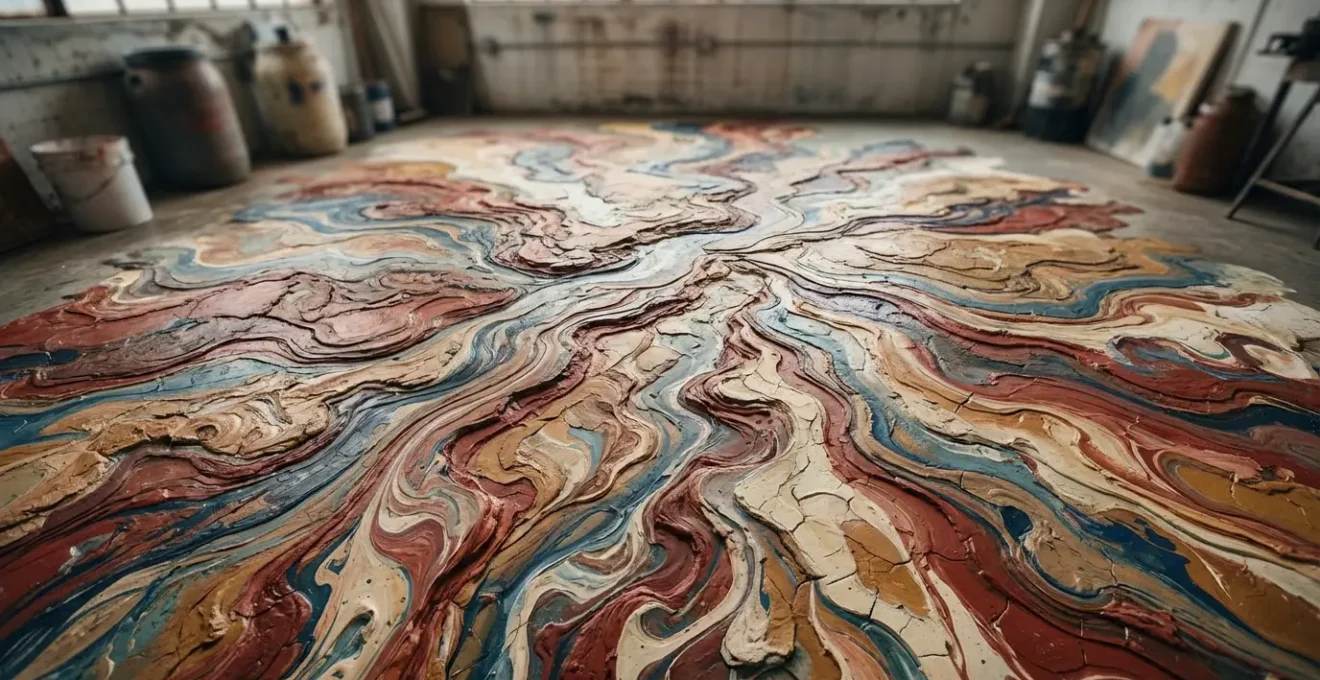
Every aspiring abstract painter has experienced the moment of horror: two beautiful, vibrant colors are applied, they touch, and instantly devolve into a dull, lifeless “mud.” This common failure isn’t a lack of artistic talent; it’s a misunderstanding of fluid dynamics and material science. The “wet-on-wet” technique is not a free-for-all; it’s a controlled interaction between liquids of varying properties, primarily viscosity.
Viscosity is simply a fluid’s resistance to flow. Honey is more viscous than water. When you apply two acrylic or oil paints of similar viscosity onto each other while both are wet, they will readily mix, leading to subtractive color mixing and the dreaded grey sludge. The secret to a successful wet-on-wet application, where colors can overlap without turning to mud, lies in deliberately manipulating the viscosity of your paints. A less viscous (thinner) paint will not easily displace or mix with a more viscous (thicker) paint. This creates distinct boundary layers, allowing colors to sit beside or on top of each other while maintaining their integrity.
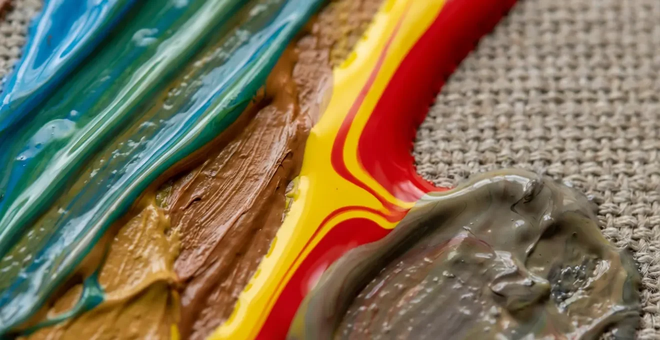
Jackson Pollock was an undisputed master of this principle. His “drip technique” was a high-level performance of viscosity control. Research has shown that Pollock’s technique involved pouring paint straight from a can, but his genius was in how he modified that paint. He used everything from standard oils to glossy house enamels, creating a range of viscosities. By layering a thin, fluid enamel over a thicker, more stable oil-based paint, he could create intricate webs of color that coexisted without becoming a uniform mess. He wasn’t just dripping; he was engineering fluid interactions in real-time.
When to stop: recognizing the moment an abstract painting is “finished”?
For the abstract artist, “When is it finished?” is the most terrifying question. Without a recognizable subject to render, the finish line is elusive. It’s often seen as a purely intuitive decision. However, scientific analysis of Jackson Pollock’s work suggests that “finished” might be a more objective, even mathematical, state than we think. The key lies in the concept of fractal complexity.
Fractals are complex, self-repeating patterns found everywhere in nature, from coastlines to snowflakes. In the 1990s, physicist Richard Taylor analyzed Pollock’s drip paintings and discovered they were not random splatters at all; they were perfect examples of fractal patterns. The “fractal dimension” (D) of a painting measures its complexity. A straight line has a D of 1, while a completely filled-in surface has a D of 2. Pollock’s work sits in a “sweet spot” of complexity that the human eye finds deeply satisfying.
Case Study: The Evolution of Pollock’s Fractal Dimension
A detailed analysis of Pollock’s work over time reveals a fascinating progression. His early works from 1943 had a low fractal dimension of just 1. As he honed his pouring technique, the complexity grew steadily. Scientific study shows that in his ‘classic’ period of 1948–1952, he perfected his technique and D rose to a value of 1.7. Intriguingly, one analysis captured him creating a pattern that reached an even higher complexity, which he immediately erased, suggesting he felt it was “too much.” This implies his decade of refinement was a quest to intuitively generate a specific, optimal level of visual complexity, a state he recognized as “finished.”
This suggests that for Pollock, “finished” wasn’t just a feeling; it was the moment the canvas reached a specific density and complexity that he had learned to recognize through thousands of hours of practice. He wasn’t just adding paint until it “felt right”; he was building a complex system to a state of optimal equilibrium. This reinforces his famous assertion, which stands as a direct rebuttal to the idea of chaos:
I can control the flow of the paint. There is no accident.
– Jackson Pollock, The Case for Jackson Pollock – PBS
Recognizing the “finished” state is therefore a skill of perception, an ability to see when the visual system on the canvas has achieved a state of balanced complexity—a perfect, nature-like order masquerading as chaos.
Why holding the brush at the ferrule kills your gestural energy?
Holding a paintbrush is not one-size-fits-all. Where you hold it dictates the kind of mark you can make. For detailed, controlled work, holding it close to the bristles—at the metal band called the ferrule—is essential. But for the sweeping, energetic gestures of abstract expressionism, this same grip is a death sentence. The reason is simple physics: it chokes the brush’s potential as a lever and a pendulum.
When you hold the brush at the very end of the handle, you create a long lever arm. A small movement in your shoulder or elbow translates into a large, fast, and sweeping arc at the brush tip. This amplifies your physical energy and allows you to create marks that have momentum and grace. Holding it at the ferrule, by contrast, turns the entire system into a short, stubby tool. You are forced to “draw” with your fingers and wrist, resulting in tight, controlled, and often lifeless lines that lack the monumental feeling of a true gesture.
Furthermore, holding the brush at the end allows it to act as a pendulum. There is a natural “lag” between your physical intention and the mark being made. This slight delay, dictated by the physics of the moving brush, introduces a level of organic, authentic variation that is impossible to fake. It forces you to trust the process rather than micromanage the result. Choking up on the ferrule eliminates this lag, putting you in a state of total control, which is the enemy of a truly expressive, gestural mark. The biomechanical analysis of different painting techniques shows that a tight, controlled grip for stippling or detail work is a high-force, low-energy-transfer action, the opposite of what’s needed for gestural work.
Action Plan: Optimize Your Brushwork with Physics
- Grip placement: Hold the brush at the very end of the handle to maximize its length as a lever arm for sweeping arcs.
- Body mechanics: Use your entire arm as a compound pendulum system, initiating movement from the shoulder and core, not the wrist.
- Embrace the lag: Allow for the natural delay between your movement and the mark to create an authentic, energetic gesture.
- Reduce micro-management: Consciously limit wrist and finger involvement, trusting the physics of the moving brush.
- Focus on energy transfer: Prioritize transferring kinetic energy from your body through the brush onto the canvas, rather than controlling every detail of the line.
By understanding the brush not as a pencil but as a complex physical tool—a lever, a pendulum, a whip—you can unlock a new vocabulary of marks that carry the authentic energy of your entire body.
Why did Renaissance painters use crimson lakes knowing they would fade?
The story of abstract art’s scientific underpinnings doesn’t begin in the 20th century. The tension between artistic intent and the physical limitations of materials is as old as art itself. A fascinating historical precedent can be found in the Renaissance, with the widespread use of brilliant but “fugitive” pigments like crimson lake. These pigments, derived from insects, created breathtakingly vibrant reds and pinks, but artists knew they were unstable and would fade over time. Why use them?
The answer reveals a different cultural and scientific mindset. Renaissance artists operated on a principle of “present value” over long-term permanence. In an era before modern chemistry, the choice of a pigment was often tied to the “doctrine of signatures”—a pre-scientific belief that the vitality of a source (like the vibrant cochineal insect) would transfer to the color itself. A brilliant, living red was seen as possessing more spiritual and aesthetic power in the moment, a crucial factor for religious commissions designed to inspire awe and devotion.
As one art historian’s perspective explains, the immediate emotional impact was the primary goal. The awe experienced by a 15th-century churchgoer seeing a freshly painted, glowing depiction of a saint’s crimson robes was worth the knowledge that it wouldn’t last forever. This choice was a conscious trade-off. They weren’t ignorant of the material’s flaws; they simply valued its immediate, powerful effect more than its archival stability. In some theological interpretations, the fading of these earthly colors could even serve as a `memento mori`, a reminder of the transient nature of worldly beauty compared to the eternal divine.
This historical example shows that artists have always been material scientists, making calculated decisions based on the properties of their media and the intended impact of their work. The Abstract Expressionists’ experiments with house paint and industrial enamels are a direct continuation of this long tradition of balancing aesthetic goals with the physical realities of their chosen materials.
Key Takeaways
- The emotional power of a Rothko painting is not magic; it’s a calculated use of monumental scale and color theory to physically immerse the viewer.
- Monumental artistic gestures are a feat of biomechanics, requiring the artist to use their entire body as a kinetic chain to transfer energy to the canvas.
- The “finished” state of an abstract work can be understood scientifically, as artists like Pollock intuitively worked towards a specific, satisfying level of fractal complexity.
How to Find Your Unique Artistic Vision When Everyone Has a Camera?
In an age where millions of perfect, high-resolution images are created every second, the traditional role of the artist as a depicter of reality seems obsolete. If a camera can capture the world perfectly, what is left for the painter to do? The answer, as demonstrated by the Abstract Expressionists, is to shift the focus from illustrating the external world to expressing the internal one. Your unique artistic vision is not in what you see, but in how you process and translate it through a personal, physical act.
Jackson Pollock famously stated his goal was to “express my feelings, rather than illustrate them.” His vision wasn’t found in a landscape or a portrait, but in his own body and his interaction with his materials. His unique contribution was the development of a personal “performance algorithm”—a repeatable set of rules for movement, gesture, and material interaction that was entirely his own. It was a process born from years of experimentation to control the flow and coiling of paint. His vision was the process itself.
Finding your unique artistic vision today means developing your own algorithm. It’s not about finding a new subject to paint, but about finding a new way to paint it. This could mean:
- Developing a unique system for applying paint (like Pollock’s drips).
- Focusing on a narrow and deep exploration of a single color (like Yves Klein’s blue).
- Creating a personal set of rules or constraints for your process.
Your vision emerges from the friction between your intention, your body, and the physical properties of your materials. The camera can capture a moment in time, but it cannot capture the history of the physical event that is a painting. It cannot show the energy, the hesitation, the force, and the intricate dance of fluid dynamics. That is the unique domain of the artist.
Your vision is the unique, un-photographable trace of your own physical and emotional experience, encoded in the language of paint. It is the evidence of your performance.
The next time you stand before an abstract painting—or stand before your own blank canvas—look beyond the surface. See the performance, analyze the physics, and appreciate the complex, controlled system that gives birth to pure emotion. This is where true artistic vision lies.
Frequently Asked Questions about Abstract Art and Materials
Did Renaissance artists understand pigment fugitivity?
Many artists were aware that certain pigments like crimson lakes would fade, but they valued the immediate vibrancy and symbolic power these colors provided for religious and aristocratic commissions.
What was the ‘doctrine of signatures’ in pigment selection?
This was a pre-scientific belief that vibrant natural sources (like cochineal insects) would yield equally ‘lively’ colors. Artists chose pigments based on this perceived vitality rather than on chemical stability.
Could fading have been intentional in some works?
Some scholars suggest that in religious paintings, the fading of earthly colors like crimson could serve as a ‘memento mori’ – a deliberate reminder of the transient nature of worldly beauty.