Contrary to popular belief, pixel-perfect alignment isn’t just a professional standard; it’s a psychological necessity. Even a single-pixel error introduces subconscious cognitive friction that actively signals untrustworthiness to the user’s brain.
- Visual clutter and misalignment force the brain to work harder, depleting neural resources needed for decision-making.
- The brain perceives mathematically centered objects as “off,” requiring designers to use optical alignment to achieve true perceived balance.
Recommendation: Stop treating the grid as a guideline. Treat it as the fundamental structure of user trust. Every element must be deliberately placed to reduce cognitive load and reinforce the subconscious feeling of stability and reliability.
You’ve felt it before. That nagging, almost imperceptible feeling that something is “off” on an interface. You can’t quite put your finger on it, but the design feels flimsy, unprofessional, and somehow… untrustworthy. You check the usual suspects—color harmony, font choices—but the unease remains. We’re often told that using a grid system brings order and professionalism to a layout. While true, this advice barely scratches the surface of a much deeper psychological reality.
The problem is that we treat alignment as a matter of aesthetic preference or a box to tick on a quality checklist. We talk about 12-column grids and responsive breakpoints as technical solutions. But what if the true cost of a 1-pixel misalignment isn’t a slightly messy design, but a fundamental breach of the subconscious contract you have with your user? What if that tiny error is sending a powerful signal to their brain: “This place is unstable. You cannot trust what you see here.”
This article moves beyond the “what” of grid systems and dives into the “why.” We will dissect the psychological mechanics behind alignment, from the cognitive tax of visual clutter to the subtle art of optical balancing. We will explore how to build and implement frameworks that don’t just look good, but feel fundamentally correct to the human brain, ultimately building a foundation of unwavering user trust.
To navigate this deep dive into the psychology of layout, we’ve structured the analysis into key areas. This framework will guide you from the foundational brain science to the practical, pixel-level execution required for truly masterful design.
Summary: The Psychological Imperative of Perfect Alignment
- Why visual clutter increases the time it takes to make a decision by 50%?
- How to construct a 12-column grid that works for both mobile and desktop?
- Optical Center vs. Geometric Center: Which looks “correct” to the human eye?
- The typography mistake in headlines that makes professional work look amateur
- How to export icons so they snap to the pixel grid in the final build?
- Why 300 DPI is a myth for billboards (and what number actually matters)?
- When to erase your construction grid: keeping the structure without the mess?
- Why Your SVG Icons Look Blurry on Retina Screens and How to Fix It?
Why visual clutter increases the time it takes to make a decision by 50%?
The human brain is an efficiency engine. When presented with a visual scene, it instinctively tries to create order from chaos. When a layout is cluttered or elements are misaligned, you are forcing the user’s brain to pay a cognitive tax. It has to spend precious neural resources trying to process irrelevant information or make sense of a disorganized structure. This isn’t just an annoyance; it has a measurable, detrimental effect on performance and perception.
This phenomenon, often called “visual crowding,” is a known limitation of our peripheral vision and cognitive processing. Research from Yale University found that visual clutter alters information flow in the brain, making it harder to identify objects and process information effectively. Instead of focusing on the task at hand—like making a purchase or finding information—the user’s brain is tied up in a background process of trying to filter out the noise. This directly impacts their ability to make decisions quickly and confidently.
Ultimately, a cluttered or misaligned interface creates a sense of instability. It suggests a lack of care and precision, which the user’s subconscious translates into a lack of reliability. They may not know why they feel hesitant, but the feeling is real. By failing to provide a clear, orderly visual hierarchy, you are inadvertently increasing their decision time and eroding the subconscious trust they place in your product from the very first glance.
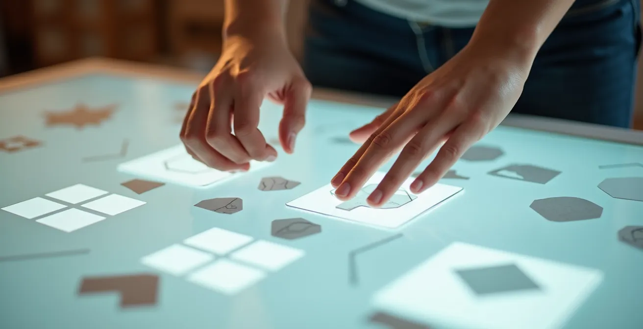
How to construct a 12-column grid that works for both mobile and desktop?
The 12-column grid has become the de facto standard in responsive design for a simple mathematical reason: its divisibility. Twelve can be cleanly divided by 2, 3, 4, and 6, offering unparalleled flexibility for creating layouts. A sidebar can take up 3 columns, the main content 9. You can have three 4-column blocks, or four 3-column blocks. This versatility is what allows a design to elegantly reflow from a wide desktop monitor to a narrow mobile screen.
Constructing a 12-column grid is less about drawing lines and more about defining rules for behavior. The core components are columns, gutters (the space between columns), and margins (the space at the edges). The magic happens at the “breakpoints”—specific screen widths where the layout adapts. For example, a 4-column layout on desktop might stack into a single column on mobile. Frameworks like Bootstrap codify this, offering a standard grid system with 12 template columns available per row.
The key to a successful implementation is consistency in gutters and margins across all breakpoints. While the column widths change, the negative space that defines the rhythm of your design should feel consistent. This creates a predictable and harmonious experience for the user, regardless of their device. The structure may change, but the underlying structural integrity remains intact.
This table illustrates the common breakpoints used in responsive design to manage the behavior of a 12-column grid across different devices.
| Device Size | Breakpoint | Container Width | Column Behavior |
|---|---|---|---|
| Extra Small | < 576px | 100% | Stack vertically |
| Small | ≥ 576px | 540px | Start horizontal layout |
| Medium | ≥ 768px | 720px | Flexible columns |
| Large | ≥ 992px | 960px | Desktop layout |
| Extra Large | ≥ 1200px | 1140px | Wide screen optimization |
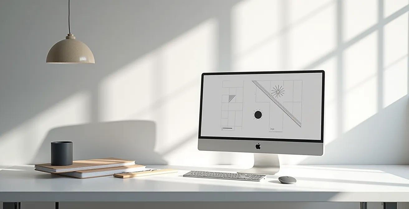
Optical Center vs. Geometric Center: Which looks “correct” to the human eye?
This is where the perfectionist designer separates from the merely competent one. You’ve perfectly centered an element within its container using software guides. The coordinates are mathematically flawless. Yet, it looks… slightly too low. This isn’t an illusion; it’s a well-documented quirk of human perception. The geometric center—the mathematical middle of a shape—is not the same as the optical center, the point where an object appears to be centered to the human eye.
Our brains perceive visual mass differently based on shape. Elements like triangles or the “play” icon (▶) have more visual weight at their base. When geometrically centered, they appear to be sagging. To correct this, you must shift them slightly upwards to achieve optical balance. Similarly, a circle or a square centered vertically within a rectangle will often look more balanced when moved slightly above the true geometric center. This compensates for our brain’s tendency to give more weight to the bottom half of a visual field.
Achieving this balance is an art that defies pure mathematics. It requires training your eye to see beyond the bounding boxes and alignment guides of your design software. Techniques like the “squint test”—blurring your vision to see the distribution of visual weight rather than the details—are invaluable. It forces you to evaluate the composition based on mass and balance, the same way a user’s subconscious brain does in a split second. Ignoring optical alignment is a classic sign of an amateur design; it creates a subtle, unnerving dissonance that undermines the feeling of polish and stability.
Your checklist for achieving true optical balance
- Apply the squint test to blur details and reveal the true visual weight distribution of your layout.
- Shift triangular or bottom-heavy elements upward by approximately 5-10% of their height to compensate for their visual mass.
- Consider the fovea’s role in high-resolution central vision when positioning your most critical elements; they demand perfect balance.
- Use asymmetrical grids intentionally to create productive visual tension, rather than accidental imbalance.
- Balance visual weight through a combination of size, color intensity, and positioning, not just strict geometric alignment.
The typography mistake in headlines that makes professional work look amateur
Typography is a microcosm of the entire grid system. A block of text is its own intricate layout of characters, words, and lines, and the same principles of alignment, spacing, and rhythm apply. The most common and jarring mistake that instantly flags a design as amateurish is poor ragging. The “rag” is the uneven edge of a block of text, typically the right side in left-aligned text. A good rag is soft and unobtrusive. A bad rag creates distracting shapes, awkward line breaks, or, in the worst case, unintentional patterns that draw the eye away from the content.
Another subtle but crucial error is ignoring kerning. While modern software handles most letter-spacing well, certain letter combinations (like ‘AV’, ‘To’, or ‘F.’) create awkward gaps that need manual adjustment. Failing to fix these pairs creates a micro-moment of visual friction. It’s a tiny “stumble” for the eye that, when repeated, contributes to a feeling of sloppiness. This is not just about aesthetics; a design that appears poorly constructed makes the product itself seem less usable and trustworthy.
Professionals obsess over these details. They manually adjust line breaks to create a balanced rag. They spend time kerning headlines to perfection. They ensure “typographic color”—the overall texture and density of a text block—is even and consistent, free from “rivers” of white space that can appear in justified text. This isn’t pedantic; it’s a deep understanding that the brain processes text as a visual shape first and as information second. A smooth, well-balanced shape is processed with less cognitive effort, making the content easier to read and the entire experience feel more polished and authoritative.
How to export icons so they snap to the pixel grid in the final build?
You’ve meticulously designed a set of icons. They are perfectly aligned in your design file. Yet, when they appear in the final app or on the website, they look soft, slightly blurry, and just… wrong. This is often the result of a disconnect between your vector design environment and the pixel-based reality of a screen. If an icon’s vector path falls between pixels, browsers and operating systems will use anti-aliasing to render it, resulting in blurry or fuzzy edges. This is a critical failure in maintaining structural integrity at the micro-level.
To ensure icons are crisp and snap to the pixel grid, you must work with the grid in mind from the very beginning. This means:
- Design on a pixel grid: Set up your artboard in whole-pixel increments (e.g., 24×24, 32×32) and ensure all vector points and paths snap to that grid.
- Use whole number coordinates: All elements should be positioned at integer X and Y coordinates. A shape at X=10.5 will inevitably be blurry.
- Align strokes correctly: Ensure your vector strokes are aligned to the inside, outside, or center of a path in a way that respects the pixel grid. A 1px stroke centered on a path that falls on a half-pixel boundary will render as a 2px-wide blurry line.
This obsessive attention to the pixel grid is not just for visual neatness. According to UXPin research, this precision creates a professional look that builds trust with users. A soft or blurry icon is another form of visual noise. It’s a small signal of imprecision that, compounded with others, tells the user that the creators didn’t care enough to get the details right. If they can’t get a tiny icon right, can they be trusted with my data or my money? The leap is subconscious but powerful.
Why 300 DPI is a myth for billboards (and what number actually matters)?
The “300 DPI for print” rule has been so thoroughly hammered into designers that it’s often applied without thought, leading to absurdly large files for media like billboards. The truth is, 300 DPI (Dots Per Inch) is a standard for high-quality offset printing viewed from arm’s length, like a magazine. It’s entirely irrelevant for a billboard that will be viewed from hundreds of feet away. The metric that truly matters is not DPI, but Pixels Per Degree (PPD), which accounts for viewing distance.
PPD measures how many pixels of an image fall within one degree of your field of vision. The human eye with 20/20 vision can resolve details down to about 60 PPD. Anything higher is effectively invisible. A smartphone, held close, needs a very high pixel density (PPI) to hit this 60 PPD target. A billboard, viewed from a great distance, can achieve a sufficient PPD with a much, much lower DPI—often as low as 10 to 30 DPI.
This insight is captured perfectly by the Vision Science Research Group, who state:
Angular resolution, measured in arcminutes, is the fundamental metric that determines required image resolution based on viewing distance, not arbitrary DPI standards.
– Vision Science Research Group, Display Technology and Human Vision
Understanding this principle is liberating. It stops you from creating unnecessarily massive files and allows you to optimize resolution for the specific context of use. It demonstrates a deeper, more fundamental understanding of perception than simply reciting the “300 DPI” mantra. It’s the difference between following a rule and understanding the science behind it.
This table from a Smashing Magazine analysis on layout grids shows how the required resolution changes dramatically with viewing distance.
| Medium | Typical Viewing Distance | Required PPD (Pixels Per Degree) | Typical DPI/PPI |
|---|---|---|---|
| Smartphone | 12 inches | ~60 PPD | 300+ PPI |
| Desktop Monitor | 24 inches | ~45 PPD | 100-150 PPI |
| TV Screen | 6-10 feet | ~30 PPD | 50-75 PPI |
| Billboard | 50+ feet | ~10 PPD | 10-30 DPI |
When to erase your construction grid: keeping the structure without the mess?
A common mistake for developing designers is to fall in love with the grid itself, treating it as a visual element to be displayed rather than the invisible scaffolding it is meant to be. Unless you are intentionally aiming for a brutalist or technical aesthetic, the grid lines themselves should never be part of the final design. Their purpose is to inform the placement of elements, not to be an element themselves. The true measure of a well-executed grid is that its presence is felt, not seen.
The structure should radiate through the consistent alignment of text and images, the rhythmic repetition of negative space in your gutters and margins, and the clear visual hierarchy it creates. As the Baseline Design Bootcamp succinctly puts it, grids are there to serve clarity. The moment the grid itself becomes a source of visual noise, it has failed its one and only purpose.
Knowing when to “erase” the grid is a matter of confidence. You remove the visible guides once the layout is set, trusting that the structural integrity you’ve built will hold. The user should experience the result of the grid—a sense of order, rhythm, and stability—without ever being consciously aware of the system that created it. This invisible structure is what guides their eye through the content effortlessly. Keeping the grid lines is like a magician explaining the trick; it destroys the magic and replaces a sense of wonder with a tedious technical explanation.
Key Takeaways
- Misalignment isn’t just sloppy; it’s a psychological trigger that increases cognitive load and erodes the user’s subconscious trust in your interface.
- The “correct” center for an object is often optical, not geometric. You must learn to trust your eyes over your software’s mathematical precision to achieve true balance.
- The fundamental principle governing resolution is Pixels Per Degree (PPD), which accounts for viewing distance, not a fixed DPI number.
Why Your SVG Icons Look Blurry on Retina Screens and How to Fix It?
It’s one of the most frustrating paradoxes in modern UI design. You’ve used SVGs (Scalable Vector Graphics) for all your icons, believing they are the solution to the problem of varying screen densities. Yet, on a high-resolution “Retina” display, they can still appear soft or blurry. This often happens when the SVG’s dimensions are not aligned with the physical pixel grid of the screen, or when the viewbox is not set to whole numbers. The browser is forced to use anti-aliasing to render vector paths that fall on “half-pixels,” creating the very blurriness you sought to avoid.
The fix requires a level of precision that borders on obsessive. The SVG’s `width` and `height` attributes should be defined in whole pixels. The `viewBox` attribute must also use integer values. Most importantly, the vector paths inside the SVG must be drawn to align with a pixel grid. An SVG containing a horizontal line defined from `y=0.5` to `y=0.5` is destined to be blurry, as it will straddle two rows of physical pixels. The path must be on a whole number, like `y=1`.
This issue brings us full circle to the core psychological principle: the brain abhors ambiguity. A blurry icon is a form of visual clutter. It’s an unresolved detail that pulls at our cognitive resources. A study by Princeton psychologist Sabine Kastner on attention found that the brain may not be good at blocking out this kind of clutter. When a second, distracting object was introduced into a subject’s visual field, brain scans detected a “fuzzy version” of that object being processed. As her research concluded, the more objects (or imperfections) in the visual field, the harder the brain has to work to filter them, causing it to tire and reducing its ability to function.
A blurry icon is that “fuzzy object.” It’s a tiny piece of unresolved visual information that adds to the overall cognitive load, subtly wearing down the user’s focus and trust.