The fastest way to communicate a complex mechanical idea isn’t with more words or a perfect 3D model; it’s with a strategically imperfect sketch.
- Mastering exploded views and line weight hierarchy communicates function and assembly more effectively than a photorealistic rendering.
- The choice between analog markers and a digital tablet depends entirely on the context: markers for collaborative speed, digital for iterative refinement.
Recommendation: Instead of aiming for artistic perfection, focus on a “speed-to-clarity” ratio, where every line is a deliberate communication choice to save time and prevent misunderstanding.
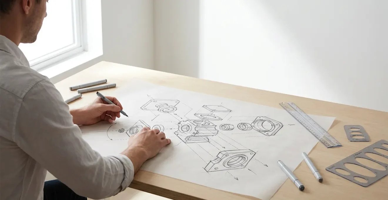
You’re in a critical design review. The idea for a new mechanism is crystal clear in your head, but words are failing you. You try to describe the interlocking parts, the assembly sequence, the core user interaction, but you can see the blank stares. This frustration is a universal experience for engineers and industrial designers trying to convey complex, three-dimensional concepts. The common advice is to “practice drawing” or invest in the latest digital tablet, treating sketching as a matter of artistic talent or tooling.
While motor skills are part of the equation, this approach misses the fundamental point. The most effective designers don’t treat sketching as art; they wield it as a language. It’s a system for rapid visual communication, optimized for clarity and speed, not beauty. The real key isn’t about drawing a perfect straight line, but knowing why that line needs to be thick or thin. It’s not about rendering a flawless surface, but about deconstructing a product into an exploded view that anyone can understand in seconds.
But what if the secret to powerful technical sketching wasn’t about adding more detail, but about strategically removing it? What if the goal wasn’t a finished picture, but a cognitive shortcut that allows your team’s brains to instantly grasp function and form? This is the core of effective visual communication. It’s a learnable system of deliberate choices designed to minimize ambiguity and accelerate decision-making.
This guide will deconstruct the techniques that separate a simple drawing from a powerful communication tool. We will explore how to create clarifying exploded views, master perspective without rulers, choose the right tool for the job, and use line weight as a strategic weapon to direct attention. It’s time to stop drawing and start communicating.
To navigate this system, this article breaks down the essential techniques into focused sections. Each part addresses a specific, high-impact skill that will immediately improve the clarity and speed of your technical sketches.
Summary: How to Communicate Complex Machine Designs through Quick Technical Sketching?
- Why an exploded view clarifies assembly better than a finished rendering?
- How to draw correct ellipses in perspective without templates or rulers?
- Alcohol Markers vs. iPad Pro: Which is faster for live brainstorming sessions?
- The vanishing point error that twists your product design sketch
- When to use thick outlines: directing the viewer’s eye to the most important feature?
- How to calculate the spacing of fence posts receding into the distance accurately?
- How to place anchor points perfectly to create the smoothest possible curves?
- How to cut 3D render times in half without losing texture quality?
Why an exploded view clarifies assembly better than a finished rendering?
A beautifully finished 3D render is seductive. It shows the final product in all its glory, with perfect lighting and realistic materials. However, for communicating how a machine works or assembles, it’s often a failure. A finished render presents a high cognitive load; the viewer’s brain must mentally deconstruct the object to understand its inner workings. It hides the very information you’re trying to convey. An exploded view, by contrast, is a masterclass in clarity. It lays out components along their assembly axes, creating a visual map of how everything fits together. This isn’t just a drawing; it’s a narrative of construction.
The power of the exploded view lies in its honesty. It shows the relationship between parts, the order of assembly, and the hidden features that make the product function. This method is exceptionally powerful in the early stages of development, where the goal is to sell an idea and gather feedback long before any CAD data exists. A quick, well-executed exploded sketch can convey a complex assembly in 30 seconds, a task that might take an hour to model and render in 3D.
Case Study: Fed Rios’s Approach to Rapid Product Development
In his design sketching courses, product designer Fed Rios emphasizes that an exploded view sketch is a primary tool for ideation, not just documentation. He teaches that creating this view from imagination is far more efficient in the early stages of product development. When you need to quickly sell an idea to a team or client, a compelling sketch is faster and more engaging than waiting for a 3D model, proving that clarity and speed are more valuable than polish during brainstorming.
Creating an effective exploded view relies on a few core principles: starting with a central component as an anchor, pulling parts out along their natural assembly paths, maintaining consistent spacing for visual rhythm, and using action lines to show connections. This systematic approach transforms a complex machine into a simple, digestible story.
Ultimately, a finished render answers “What does it look like?” while an exploded view answers “How does it work?”. For an engineer or designer, the second question is almost always more important.
How to draw correct ellipses in perspective without templates or rulers?
Nothing reveals an amateur sketch faster than a poorly drawn ellipse. Circles in perspective—wheels, dials, buttons, holes—appear as ellipses, and their accuracy is critical for a believable 3D form. Relying on templates is slow and restrictive, while free-handing them often results in lopsided, “football” shapes. The key to drawing fast, confident ellipses is not in the wrist or fingers, but in the shoulder. It’s a physical motion that, once learned, becomes ingrained as muscle memory.
The “ghosting” method is the standard professional technique. It involves positioning your arm so your shoulder is directly above the drawing point, locking your wrist, and making several practice passes in the air just above the paper. These “ghost” strokes program the motion into your arm. When you commit to paper, you do it in a single, smooth, and confident stroke originating from the shoulder. This creates a far more symmetrical and natural curve than a series of hesitant, sketchy lines.

Beyond the physical motion, understanding the geometry is crucial. As expert Chris Mattson points out, the orientation of the ellipse gives it context:
The minor axis of an ellipse always aligns with the axis that would protrude perpendicularly from its center.
– Chris Mattson, BYU Design Review – Learn to Sketch: Part 2
This means if you’re drawing a wheel on a car, the minor axis (the shortest diameter of the ellipse) is the axle. Nailing this alignment is just as important as the shape of the curve itself. By combining the physical technique of drawing from the shoulder with the intellectual understanding of axis alignment, you can produce accurate ellipses quickly and consistently, every time.
This is a foundational skill that pays dividends in every subsequent sketch, allowing you to represent cylindrical forms and circular features with both speed and accuracy.
Alcohol Markers vs. iPad Pro: Which is faster for live brainstorming sessions?
The debate between traditional and digital tools often misses the point by focusing on features rather than context. For a designer in a live brainstorming session, the only metric that matters is the speed-to-clarity ratio. Which tool allows you to get a clear idea out of your head and in front of the team the fastest? The answer is not universal; it depends entirely on the session’s goal.
As industrial design mentor Chou-Tac Chung notes, the tool is secondary to the thinking behind it. On his platform, he states:
Many beginners slow their design sketching growth by copying without understanding underlying principles.
– Chou-Tac Chung, The Design Sketchbook – 24 Industrial Design Sketching Tips
This principle applies directly to tool selection. An iPad Pro with its infinite undos and layers offers incredible power for refinement, but this very perfectionism can be a bottleneck. In a group setting, the slight delay of opening an app and the silent, isolated nature of drawing on a screen can create a barrier. Conversely, uncapping an alcohol marker is instant. The physical act of sketching on large paper, the audible scratch of the nib, and the “finality” of each stroke create an atmosphere of forward momentum and invite collaboration. This “intentional imperfection” signals that ideas are still fluid and open to input.
The following table breaks down the practical differences when speed is the priority.
| Aspect | Alcohol Markers | iPad Pro | Best For |
|---|---|---|---|
| Setup Time | Instant – uncap and draw | 30 seconds – unlock, open app, select tool | Markers win for spontaneous ideas |
| Iteration Speed | Layer with tracing paper (5 seconds) | Duplicate layer digitally (2 seconds) | iPad wins for solo work |
| Group Visibility | Large format visible to 5+ people | Small screen, needs projection | Markers win for collaboration |
| Correction Time | No undo – commit and move forward | Instant undo/redo available | iPad wins for refinement |
| Psychological Impact | Audible scratching invites input | Silent process feels ‘finished’ | Markers win for open discussion |
For rapid, collaborative ideation with a group, markers on paper remain undefeated. For solo work or refining a concept with multiple iterations, the iPad Pro’s speed in duplication and correction is superior. The master designer has both in their toolkit and knows when to deploy each.
The vanishing point error that twists your product design sketch
Perspective is the scaffolding upon which a 3D sketch is built. While most designers learn the basics of one, two, and three-point perspective, a subtle but common error can completely undermine a drawing: inconsistent vanishing points. This occurs when lines that are supposed to be parallel in 3D space (like the top and bottom edges of a box) don’t converge to the *same* single point on the horizon line. The result is a twisted, warped object that feels fundamentally wrong, even if the viewer can’t pinpoint why. As a BYU Design Review analysis of perspective errors notes, a tiny perspective mistake on a handle can ruin the whole sketch, so this is not a part to be rushed.
This error often creeps in during fast sketching, when intuition takes over from systematic construction. You might get the first few lines right, but as you add details, subsequent lines begin to drift towards their own imaginary vanishing points. The good news is that there is a quick, tool-free method to check your work: the Pen-Sight Method.
This technique turns your own pen into a diagnostic tool for perspective alignment. It’s a rapid sanity check that takes only seconds but can save an entire sketch from the uncanny valley of bad perspective. The process is simple:
- Hold your pen at arm’s length between your eye and the sketch.
- Close one eye to flatten your vision and eliminate true depth perception.
- Align the pen with each supposedly parallel line in your sketch, one by one.
- Check if all lines converge toward the same invisible point on the horizon.
- Mark and correct any lines that drift away from the true vanishing point, redrawing from the shoulder for a more confident stroke.
This simple habit of periodically checking your convergence points ensures that the foundational structure of your sketch remains solid, no matter how quickly you’re working or how many details you add. It’s a cognitive shortcut that reinforces accuracy without slowing you down.
By making this quick check a regular part of your sketching workflow, you build a reliable foundation, ensuring your product designs feel grounded and believable rather than twisted and broken.
When to use thick outlines: directing the viewer’s eye to the most important feature?
Line weight is the most powerful and underrated tool in a designer’s sketching arsenal. A sketch with a single, uniform line weight is flat, confusing, and difficult to read. It forces the viewer’s brain to work harder to distinguish the overall form from surface details and part lines. Conversely, a sketch that uses a deliberate hierarchy of line weights becomes instantly legible. It’s the visual equivalent of using headlines, subheadings, and body text to structure a document. This is the Communication Hierarchy of Line Weight, and it’s a system for telling the viewer’s eye where to look and in what order.
The system is simple but profoundly effective. It organizes every line in the sketch into a level of importance, assigning a corresponding thickness:
- Level 1 (Thickest): The main silhouette or contour line. This line defines the overall boundary of the product against its background. It’s the first thing the eye should register.
- Level 2 (Medium-Thick): Key interaction points. These are the parts the user touches: buttons, handles, triggers, and dials. Making them stand out directs attention to the product’s function.
- Level 3 (Medium): Parting lines. These lines indicate where different components separate or where materials change, helping to explain the object’s construction.
- Level 4 (Thin): Surface details. This includes textures, vents, graphics, and minor decorative elements that add realism but are not critical to understanding the form.
- Level 5 (Thinnest): Construction lines. These are the underlying perspective guides and ellipses. They can be left faintly visible to add a technical, “in-process” feel to the sketch.
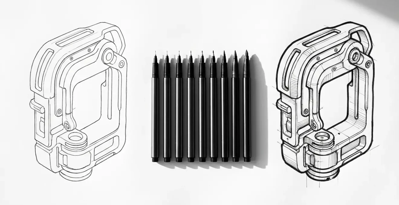
Applying this hierarchy transforms a sketch from a simple representation into a guided tour of the product. The thickest lines grab initial attention, establishing the primary form. The eye is then naturally drawn to the next thickest lines—the interactive elements—before processing the finer construction and surface details. This isn’t an artistic choice; it’s a functional one, designed to reduce ambiguity and increase the speed of comprehension.
By mastering this hierarchy, you take control of the narrative of your sketch, ensuring that the most important features of your design are the first things your audience sees and understands.
How to calculate the spacing of fence posts receding into the distance accurately?
One of the most common challenges in perspective sketching is representing repeating elements that diminish in size and spacing as they recede toward the vanishing point. Whether it’s fence posts, columns, or railway ties, guessing the spacing often leads to an unnatural, unconvincing result. The elements either shrink too quickly or not fast enough. Fortunately, there is a classic, geometric technique that provides mathematically accurate spacing without any complex calculations: the Diagonal Division Method.
This method is a powerful cognitive shortcut that uses the sketch’s own geometry to determine the placement of subsequent elements. It ensures that the perceived distance between each object decreases at a perfectly consistent rate according to the laws of perspective. Once you’ve established your horizon line, vanishing point, and the first two elements, the rest of the sequence can be mapped out with precision.
The technique works as follows:
- Draw your first two elements. Establish the height and spacing of the first two posts (or other objects) in the foreground. Their top and bottom edges should recede towards the main vanishing point.
- Find the midpoint. Draw a diagonal line from the top of the first post to the bottom of the second post. Then, draw another diagonal from the bottom of the first post to the top of the second. The point where these two diagonals cross is the visual midpoint between the posts.
- Project the next position. Draw a line from the vanishing point through this midpoint and extend it until it intersects the top and bottom perspective lines. This intersection marks the exact position of the next post.
- Find the third post. Now, draw a diagonal line from the top of the second post, passing through the horizontal center line of your first two posts, until it intersects the bottom perspective guide. This intersection point is the base of the third post.
- Repeat the process. You can continue this sequence, using the diagonal from the previously drawn post to find the location of the next one, creating a perfectly spaced series of objects receding into the distance.
This method removes all guesswork from the equation. It’s a reliable, repeatable system that can be executed quickly to add a high degree of realism and accuracy to any scene with repeating elements.
By leveraging this geometric principle, you can construct complex scenes with confidence, knowing that the spatial relationships in your sketch are not just intuitive, but structurally sound.
How to place anchor points perfectly to create the smoothest possible curves?
While hand-sketching is about fluid, shoulder-driven lines, digital sketching and vector illustration rely on the precise placement of Bezier curve anchor points. Poor anchor point strategy is the source of most bumpy, awkward, or unnatural digital curves. The common mistake is to use too many points, trying to “trace” a curve by adding an anchor at every slight change in direction. This creates a line that is difficult to edit and lacks smoothness. The professional approach is counter-intuitive: use the absolute minimum number of anchor points possible.
The guiding principle is the “Extremes Rule.” This rule dictates that you should only place anchor points at the extreme ends of a curve’s arc—its highest, lowest, leftmost, or rightmost points. A simple ‘S’ curve, for example, requires only two anchor points, not one at every bend. The smooth transition between these extremes is then controlled entirely by the handles of each anchor point.
Case Study: Luciano Bove’s Automotive Line Quality Techniques
In tutorials for aspiring automotive designers, professional designer Luciano Bove demonstrates numerous exercises for improving line quality. While many focus on hand control, his principles apply equally to digital work. He emphasizes that a “quality line” is one of ‘intent’—a smooth, flowing curve that is controlled and deliberate. This is achieved by minimizing control points, whether it’s the number of pen strokes by hand or the number of anchor points in a vector program, a technique perfected in the world of car body design.
To implement the Extremes Rule effectively, follow this five-step process:
- Identify the extremes: Look at your intended curve and find its outermost points on the X and Y axes.
- Place anchors only at extremes: Add your anchor points at these locations and nowhere in between.
- Adjust handles to ~1/3 distance: Pull the handles out from the anchor point. A good starting point is to make the handle’s length about one-third of the distance to the next anchor point.
- Keep handles tangent: The direction of the handle should be tangent to the direction the curve is heading at that anchor point. For a point at the top of a curve, the handles should be perfectly horizontal.
- Test for smoothness: Temporarily hide the anchor points and handles to see the raw curve. It should flow cleanly without bumps or kinks. If it doesn’t, you likely have too many points or your handle tangents are off.
–
By adopting this “less is more” philosophy, your digital curves will become smoother, more elegant, and infinitely easier to edit, mirroring the grace of a perfectly executed hand-drawn line.
Key takeaways
- Prioritize Exploded Views: For communicating assembly and function, an exploded sketch is faster and clearer than a finished 3D render.
- Use Line Weight as a System: Implement a hierarchy of line weights to guide the viewer’s eye, with the thickest lines for the main silhouette and thinner lines for details.
- Choose Tools Based on Context: Use alcohol markers on large paper for fast, collaborative group brainstorming and a digital tablet for solo iterative refinement.
How to cut 3D render times in half without losing texture quality?
The ultimate goal of many technical sketches is to serve as a blueprint for a 3D model. However, the connection between the initial sketch and the final render is often inefficient. A significant amount of time is wasted in the 3D software experimenting with camera angles, lighting, and material assignments that were already implicitly decided in the 2D phase. By adding a simple layer of metadata to your initial sketch, you can create a “map” that dramatically accelerates the 3D workflow, effectively cutting down on rendering and setup time.
This technique is Sketch-Based Material ID Mapping. Instead of just drawing the form, you use a simple color-coding system on a separate layer of your sketch to pre-assign material properties. This map doesn’t need to be beautiful; it just needs to be clear. For example, you could use solid red for all glossy plastic surfaces, blue for brushed metal, yellow for matte rubber, and so on. This simple step turns your conceptual sketch into a technical document that a 3D artist (or you, later) can read at a glance.
This process bridges the gap between 2D ideation and 3D execution, a workflow essential to professional industrial design as taught in many advanced courses. For instance, Marouane Bembli’s Udemy course on Photoshop sketching highlights giving students “an insight to how it’s done in the design industry,” and this direct link between sketch and final render is a key professional practice.
Action Plan: Your Material ID Mapping Workflow
- Create a Material ID Map: On your initial sketch, use simple, flat color codes to designate different materials. Mark ‘M1’ for matte surfaces, ‘G1’ for glossy, ‘T1’ for transparent, etc.
- Identify Bump Map Opportunities: In your sketch, circle areas where texture can be simulated with a bump or normal map instead of being modeled with complex geometry (e.g., knurling on a knob).
- Use Sketch as a Backdrop Plate: Import your sketch directly into your 3D software and use it as a background image to match the camera angle and perspective instantly.
- Apply Materials via the Map: Instead of clicking on individual surfaces in the 3D model, use your color-coded sketch map as a guide to quickly apply pre-made materials to the corresponding parts.
- Prioritize Key Areas: Use the map to focus rendering power on visually important areas, while simplifying textures and geometry in less visible spots.
This front-loading of effort pays massive dividends. Matching the camera angle becomes instant, material assignment is no longer a guessing game, and you can make strategic decisions about where to use computationally expensive materials versus simple shaders. It transforms the sketch from a mere suggestion into the core of an efficient, streamlined production pipeline.
Start applying this Material ID Map to your next project. You’ll find that the five extra minutes you spend in the sketching phase can save you hours of frustrating trial-and-error in the 3D rendering stage.