The frustrating appearance of ink scumming is not a random failure, but a predictable breakdown in the stone’s hygroscopic balance between water and grease.
- Scumming often results from “etch fatigue,” where the chemical preparation degrades from the mechanical abrasion of printing.
- Mastering the process requires developing a “chemical intuition,” linking sensory cues like ink tack and water temperature to the invisible molecular reactions on the stone.
Recommendation: Instead of just adding more water, perform a systematic diagnostic check focusing on ink viscosity, water saturation, and a gentle reinforcement of the etch with gum arabic to restore the critical chemical equilibrium.
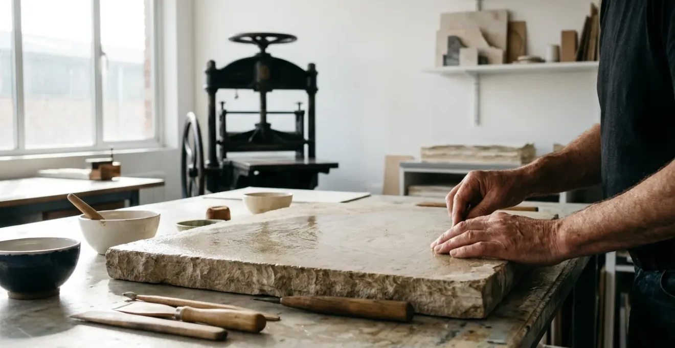
For any printmaking student, the moment an image begins to fill in with ink is a moment of pure frustration. After hours of careful drawing and preparation, the tenth print suddenly looks like a smudged mess. The common advice is often to “use more water” or “check your ink,” but these are just symptoms. This struggle is not a lack of skill, but a miscommunication with the materials. The art of lithography is a constant dialogue between chemistry and touch, a process governed by the invisible forces of water repulsion and grease attraction.
To truly solve the problem of scumming, one must move beyond a simple recipe and develop a deeper, almost sensory understanding of the process. It’s about learning to read the stone’s surface, to feel the ink’s viscosity, and to understand what is happening at a molecular level. The real issue is often a breakdown in the delicate hygroscopic balance—the carefully established separation between the water-receptive (hydrophilic) non-image areas and the grease-receptive (hydrophobic) image areas. This balance is not static; it’s a dynamic state that can be exhausted by the physical stress of printing.
But what if the key wasn’t just reacting to problems, but anticipating them by understanding their chemical roots? This guide moves beyond the platitudes to decode the sensory cues that signal a shift in this crucial balance. We will explore why an image fills in, how the initial graining of the stone sets the stage for success or failure, and how the very tools you draw with participate in this chemical conversation. By connecting the physical act of printing to its underlying chemistry, you can transform from a frustrated operator into a confident artist in control of your edition.
This article provides a structured approach to mastering the temperamental nature of stone lithography. We will begin by diagnosing the immediate problem of scumming and then delve into foundational techniques, material choices, and advanced strategies to ensure every print in your edition is as perfect as the first.
Summary: How to Master Ink Control in Stone Lithography
- Why your image is filling in with black ink after only 10 prints?
- How to grain a limestone slab to remove the previous ghost image completely?
- Liquid Tusche vs. Grease Crayon: Which creates more reticulated organic textures?
- The “hot etch” mistake that burns the image off the stone forever
- How to organize your paper stack to print an edition of 50 alone efficiently?
- Why Ferric Chloride is safer than Nitric Acid but requires vertical tanks?
- Why smooth bristol board rejects soft graphite layering?
- Numbering Strategy: How Many Prints Should Be in a Limited Edition to Maximize Value?
Why your image is filling in with black ink after only 10 prints?
The dreaded “fill-in,” where non-image areas begin accepting ink, is the most common failure in stone lithography. This phenomenon, known as scumming, signals a critical breakdown of the chemical boundary between your drawing and the blank stone. It’s not just that the stone is “getting greasy”; it’s a sign of etch fatigue. The initial etch with an acid and gum arabic solution chemically alters the limestone, making non-image areas hydrophilic (water-loving). However, the repetitive friction of the roller and the chemical properties of the ink slowly wear down this delicate preparation. After a number of prints, this barrier can weaken, allowing the greasy ink to find purchase in the stone’s pores where it doesn’t belong.
This breakdown is accelerated by several factors you can diagnose through sensory cues. An ink that is too stiff or “tacky” will exert more physical force on the stone, accelerating wear. A studio that is too warm can lower the ink’s viscosity, causing it to spread more easily into microscopic crevices. Even the sponge you use can be a culprit; if it’s not carrying enough clean water, you’re not adequately replenishing the protective water film on the non-image areas before each inking. Each pass of the roller becomes a test of this molecular threshold, and after ten or so prints, the cumulative effect can cause the system to fail.
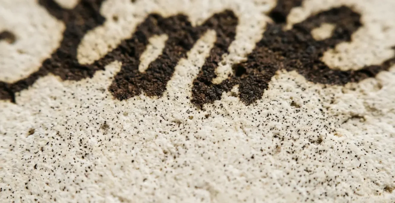
The image above reveals the very beginning of this process. Tiny, unwanted ink particles are starting to cling to the stone’s texture in what should be a clean area. To combat this, you must think like a chemist and systematically restore the stone’s balance. It requires more than just flooding the surface with water; it demands a precise, measured response to reinforce the weakened etch and re-establish the all-important hygroscopic balance.
Action Plan: Mid-Edition Fill-In Diagnostic
- Check sponge water saturation: Ensure water is clean and the sponge is properly dampened, not dripping wet or too dry.
- Assess ink tack and temperature: Adjust the ink if it feels too sticky or if the studio environment is excessively warm.
- Apply gentle gum arabic wipe: Use a clean sponge with a thin solution of gum arabic to reinforce the etch on non-image areas.
- Examine for micro-contaminants: Look for roller debris or paper dust accumulation that could be depositing grease onto the stone.
- Consider ‘etch fatigue’: Recognize that the initial preparation may be degrading and requires a delicate chemical reinforcement, not just more water.
How to grain a limestone slab to remove the previous ghost image completely?
A pristine print begins long before you ever make a mark. It starts with the stone itself. Graining is not merely about cleaning the surface; it’s a sculptural process of creating a new, perfectly receptive texture. A “ghost image” persists because the grease from the previous drawing has chemically bonded with the stone, penetrating its pores. Simply wiping it clean is not enough. You must physically remove the top layer of the limestone to expose a fresh, chemically neutral surface. This is achieved through a systematic process of abrasion with a levigator and progressively finer grits of carborundum.
The process is a dialogue with the material, guided by sound and feel. You start with a coarse grit to do the heavy work of removing the old image. The sound should be a loud, grinding roar. As you work in a figure-eight pattern, this sound will soften, indicating the grit has broken down and it’s time to clean the stone and move to the next, finer grit. The transition between grits is a critical moment. If any coarse particles remain when you introduce a finer grit, they will create deep, random scratches that will mar your final print. This is why a thorough washing between stages is essential to achieving a uniform surface.
Professional Grit Progression Sequence
To achieve a professional-grade surface, the grit sequence must be methodical. A typical progression starts with 80 grit, then moves to 120, 180, and finally 220. It’s not enough to simply use each grit once; you must go through the full graining process three times at each level before advancing. For instance, you will grain with 80 grit, wash, grain with 80 grit again, wash, and a third time with 80 grit before finally washing thoroughly and moving to the 120 grit. This repetition ensures a perfectly even and consistent surface tooth, completely obliterating any trace of the ghost image.
The physical substance of the stone itself plays a role in this stability. The iconic grey-blue stones from German quarries have a dense, uniform composition that makes them ideal for this process. In fact, new professional lithography stones from Munich quarries are typically 4 inches thick, providing the mass and stability needed to withstand repeated graining cycles over decades of use without warping or cracking. This substantial nature is a testament to the physicality of the medium, where preparing the foundation is as much a part of the art as the drawing itself.
Liquid Tusche vs. Grease Crayon: Which creates more reticulated organic textures?
The choice between a solid grease crayon and a liquid tusche wash is a fundamental decision that defines the character of a lithographic drawing. While both rely on the same principle—depositing a greasy material onto the stone—they interact with the surface in vastly different ways to produce distinct textures. A grease crayon offers direct, controlled mark-making, much like a pencil on paper. The texture is a direct translation of the artist’s pressure and the tooth of the stone. It is excellent for linear work and building up tones through hatching.
Liquid tusche, however, invites an element of chance and chemistry into the drawing process. Tusche is essentially a grease-based ink that can be diluted with water or solvents. When a tusche wash is applied to the stone, a beautiful phenomenon called reticulation occurs. The grease and water in the mixture naturally resist each other, separating into intricate, web-like patterns as the wash dries. This creates deeply organic and unpredictable textures that are impossible to achieve with a crayon. The nature of this reticulation is the essence of the “surface dialogue,” where the artist initiates a chemical reaction and then collaborates with the results.
An artist can learn to control this beautiful chaos through careful manipulation of the variables. The key factors are the tusche-to-water ratio and the condition of the stone itself. Here’s how you can steer the effect:
- Apply tusche to a pre-dampened stone for softer, more diffused reticulation patterns.
- Use a bone-dry stone for sharper, more defined and crackled textures.
- Adjust the water-to-tusche ratio to control the intensity and scale of the “bloom.”
- Experiment with water temperature, as warmer water can create more dramatic, larger patterns.
Advanced Layering for Textural Depth
Master printmakers don’t limit themselves to a single tool. As described in advanced workshops, artists can achieve incredible depth by combining techniques. One can block out areas with a layer of gum arabic, which will resist any drawing material applied over it. Then, they might paint with tusche washes of varying dilutions, use litho crayons dipped in water for a painterly effect, and even use rubbing inks with paper stencils to create further layers of organic texture. This method of layering different greasy materials builds a complex, rich image that fully exploits the chemical potential of the medium.
The “hot etch” mistake that burns the image off the stone forever
The etching stage is where the drawing is chemically fixed to the stone, and it is the most nerve-wracking part of the process for many students. A “hot etch” is a catastrophic error where the acidic solution is too strong. Instead of gently desensitizing the non-image areas, it aggressively attacks the greasy drawing material, effectively lifting it off the stone. The image is not just damaged; it is chemically burned away, often permanently. This happens when the concentration of acid (typically nitric or phosphoric acid) in the gum arabic solution is too high for the amount of grease in the drawing.
This is a purely chemical miscalculation. The goal of the etch is to create a durable, hydrophilic film of calcium nitrate and adsorbed gum arabic on the non-image areas. A gentle etch does this perfectly. However, a “hot” or overly acidic etch breaks down the very grease it is supposed to leave untouched. It is a fine balance. The gum arabic itself plays a dual role: it is both the carrier for the acid and a desensitizing agent. However, research shows that the desensitizing properties of gum arabic are lost at a pH greater than 5.0, meaning an overly acidic solution loses its protective qualities and becomes purely corrosive to the entire surface, image and all.
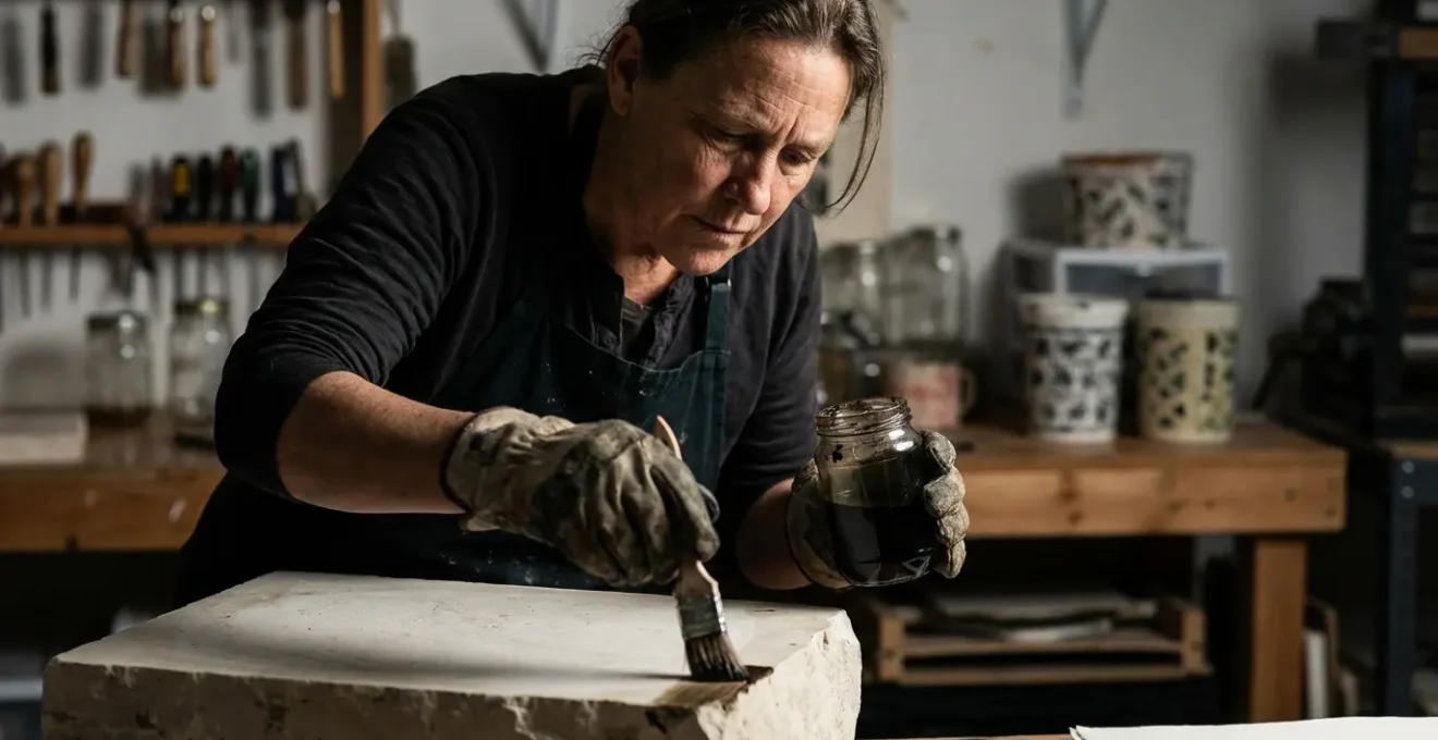
The only way to avoid this disaster is through caution and testing. An experienced printmaker develops a chemical intuition, learning to “read” the drawing and estimate the appropriate etch strength. Dark, greasy areas require a stronger etch than delicate, light washes. A “hot etch” often has a distinctively sharp, acrid smell and may fizz visibly upon contact with the stone. If you suspect your etch is too strong, you must act immediately to neutralize the acid before it causes irreversible damage.
If you suspect an etch is too hot, follow this emergency procedure:
- Immediately flood the stone surface with clean, cool water to dilute and wash away the acid.
- Gently blot the excess liquid with clean cheesecloth or a soft sponge. Do not rub, as this could smear the already compromised image.
- Liberally apply a solution of pure gum arabic to the entire surface to neutralize any remaining acid.
- Allow the pure gum to sit for at least 30 seconds before buffing it down into a thin, tight layer.
How to organize your paper stack to print an edition of 50 alone efficiently?
Pulling a large edition solo is a marathon, not a sprint. Success hinges on workflow efficiency and meticulous organization. The primary challenge is maintaining consistent paper dampness throughout a printing session that can last for hours. Paper for lithography, such as the widely used Arnheim 1618, must be dampened to accept the ink properly. If it’s too wet, the image will be blurry; if it’s too dry, the ink transfer will be weak and uneven. Printing an edition of 50 means managing 50 sheets of paper, each at its optimal moisture level, exactly when you need it.
The key is to move away from a linear, start-to-finish mindset and adopt a circular, station-based workflow. Imagine your press as the central hub of a wheel. The other key stations—paper dampening, inking, and print drying—should be spokes, all within a step or two of the press. This minimizes movement and creates a rhythmic, repeatable flow: dampen paper, ink the stone, pull the print, place it on the drying rack, and repeat. This physical rhythm helps maintain focus and consistency, which are crucial for a uniform edition.
Batching Strategy for a 50-Print Edition
Instead of dampening all 50 sheets at once, a professional strategy involves batching. Professional printmakers often pre-dampen paper in batches of 10. Each batch is soaked and then stored in a stack, interleaved with blotters or newsprint, and wrapped tightly in plastic to prevent evaporation. These batches are then rotated throughout the session. You might print the first batch of 10 while the second batch rests and equalizes its moisture content. This ensures that the last print of the edition is made on paper with the same moisture level as the first.
The physical layout of your studio stations has a measurable impact on efficiency. A circular setup can dramatically reduce the amount of walking and wasted motion compared to a linear assembly-line layout. This table illustrates how reorganizing your space can save significant time and energy over the course of a large edition.
| Station Type | Linear Workflow | Circular Workflow | Efficiency Gain |
|---|---|---|---|
| Paper Dampening | Separate corner | Adjacent to press | -50% walking time |
| Stone/Press | Central position | Central hub | Equal access all sides |
| Drying Rack | End of line | Opposite dampening | Natural flow pattern |
| Ink Station | Side position | Within arm’s reach | -30% movement |
Why Ferric Chloride is safer than Nitric Acid but requires vertical tanks?
The choice of etchant in printmaking is a critical decision that balances artistic results with studio safety. For decades, nitric acid was the standard for etching metal plates and, in a diluted form, for lithography stones. However, it is highly corrosive and releases toxic nitrogen dioxide fumes, requiring powerful and expensive ventilation systems. In the shift towards non-toxic printmaking, ferric chloride has emerged as a much safer and more controllable alternative. The primary safety benefit is that the etching reaction with ferric chloride is a process of oxidation that produces zero hazardous fumes, making it usable in studios with standard ventilation.
However, this safety comes with a practical trade-off. Ferric chloride works best when a plate is suspended vertically in a tank. Unlike nitric acid, which works aggressively in a shallow tray, ferric chloride’s reaction produces a sediment that can settle on the surface of a horizontal plate, blocking the acid from reaching the metal and causing an uneven etch. A vertical tank solves this problem by allowing the sediment to fall harmlessly to the bottom, ensuring a continuous and consistent etch across the entire plate. This setup is essential for achieving the clean, sharp lines that ferric chloride is known for.
While a vertical tank might seem like a space constraint, it’s actually a highly efficient design. A study on studio setups revealed that, compared to a typical acid tray, a vertical etching tank uses 80% less studio floor space and has 95% less exposed surface area, which dramatically reduces evaporation. This not only conserves the chemical but also maintains a more stable concentration over time, leading to more predictable results. Setting up a vertical tank requires a few key components to ensure safety and effectiveness:
- A tank made from 1/4 inch thick polyethylene or similar chemically resistant plastic.
- A form-fitting lid to minimize evaporation when not in use.
- A drip ledge to safely remove the plate without spilling the etchant.
- A solution maintained at the optimal density of 42-45 Baumé for consistent etching.
Why smooth bristol board rejects soft graphite layering?
An artist accustomed to the tooth of drawing paper is often perplexed when attempting to layer soft graphite on smooth bristol board. The surface seems to “fill up” quickly, refusing to accept more graphite and instead becoming slick and shiny. This isn’t a failure of the graphite; it’s a fundamental mismatch between the medium and the surface topography. Traditional drawing paper has a textured surface with microscopic “peaks and valleys.” Graphite particles lodge themselves in these valleys, allowing for many layers to be built up. Bristol board, especially the smooth plate-finish variety, lacks this texture. Its surface is a flat, compressed plateau.
The problem is one of both physics and chemistry. When you use a very soft graphite pencil (like a 6B or 8B) on this smooth surface, two things happen. First, there are no valleys for the graphite to settle into. Second, the pressure from the pencil, combined with the clay binder in the graphite lead, actually burnishes the paper. It flattens and polishes the paper fibers, making the surface even smoother and more non-porous. Each subsequent layer has less to grab onto, until the surface becomes so slick that it actively rejects any additional graphite particles. You are essentially polishing the paper to a point where it can no longer be drawn on.
However, this doesn’t mean bristol board is unusable for detailed work. It simply requires a change in strategy. Instead of fighting the surface, you must work with it or subtly alter it. There are several professional techniques to introduce an “invisible tooth” to a smooth surface, allowing for more extensive layering:
- Apply a very light, even coat of workable fixative spray. This creates a micro-texture that can grab graphite.
- Begin with harder leads (like 2H or H). These harder pencils can physically incise the surface slightly, creating a tooth for softer leads to adhere to later.
- Lightly “sand” the surface with a pumice-based powder or even extremely fine-grit (400+) sandpaper in gentle, circular motions to create a subtle, uniform texture.
Surface Texture Analysis
An analysis by museum conservators explains this phenomenon at a microscopic level. As noted in a study by The Metropolitan Museum of Art on materials and techniques, the smooth plateau of bristol board lacks the necessary “valleys” for soft graphite particles to anchor themselves. The burnishing effect from the clay binder in the graphite progressively seals the surface, making it resistant to further layering. This highlights that the interaction between medium and substrate is a physical process, not just an application of color.
Key Takeaways
- Ink scumming is primarily a chemical issue of “etch fatigue,” not just a physical one.
- Successful lithography depends on developing a “chemical intuition” that links sensory feedback to molecular processes.
- Edition size is a strategic decision that should reflect an artist’s career stage to balance accessibility with perceived value.
Numbering Strategy: How Many Prints Should Be in a Limited Edition to Maximize Value?
Once the technical challenges of printing are mastered, the artist must become a strategist. The decision of how many prints to include in a limited edition is not arbitrary; it’s a crucial factor that influences an artwork’s perceived value, marketability, and an artist’s career trajectory. A larger edition size makes the work more accessible and affordable, which can be ideal for building a collector base. Conversely, a smaller, more exclusive edition creates scarcity, which can drive up the price and prestige of each individual print.
For an emerging artist, the goal is often to get their work into the hands of as many collectors as possible. A larger edition size facilitates this. According to gallery advisors, most emerging artists choose edition sizes between 200-500 prints. This allows for accessible pricing while still maintaining the “limited edition” status. As an artist becomes more established and their work is in higher demand, they typically reduce their edition sizes significantly to increase the exclusivity and value of each piece. An established, blue-chip artist might release an edition of only 5 or 10 prints, which can command extremely high prices.
Generally speaking, for contemporary art to steadily increase in value the size of the edition is best kept low, perhaps between 10 and 50 editions
– Art and Collectors, Understanding your print and the value of its edition
The strategy should be tailored to career stage. In addition to the main edition, artists also pull a small number of “Artist’s Proofs” (A.P.), typically around 10% of the edition size. These are historically the first prints pulled to check quality, and they are often kept by the artist or sold at a premium to discerning collectors. The decision on edition size is a balance between building a market and creating value through scarcity, as this table illustrates.
| Career Stage | Recommended Edition Size | Pricing Strategy | Market Impact |
|---|---|---|---|
| Emerging Artist | 50-100 | Accessible pricing | Build collector base |
| Mid-Career | 25-50 | Moderate premium | Balance scarcity/availability |
| Established Artist | 5-20 | High premium | Maximize exclusivity |
| Artist’s Proofs | 10% of main edition | +15-25% premium | Special collector interest |
Mastering stone lithography is a journey from reactive troubleshooting to proactive chemical and sensory understanding. By learning to interpret the subtle cues from your materials, you can not only solve problems like ink scumming but prevent them from happening in the first place, ensuring every print in your hard-won edition is a testament to your craft and vision.