Contrary to common studio wisdom, the archival quality of a large-scale painting isn’t just about the primer recipe; it’s determined by the precise control of the chemical and physical interactions between every layer.
- An overly absorbent ground is the primary cause of “sinking” and chalky paint, as it leaches the oil binder from the pigment.
- The greatest long-term risk isn’t sagging but material fatigue and delamination, caused by improper sizing that fails to isolate the linen from acidic oils.
Recommendation: Prioritize a non-absorbent oil ground over universal acrylic gesso for superior color luminosity and blending, and always perform a solvent swab test to confirm full curing before varnishing impasto work.
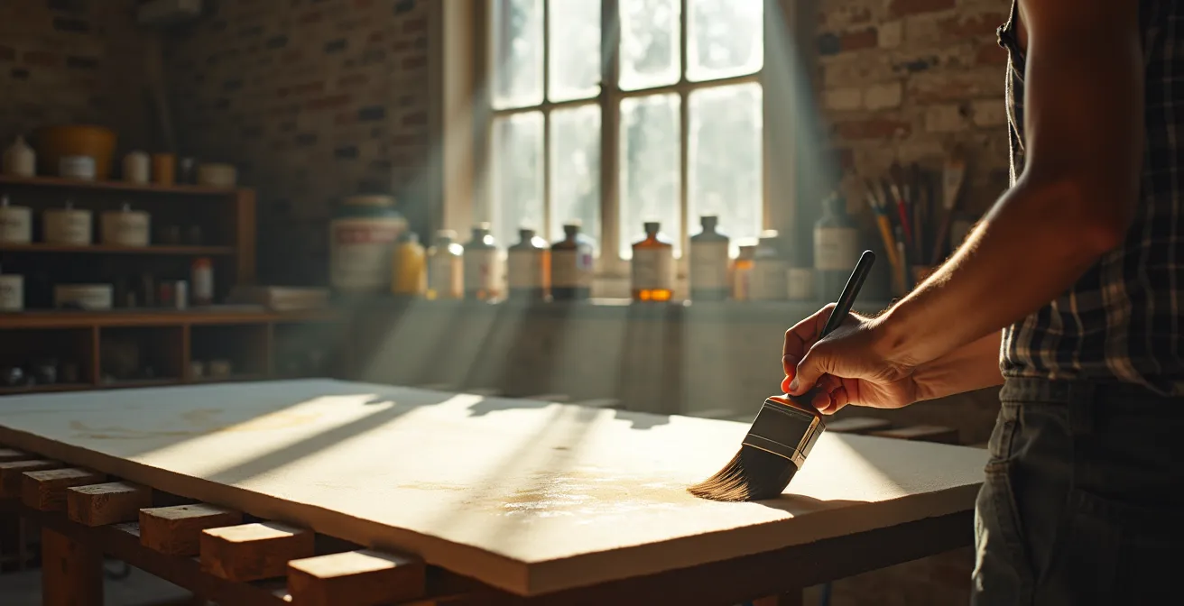
For the professional painter transitioning from intimate studies to monumental, museum-quality works, the canvas is no longer just a surface; it becomes an architectural support system. The common advice to simply “apply a few coats of gesso” falls dangerously short when dealing with the immense physical stresses and chemical complexities of a large-scale linen canvas. These works are destined to exist for centuries, and their longevity is decided long before the first brushstroke of color is applied. The foundation—the sizing and primer—is not merely preparation; it is the most critical factor in ensuring the painting’s structural and chromatic integrity over time.
Many artists grapple with frustrating issues like the paint losing its luster and appearing chalky, or the canvas sagging inexplicably over time. These are not failures of technique, but symptoms of a foundational misunderstanding. The real challenge lies in navigating the intricate dialogue between the linen fibers, the sizing that protects them, the ground that receives the paint, and the paint itself. Each layer has its own rate of expansion, contraction, and aging, and a failure in one can cascade into the catastrophic failure of the entire piece decades later.
But what if the key wasn’t finding a “better” gesso, but understanding the physics of binder absorption and tensile strength? This guide moves beyond surface-level recipes to explore the core principles of archival canvas preparation. We will delve into the scientific reasons why certain primers fail, how to achieve perfect tension without compromising the frame, and why the choice of ground is a fundamental artistic decision that dictates the final mood of the work. It’s time to shift the focus from what to use, to *why* you are using it, ensuring your magnum opus is built to last.
For those who prefer a practical demonstration, the following video offers a visual guide to the gesso application process, complementing the deep-dive technical principles covered in this article.
To navigate this technical landscape, we’ve structured this guide to address the most critical questions a professional painter faces when preparing large-scale linen. Each section tackles a specific problem, providing expert insights and actionable solutions for archival-quality results.
Summary: A Deep Dive into Archival Canvas Preparation
- Why your primer absorbs too much oil and makes the paint look chalky?
- How to stretch raw linen tight enough without warping the frame?
- Oil grounds vs. Universal gesso: Which provides the better surface for blending?
- The sizing mistake that causes oil paint to peel off the canvas after 10 years
- When is it safe to varnish a thick impasto oil painting?
- Why keys and wedges are often not enough to fix a sagging 100-year-old canvas?
- How to mix a modern equivalent of genuine Lead White without the toxicity?
- Why Your Underpainting Color Determines the Final Mood of the Piece?
Why your primer absorbs too much oil and makes the paint look chalky?
The phenomenon of paint “sinking” or appearing dull and chalky is a direct result of excessive binder absorption by the ground layer. When you apply oil paint, the pigment is suspended in a binder, typically linseed oil. This binder is what gives the paint its gloss, depth, and workability. An overly absorbent primer, like many standard acrylic “gessos,” acts like a sponge, wicking the oil binder out of the paint layer and into the ground. This leaves the pigment particles underbound on the surface, resulting in a matte, lifeless appearance. For large-scale works where color luminosity is paramount, this is a critical failure.
The issue stems from the physical structure of the primer. Acrylic gesso is formulated with a high chalk content (calcium carbonate) to create “tooth” for mechanical adhesion. While this tooth is beneficial, excessive chalk makes the surface highly porous. The solution is to create a less absorbent, or “closed,” surface that allows the oil paint to retain its own binder. This is why traditional oil primers are superior for this purpose. They create a semi-porous, integrated layer that holds the paint on the surface, preserving its inherent luster. The goal isn’t to eliminate absorption entirely, but to control it. In fact, proper priming is essential for adhesion and longevity, as binder absorption, when controlled, is a key part of the painting process. The difference is dramatic; controlled tests show that properly primed surfaces reduce binder absorption by over 65%, leading to more vibrant and stable paint films.
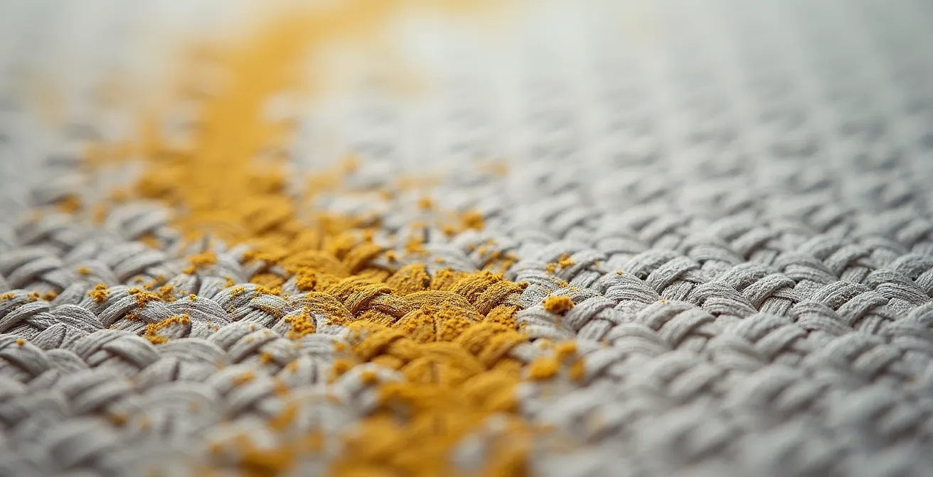
As the macro image above illustrates, the primer’s texture is not uniform. A well-formulated oil ground fills the weave of the linen, creating a smoother, less porous foundation compared to a high-chalk acrylic gesso. This structural difference is the key to preventing the chalky effect. Before committing to a large, expensive piece of linen, professionals can use a simple “Doot Test” on a sample board to evaluate how their chosen primer system interacts with their specific paints, observing for any signs of sinking over a 24-hour period.
How to stretch raw linen tight enough without warping the frame?
Stretching a large-scale linen canvas involves a delicate balance of forces. The goal is a drum-tight surface, but achieving this without introducing warp or stress to the stretcher bars is a common challenge. The critical error many artists make is over-tensioning the raw linen before the sizing process. Raw linen has a significant degree of “give,” but it will shrink considerably once an aqueous size like rabbit skin glue or PVA is applied. If the canvas is stretched to maximum tension initially, this subsequent shrinkage will exert immense force on the stretcher bars, causing them to bow inward and potentially warping the entire structure.
Professional artist Anna Rose Bain, who specializes in large works, recommends a method of moderate initial tension. For canvases over 24×36 inches, she advises using heavy-duty stretcher bars with cross braces. The raw linen is stretched with just enough tension to remove slack and wrinkles. The real tensioning happens chemically, during the sizing stage. The size application tightens the linen fibers, pulling the entire surface taut with uniform force. This method leverages the material’s natural properties rather than fighting against them with brute force, resulting in a perfectly flat and stable surface without compromising the frame’s integrity.
For very large canvases (over 48 inches), some artists prefer to stretch the linen *after* it has been sized and primed. This approach, while more physically demanding due to the stiffness of the primed canvas, eliminates any risk of frame-warping from shrinkage. The choice depends on the scale of the work and the artist’s comfort level, as this comparative table illustrates.
| Aspect | Stretching Before Priming | Stretching After Priming |
|---|---|---|
| Canvas Size Threshold | Best for under 48 inches | Recommended for over 48 inches (120cm) |
| Frame Stress | High – sizing causes shrinkage | Lower – pre-shrunk canvas |
| Difficulty Level | Easier initial stretch | Requires more strength |
| Corner Folding | Clean, easy corners | Stiffer, harder to fold |
| Risk of Cracking | None during stretching | Primer may crack if overstretched |
| Final Tension | Drum-tight after sizing | Consistent, predictable tension |
Oil grounds vs. Universal gesso: Which provides the better surface for blending?
For techniques that rely on subtle gradations and soft transitions, such as sfumato or delicate atmospheric effects, the surface of the ground is paramount. This is where the distinction between a traditional oil ground and a modern universal acrylic gesso becomes most apparent. While acrylic gesso provides excellent tooth for mechanical adhesion, its absorbent nature is a significant impediment to seamless blending. As artist Anna Rose Bain notes in her professional guide to preparing linen:
The oil primer really makes for a smooth working surface, whereas acrylic gesso tends to ‘eat up’ your oil paint during the first several working layers, causing the paint to lose its luster.
– Anna Rose Bain, Professional artist’s guide to preparing linen canvas
This “eating up” of the paint is the binder absorption discussed earlier. It reduces the “open time” of the paint, causing it to become tacky and resistant to manipulation more quickly. An oil ground, by contrast, is non-absorbent once cured. It creates a slick, semi-porous surface that allows the oil paint to sit on top, retaining its binder and staying workable for much longer. This facilitates effortless blending, as the paint glides smoothly with minimal brush drag. The colors remain saturated and vibrant from the very first layer, without the initial dulling that often occurs on an acrylic ground.
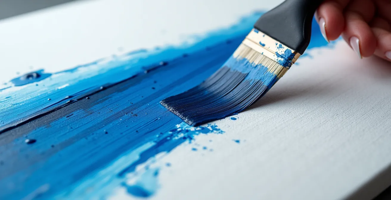
The visual difference is striking. On an oil ground, colors flow into one another. On an acrylic ground, blending requires more effort, more medium, and can result in a slightly muddied appearance as the ground’s texture interferes with the smooth transition. The following table, based on data from archival material suppliers, breaks down these key differences.
This comparison highlights the fundamental differences in how each ground interacts with oil paint, as detailed in this comparative analysis of their properties.
| Property | Oil Ground | Universal Acrylic Gesso |
|---|---|---|
| Surface Texture | Semi-porous, slick when cured | Toothy, slightly absorbent |
| Open Time | Extended – oil stays workable | Reduced – absorbs oil binder |
| Brush Feel | Smooth glide, minimal drag | Higher friction, brush drag |
| Color Vibrancy | Colors remain saturated | Initial dulling possible |
| Blending Ease | Superior – paint flows freely | Moderate – requires more medium |
| Curing Time | 2-7 days minimum | 24 hours |
The sizing mistake that causes oil paint to peel off the canvas after 10 years
The most catastrophic failure a painting can suffer is delamination—where the paint layer literally peels away from the canvas. This is almost always caused by a failure in the sizing layer. The primary role of size (traditionally rabbit skin glue, now often a pH-neutral PVA) is not to stiffen the canvas, but to act as a chemical barrier. It isolates the linen fibers from the acidic linseed oil in the primer and paint layers. Linen, a robust natural fiber, is nevertheless susceptible to degradation from acid, which makes the fibers brittle and weak over time. If oil is allowed to penetrate the canvas, it will slowly rot the support from within, leading to a complete loss of adhesion.
This is a slow, insidious process that may not become apparent for decades. It highlights why professional-grade materials are non-negotiable. For instance, while linen is the gold standard for its stability and strength, cheaper cotton canvases are far more vulnerable. Studies show that cotton canvas loses half of its tensile strength within 50 years of exposure to environmental factors, a process accelerated by oil penetration. A properly applied coat of size creates an impermeable seal, ensuring the archival integrity of the entire structure.
Using improper materials for priming or sizing is a direct path to failure, as many artists have learned the hard way. A stark historical lesson comes from the work of a modern master.
Case Study: Jackson Pollock’s Priming Failures
The consequences of poor preparation are now tragically visible in the works of Jackson Pollock. His unconventional methods, which sometimes involved using household emulsion paint as a primer or leaving the canvas unprimed altogether, are causing premature aging. This is a critical lesson, as conservators now observe that some of his paintings are exhibiting visible cracking and delamination. Household emulsion is not formulated for flexible supports; it cannot withstand the natural expansion and contraction of canvas, leading to cracks that compromise the entire paint layer above it. It demonstrates that the chemical barrier provided by proper sizing is essential for long-term stability.
The mistake is not in the brand of primer, but in failing to create a complete and unbroken shield between the oil and the canvas. Any pinhole, any thinly sized area, is a potential point of failure for future generations.
When is it safe to varnish a thick impasto oil painting?
Varnishing an oil painting is the final step in protecting its surface, but timing is everything, especially with thick impasto work. The common rule of thumb to “wait 6 to 12 months” is a dangerous oversimplification. Oil paint does not “dry” in the conventional sense of evaporation; it cures through oxidation, a chemical reaction where the oil absorbs oxygen and polymerizes into a solid, durable film. This process is highly dependent on factors like paint thickness, pigment type, medium used, and environmental conditions (temperature and humidity). A thin glaze may be cured in months, but a thick impasto passage can take years, or even decades, to cure completely.
Varnishing too early traps uncured, volatile solvents and oils beneath the varnish layer. As the underlying paint continues its slow curing process, it can cause the varnish to crack, bloom (become cloudy), or delaminate. As professional portraitist Simon Bland warns, one should be skeptical of manufacturers’ claims:
The drying time of the oil-based primer depends on the manufacturer and the temperature, yet they all have one thing in common: claims about drying time are wildly optimistic.
– Simon Bland, Professional Portrait Artist’s Guide to Preparing Linen
This skepticism should extend to the paint layers themselves. So how can a professional be certain a painting is ready? The answer lies in a simple, reliable method used by conservators: the solvent swab test. This test provides definitive proof of whether the paint film has fully polymerized and is stable enough to receive a varnish layer.
Action Plan: The Solvent Swab Test for Varnish Readiness
- Select Testing Area: Choose an inconspicuous edge of your impasto painting, preferably where the paint is thickest and was applied last.
- Prepare the Swab: Lightly dampen a clean, lint-free cotton swab with a mild, pure mineral spirit solvent like Gamsol. Do not saturate it.
- Apply Gentle Pressure: With minimal pressure, gently roll the swab over the test area in a small circular motion for about 5-10 seconds.
- Examine the Swab: Immediately inspect the cotton swab under good light. Check for any color transfer, even the faintest tint of pigment.
- Interpret the Results: If the swab is perfectly clean, the paint film is cured and ready for varnish. If any color whatsoever has lifted onto the swab, the paint is still curing. Wait at least another 2-4 weeks before re-testing.
Why keys and wedges are often not enough to fix a sagging 100-year-old canvas?
When an old painting sags, the instinctive reaction is to reach for the canvas keys or wedges in the corners of the stretcher to expand the frame and re-tighten the surface. While this can provide a temporary fix for minor slack, it is often an inadequate and even damaging solution for a truly old canvas. The reason lies in material fatigue. After a century of exposure to fluctuating temperature and humidity, the linen fibers have undergone countless cycles of expansion and contraction. They have permanently lost much of their original elasticity and tensile strength. The sagging is not simply a matter of looseness; it’s a symptom of the fabric having reached the end of its structural life.
Forcing the issue by aggressively expanding the keys can do more harm than good. The aged, brittle linen at the edges, where it is wrapped around the stretcher bars, is under the most strain. Further tension can cause these weakened fibers to crack or tear, especially on canvases prepared with a less flexible oil primer. Professional conservators report that this is a common failure point in older paintings. The keys cannot restore lost elasticity; they can only add more strain to a material that is already compromised.
In these cases, a more intensive conservation treatment is required. This often involves removing the canvas from its original stretcher, carefully lining it with a new, stable support material (a process called “lining” or “relining”), and then re-stretching it onto a new, or the original, support. This process respects the fragility of the original canvas while providing the structural integrity it no longer possesses on its own. It addresses the root cause—material fatigue—rather than just treating the symptom of sagging.
How to mix a modern equivalent of genuine Lead White without the toxicity?
For centuries, genuine Lead White (Lead Carbonate) was the undisputed king of white pigments. Prized by Old Masters for its unique combination of opacity, warmth, flexibility, and fast-drying properties, it has a distinct “ropey” texture that is difficult to replicate. However, its extreme toxicity has made it impractical and dangerous for the modern studio. The challenge for today’s professional painter is to create a functional equivalent that mimics its working properties without the health risks. This is not about finding a single pigment, but about creating a specific mixture.
Titanium White is the modern standard for opacity, but on its own, it is often too cool, stark, and its film can be brittle over time. Zinc White is more transparent and cooler, which can help counteract the starkness of titanium, but it is known to create a very brittle paint film when used alone. The secret to a modern equivalent lies in a carefully balanced formula combining multiple pigments and additives to replicate the specific characteristics of lead.
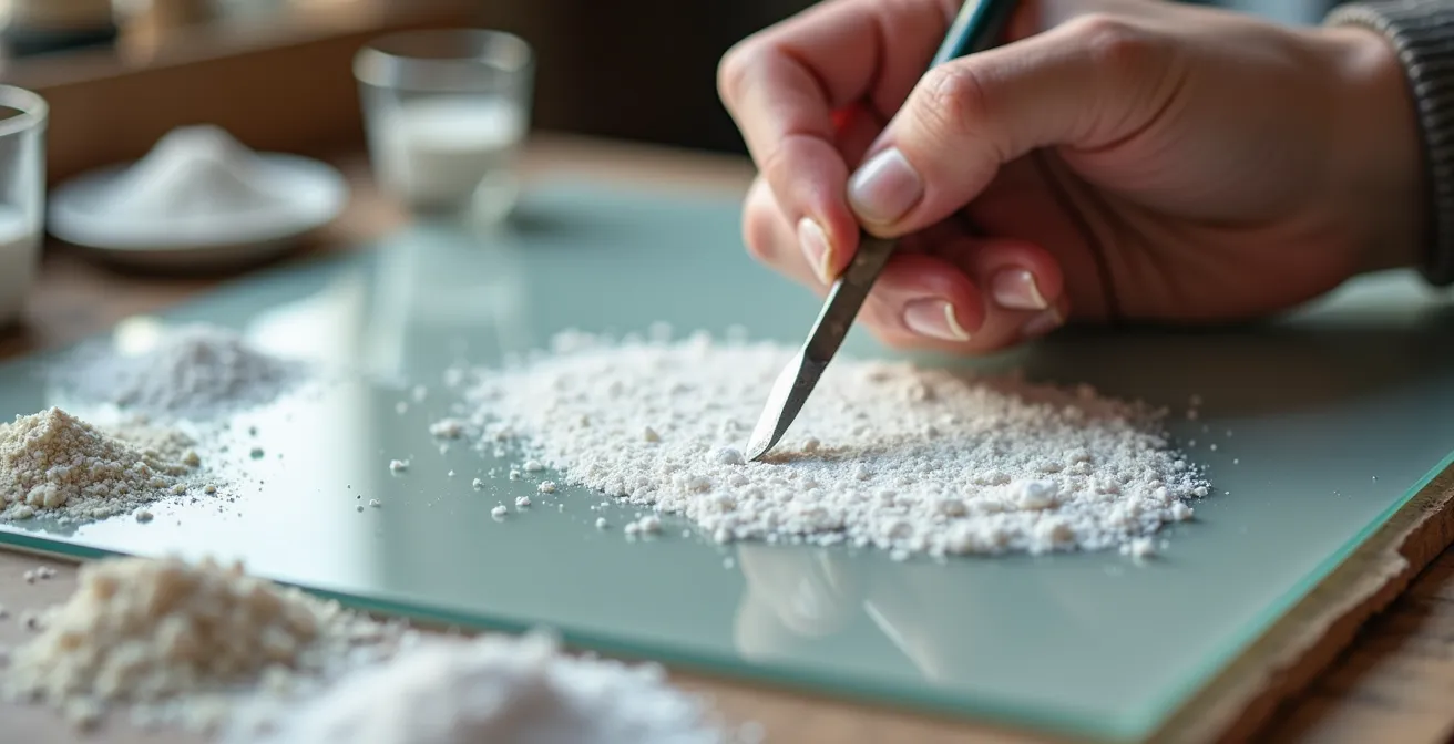
By blending different whites and a texturizing agent, an artist can create a custom white that handles like traditional lead. Here is a widely accepted recipe used by professional artists for a non-toxic alternative:
- Start with Opacity: The base of the mixture should be 60% Titanium White (PW6). This provides the essential covering power.
- Add Cool Transparency: Blend in 30% Zinc White (PW4). This cools the titanium’s slight yellow bias and adds a degree of transparency, mimicking lead’s subtlety.
- Create the Texture: The “ropey” quality comes from a texturizing agent. Add approximately 10% fine Calcite or Marble Dust (calcium carbonate) to the pigment mix.
- Choose the Right Medium: Instead of standard linseed oil, combine this pigment mixture with an alkyd medium like Liquin or Galkyd. The alkyd resin will replicate the fast-drying, catalytic properties of lead, creating a strong, flexible paint film.
This combination results in a paint that is not only safe but also possesses the desirable working properties—opacity, texture, and accelerated drying time—that made lead white so indispensable to artists for generations.
Key Takeaways
- The primary cause of chalky, sunken-in paint is an overly absorbent acrylic gesso that leaches the oil binder from the paint. A less absorbent oil ground is the archival solution.
- Proper sizing with PVA or rabbit skin glue is a non-negotiable chemical barrier. Its failure is the leading cause of long-term paint delamination.
- Never varnish a painting based on a calendar. Use the solvent swab test to confirm the paint film has fully cured, especially for thick impasto, which can take years.
Why Your Underpainting Color Determines the Final Mood of the Piece?
The primer or ground is not just a preparatory layer; it is the first optical layer of the painting. Its color, or the color of the subsequent underpainting (imprimatura), has a profound and inescapable influence on the final mood and color harmony of the entire piece. Light travels through the semi-transparent layers of oil paint, strikes the ground, and reflects back through the paint to the viewer’s eye. The color of that ground, therefore, tinges every subsequent color applied over it. A stark white acrylic gesso will reflect cool, bright light back, which can be ideal for high-key, vibrant works but can also make it difficult to achieve deep, rich shadows.
Conversely, a toned ground provides an instant mid-tone, unifying the composition from the very beginning. Traditional underpainting methods were built on this principle. An Imprimatura using warm earth tones like Burnt Sienna or Raw Umber creates a foundational warmth that radiates through the finished painting, ideal for portraits and classical compositions. A Verdaccio underpainting, using grey-greens and olives, is particularly effective for rendering lifelike flesh tones, as the green optically neutralizes the pink and red top layers, creating more naturalism. A Grisaille, an underpainting in shades of grey, establishes the entire tonal structure of the painting before color is even considered, lending a dramatic, sculptural quality to the final work.
The ground itself acts as the first underpainting. A stark white primer cools all subsequent layers. A warm, off-white or light grey oil ground provides instant harmony and makes it easier to judge tonal values accurately. The choice is a fundamental artistic decision, not a merely technical one. It sets the emotional key of the painting before the main subject is even rendered, defining whether the final piece will feel warm and inviting, cool and distant, or dramatically charged.
Armed with this deep understanding of the materials, from the tension of the linen to the chemistry of the final varnish, you are no longer just a painter. You are an architect of artworks built for permanence. The next logical step is to apply these principles by selecting archival-quality materials for your next major project.