
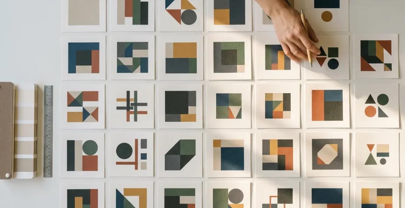
In summary:
- Always expand strokes and outline text to prevent scaling and font issues for the client.
- Clean your files by removing stray points and unused swatches to reduce size and complexity.
- Deliver separate RGB (for screen) and CMYK (for print) files to ensure color accuracy across all media.
- Use a logical layer and artboard naming system for a professional, easy-to-navigate file package.
- Align all vector points to a whole-pixel grid to avoid blurry rendering on digital screens.
There’s a specific sinking feeling every freelance illustrator knows: the client email that says, “The logo looks weird when I resize it,” or “The printer can’t use this file.” You’ve delivered the creative work, but a technical oversight sends you right back to the drawing board, causing delays and chipping away at your professional credibility. Most advice focuses on a simple checklist: send a PNG, a JPG, an EPS. But this is reactive, not preventative.
The real solution isn’t about the quantity of file formats you deliver, but the technical integrity of the files themselves. The difference between an amateur and a professional designer lies in their ability to anticipate problems and engineer files that are indestructible, portable, and future-proof. It requires a shift in mindset from just “finishing the design” to practicing “technical empathy”—considering the journey of your file long after it leaves your computer. This means understanding the deep, technical reasons behind common client complaints.
But what if the key to avoiding rejection wasn’t just following rules, but mastering the “why” behind them? Instead of just outlining fonts, you’ll understand the destructive process you’re initiating. Instead of just sending CMYK files, you’ll grasp the financial fallout of getting it wrong. This guide breaks down the critical technical preparations that transform a fragile design into a robust, professional asset package, making you an indispensable partner, not just another creative for hire.
This article provides a comprehensive roadmap to mastering the technical side of your deliverables. Each section tackles a common point of failure, explaining not just what to do, but why it is critical for a flawless client handover.
Table of Contents: How to Prepare Vector Files for a Flawless Client Handover and Avoid Rejection?
- Why your client sees thin lines instead of thick strokes when they resize your logo?
- How to remove 500 invisible anchor points to reduce file size?
- CMYK for Print vs. RGB for Screen: Why you need to deliver both color profiles?
- The messy file mistake that ensures no other designer can ever edit your work
- How to set up multiple artboards for a cohesive brand asset export?
- Why placing a vector point at 10.5px creates anti-aliasing fuzz?
- Why 300 DPI is a myth for billboards (and what number actually matters)?
- How to Organize a 500-Layer Photoshop File So Your Team Doesn’t Hate You?
Why your client sees thin lines instead of thick strokes when they resize your logo?
This is one of the most common and frustrating client complaints. You design a logo with beautiful, bold 12-point strokes, but when the client scales it down for their website, the strokes suddenly look like hairlines—or worse, they disappear. The issue stems from the difference between a live stroke and an expanded shape. A live stroke is a mathematical instruction: “draw a path and apply a 12-point thickness to it.” When you scale the object, the path scales, but the instruction to keep the stroke at 12-points remains, making it look disproportionately thick or thin.
The solution is a destructive but necessary step: expanding the stroke. Using the ‘Object > Expand’ or ‘Object > Path > Outline Stroke’ command in Adobe Illustrator converts the stroke into a filled shape. This shape has its own vector outline and will scale proportionally with the rest of the artwork. Now, instead of a path with a thickness property, you have a solid shape that behaves predictably at any size. This single action is a cornerstone of creating robust, portable vector assets.
It’s important to understand when this is necessary. According to a common support scenario, the ‘Expand Appearance’ option is only active when an effect or special brush has been applied. For standard strokes, you must use ‘Expand’ or ‘Outline Stroke’. Designers often get confused when the option is grayed out, but it’s usually because they are trying to expand a simple path that has no dynamic “appearance” to expand. The key is to transform all dynamic properties—like strokes, brushes, and effects—into static, foundational shapes before handover to guarantee file integrity.
How to remove 500 invisible anchor points to reduce file size?
A clean vector file is a fast vector file. Hidden complexity, often in the form of hundreds of redundant or stray anchor points, is a primary cause of file bloat. These invisible points can accumulate from using the Image Trace tool, complex brush strokes, or imperfect path drawing. While they may not be visible at a glance, they dramatically increase file size, slow down rendering in design software, and can even cause errors with specialized equipment like vinyl cutters or embroidery machines. Removing them is an essential act of file hygiene.
Fortunately, design software provides powerful tools for this cleanup. The first line of defense is finding and deleting stray points—single anchor points not connected to any path segment. In Illustrator, this is easily done via ‘Select > Object > Stray Points’ and then hitting delete. This instantly removes orphaned data that serves no purpose. For paths with too many points, the ‘Object > Path > Simplify’ command is invaluable. This tool intelligently removes redundant anchor points while preserving the curve’s shape, with a slider to control the precision.

Beyond anchor points, file bloat also comes from unused assets in your file’s library. Swatches, brushes, symbols, and graphic styles can accumulate during the creative process. Before saving your final deliverable, it’s crucial to purge these. In panels like Swatches or Symbols, use the flyout menu to ‘Select All Unused’ and then delete them. This ensures the final file contains only the elements essential to the artwork, resulting in a lean, efficient, and professional deliverable that is easy for anyone to work with.
CMYK for Print vs. RGB for Screen: Why you need to deliver both color profiles?
Color is the lifeblood of a brand, and nothing undermines a designer’s work faster than incorrect color reproduction. The distinction between CMYK and RGB color modes is not just technical jargon; it’s the fundamental divide between the worlds of print and digital. Failing to provide files in the correct color space is a guarantee for client frustration. RGB (Red, Green, Blue) is an additive color model used for digital screens, which emit light. It has a wide gamut, capable of producing vibrant, luminous colors. In contrast, CMYK (Cyan, Magenta, Yellow, Key/Black) is a subtractive model for print, where inks are applied to paper, absorbing light. Its color gamut is naturally smaller and more muted.
Delivering a logo in only one color mode forces the client or their vendors to perform the conversion, which often leads to disastrous results. Converting a vibrant RGB green to CMYK can result in a dull, muddy olive. The financial consequences can be severe. In one documented case, a marketing agency printed 10,000 brochures using RGB files, resulting in a $15,000 reprint cost to fix the muddy colors that could have been avoided with proper file preparation. This is why a professional handover must include assets pre-built for both environments.
A professional workflow involves creating master files for each color space and exporting the appropriate file formats from them. This ensures that you, the designer, control the color conversions and can make necessary adjustments to maintain brand consistency.
This table breaks down the essential differences and use cases for each color mode, serving as a critical reference for any designer.
| Aspect | CMYK | RGB |
|---|---|---|
| Use Case | Print materials (business cards, brochures) | Digital screens (websites, social media) |
| Color Range | Narrower gamut, more muted colors | Wider spectrum, brighter colors |
| File Formats | EPS, PDF, AI | SVG, PNG, JPG |
| Black Creation | Rich black: C:60 M:40 Y:40 K:100 | Pure black: R:0 G:0 B:0 |
| Conversion Warning | Colors may appear duller than RGB | May print differently than displayed |
The messy file mistake that ensures no other designer can ever edit your work
Handing over a vector file with a chaotic layer structure is the digital equivalent of leaving a booby trap for the next person. A file named with dozens of “Layer 1 copy 3” or containing a jumble of unlocked, unlabeled objects is a nightmare to navigate. This lack of organization not only reflects poorly on your professionalism but also makes it nearly impossible for another designer, a web developer, or even the client themselves to make simple edits or extract assets. Practicing technical empathy by creating a logically organized file is a hallmark of a seasoned professional.
A robust layer organization system is hierarchical and descriptive. Start by grouping related elements. For a logo, you might have top-level groups like “Logotype,” “Icon,” and “Tagline.” Inside these, you can further organize components. Naming should be explicit, for example: `LOGO > PRIMARY > Icon`. Color-coding these groups (e.g., red for headers, blue for body) adds another layer of at-a-glance clarity. Before the final save, it’s crucial to delete all hidden and empty layers and unlock any forgotten locked elements, as these can cause confusion and are often overlooked.
Going a step further, the ultimate professional courtesy is to include a non-printing “File Guide” layer. This layer can contain brief notes about the file’s construction, font names used (before outlining), and color hex codes. It acts as a mini-manual for anyone who opens the file in the future, saving them hours of reverse-engineering your work and solidifying your reputation as a thoughtful and collaborative designer.
Action Plan: Your Pre-Delivery File Audit
- Points of contact: Scour the file for unexpanded strokes, live text, or open paths that could break upon scaling or transfer.
- Collecte: Inventory all fonts, linked images, and color swatches. Ensure fonts are outlined and images are embedded or packaged.
- Cohérence: Confront each artboard with its purpose. Does the “logo_primary_cmyk” artboard actually use CMYK colors?
- Mémorabilité/émotion: Review your layer structure. Would a designer opening this file for the first time understand your organization in under 30 seconds?
- Plan d’intégration: Delete all unused swatches, symbols, and graphic styles. Purge all hidden or locked layers that are not part of the final design.
How to set up multiple artboards for a cohesive brand asset export?
A single logo design rarely lives in isolation. It needs to exist in multiple variations: primary logo, icon-only, monochrome, full-color, and versions for both print and web. Creating and exporting these one by one is inefficient and prone to error. The professional solution is to use a multi-artboard setup within a single master vector file. This approach centralizes all brand assets, ensuring consistency and dramatically speeding up the export process.
The key to an effective artboard workflow is systematic organization. Each artboard should be dedicated to a specific asset variation and named accordingly (e.g., `logo_primary_rgb`, `icon_cmyk`, `logotype_white`). This naming convention is not just for organization; modern design tools use these artboard names to automatically name the exported files, eliminating manual renaming. Maintaining consistent artboard sizes for similar assets (e.g., 1000x1000px for all square icons) also adds to a clean and predictable package.
The real power of this method is unlocked when combined with Global Swatches. By defining your brand colors as global, any update to a color will instantly propagate across all artboards and all assets using it. This is a massive time-saver for brand color revisions. When it’s time to deliver, instead of exporting each asset manually, you can use the ‘Export for Screens’ feature (Cmd+Opt+E in Illustrator). This panel allows you to select all artboards and batch-export them into multiple formats (SVG, PNG, PDF) and sizes (1x, 2x) in a single click, creating a comprehensive and perfectly organized asset package in seconds.
Why placing a vector point at 10.5px creates anti-aliasing fuzz?
When a vector logo that looks perfectly sharp in Illustrator appears slightly soft or fuzzy on a website, the culprit is often sub-pixel placement. Digital screens are made of a rigid grid of physical pixels. A vector object, being a mathematical formula, can theoretically have coordinates at fractional values like X: 10.5px. When a screen’s rendering engine tries to display a line that falls between two physical pixels, it has to compromise. It does this through anti-aliasing, rendering both adjacent pixels in a lighter shade to create the illusion of a line in the middle. The result is a characteristic blurriness or “fuzz.”
Achieving pixel-perfect crispness for screen-based designs requires aligning every vector point and path to the whole-pixel grid. Modern design software has built-in features to enforce this. The most important is ‘Snap to Pixel Grid’. When enabled, every point you draw or move will automatically snap to the nearest whole integer coordinate. For existing artwork, you can use the Transform panel to manually inspect and correct the X/Y coordinates and W/H dimensions of your objects, ensuring they are all whole numbers. Using the ‘View > Pixel Preview’ mode is essential as it gives you a real-time WYSIWYG view of how your vectors will be rasterized on screen.
Impact of Sub-Pixel Rendering on Brand Perception
The seemingly minor issue of sub-pixel rendering can have a major impact on how a brand is perceived. A major tech company discovered their logo appeared blurry across all their digital touchpoints. This subtle lack of crispness directly undermined their core brand message of “precision technology.” The issue persisted, eroding user trust in their attention to detail, until their entire suite of digital logos was rebuilt with all vector points properly aligned to the pixel grid. This case highlights that responsiveness and clarity at all scales are not just technical details but crucial components of brand integrity.
This attention to micro-detail is what separates good design from great digital execution. For assets like icons, which are often displayed at small sizes, working on standard-sized artboards (16×16, 32×32, 64×64) and adhering strictly to the pixel grid is non-negotiable for achieving a professional, sharp final product.
Why 300 DPI is a myth for billboards (and what number actually matters)?
The “300 DPI for print” rule is one of the most widely taught yet frequently misapplied concepts in design. While 300 Dots Per Inch (DPI) is the correct standard for high-quality, close-range print materials like magazines and brochures that are viewed from a foot or two away, it is complete overkill for large-format printing like billboards. Applying this rule universally leads to absurdly massive file sizes that can choke printers and slow down production, without any discernible increase in quality.
The critical variable that determines the required resolution is not the medium itself, but the intended viewing distance. The human eye has a finite ability to resolve detail; from 50 feet away, it cannot distinguish the difference between 50 DPI and 300 DPI. For a billboard, a resolution of 20-50 DPI is often more than sufficient. For a vehicle wrap viewed from 10-20 feet, something in the 75-150 DPI range is appropriate. Insisting on 300 DPI for a billboard file will create a multi-gigabyte behemoth when a perfectly sharp result could be achieved with a file a fraction of that size.
Bigger is not always better – using unnecessarily high resolution files can cause printer processing errors and extend production timelines
– Print Production Specialist, TMImpressions Print Guide 2024
Understanding this relationship is crucial for any designer working with print. It demonstrates a practical knowledge of production processes and saves time and headaches for both you and your print vendor. The following table illustrates how resolution requirements change dramatically with distance.
The following data provides a clear guideline on how to approach resolution for various print applications, as detailed in a comparative analysis of design best practices.
| Application | Viewing Distance | Required DPI | File Size Impact |
|---|---|---|---|
| Billboard | 50+ feet | 20-50 DPI | Manageable (10-50MB) |
| Vehicle Wrap | 10-20 feet | 75-150 DPI | Moderate (50-200MB) |
| Poster | 3-6 feet | 150-200 DPI | Large (200-500MB) |
| Magazine | 12-18 inches | 300 DPI | Standard (10-50MB) |
| Business Card | 6-12 inches | 300-600 DPI | Small (5-20MB) |
Key Takeaways
- File integrity is paramount: expanded strokes, outlined fonts, and clean paths prevent 90% of client complaints.
- Always deliver both RGB and CMYK versions of assets, organized by color space, to ensure brand consistency across web and print.
- A meticulously organized file with named layers and artboards is a sign of professionalism and respect for anyone who uses your files after you.
How to Organize a 500-Layer Photoshop File So Your Team Doesn’t Hate You?
While this guide focuses on vector files, many projects require accompanying raster assets created in Adobe Photoshop, such as complex social media graphics, website mockups, or photorealistic presentations. A 500-layer Photoshop file can quickly become an unmanageable labyrinth if not organized with discipline. A disorganized PSD is not only a source of frustration for your team but also a significant bottleneck in any collaborative workflow, making updates and edits a time-consuming and error-prone process.
The principles of file hygiene are just as critical in Photoshop as they are in Illustrator. The foundation of a clean PSD is a logical grouping and naming convention. Create master groups for major sections of the layout, like ‘Header’, ‘Body’, and ‘Footer’. Within these, continue to nest related layers. Name every single layer descriptively—’Layer 1 copy’ is never acceptable. Use color labels to signify status: red for ‘Work in Progress,’ yellow for ‘Needs Review,’ and green for ‘Approved.’ This visual system provides immediate clarity on the state of the project.
For maximum efficiency and non-destructive editing, leverage Smart Objects and Layer Comps. Convert any repeating elements (like logos or buttons) into Smart Objects. This allows you to update one instance and have the change automatically apply everywhere it’s used. According to 2024 workflow efficiency studies, this practice alone can lead to a 95% reduction in update time when using linked Smart Objects. Layer Comps are perfect for managing different versions of a design (e.g., Desktop vs. Mobile view) within a single file, allowing you to switch between layouts without duplicating hundreds of layers. Adopting these organizational habits transforms your PSD from a personal scratchpad into a robust, team-friendly production file.
By integrating these technical best practices into every project, you fundamentally change your role from a simple creative vendor to a trusted technical partner. This commitment to delivering flawless, future-proof files eliminates frustrating revisions, builds a reputation for reliability, and ultimately allows you to focus on what you do best: creating powerful designs.