
In summary:
- Edge distortion is not a random error but a predictable consequence of exceeding the human eye’s natural field of view.
- The key to eliminating distortion is to keep all primary elements of your drawing within a 60-degree cone of vision.
- Accurate spacing of receding objects can be calculated with geometric precision using techniques like the diagonal “X-method.”
- A clean, professional result relies on a structured workflow, treating your perspective grid as temporary scaffolding, not the final artwork.
Every illustrator knows the frustration: hours spent constructing a complex cityscape, only to find the buildings at the edges look bizarrely stretched and warped, a classic “fish-eye” effect. The common advice—”place your vanishing points further apart”—is a vague guideline, not a solution. It treats a problem of optical geometry as a matter of guesswork. This approach fails because it ignores the fundamental principle governing how we perceive space. You can draw perfect lines to your vanishing points and still create a distorted, unbelievable world.
The issue isn’t your ability to draw a straight line; it’s a misunderstanding of the physics of sight. To achieve true realism, you must stop thinking like an artist simply connecting dots and start thinking like a camera lens designer. The secret to a distortion-free cityscape lies not in the placement of your vanishing points alone, but in respecting the mathematical limits of a natural field of view. The core of this is a non-negotiable geometric rule: the cone of vision. This is the precise, calculable zone where objects appear natural to the human eye.
This guide will deconstruct the geometry behind believable 3-point perspective. We will move beyond vague tips to provide a rule-based framework for constructing scenes. We’ll define the exact cause of distortion, provide mathematical methods for calculating depth, and outline a professional workflow for managing your construction lines. By mastering these principles, you will gain the control to build vast, complex cityscapes that feel immersive and structurally sound from edge to edge.
This article provides a structured approach to mastering perspective. The following sections break down the core geometric principles, common errors, and advanced techniques needed to create professional, distortion-free architectural drawings.
Summary: How to Draw a 3-Point Perspective Cityscape Without Distortion
- Why moving your vanishing points too close together creates unnatural distortion?
- How to calculate the spacing of fence posts receding into the distance accurately?
- Line convergence vs. Value shift: Which creates more depth in a landscape background?
- The horizon line error that makes your buildings look like they are falling over
- When to erase your construction grid: keeping the structure without the mess?
- How to adjust your lens choices when moving from APS-C to Full Frame?
- Why your anamorphic drawing looks stretched from the front but perfect from the side?
- Manual Drafting vs. CAD: Is Hand-Drawing Still a Hireable Skill in Engineering?
Why Moving Your Vanishing Points Too Close Together Creates Unnatural Distortion?
The unnatural “fish-eye” distortion that plagues many wide-angle perspective drawings is not a random flaw; it is a predictable violation of a fundamental optical principle. Moving vanishing points (VPs) too close together on your page forces the drawing to represent an angle of view wider than the human eye can comfortably process. The result is a scene that, while technically correct in its construction, appears warped and unbelievable at the periphery.
The solution lies in understanding and respecting the cone of vision. This is the theoretical 3D cone extending from the viewer’s eye (the Station Point) to the scene. The area within this cone is where objects can be seen clearly without turning one’s head. According to perspective theory fundamentals, this is generally accepted as being around 60 degrees. Any object or part of a building drawn outside of this 60-degree cone will appear stretched and distorted because it falls into our peripheral vision, which the brain perceives differently.
When VPs are placed too close to each other and within the picture plane, you are effectively simulating an extremely wide-angle lens, forcing a field of view far exceeding 60 degrees. To prevent this, the vanishing points for your main axes should always be placed far outside the actual drawing area. By constraining the primary elements of your cityscape within the cone of vision, you ensure that the perspective relationships remain natural and the architecture appears stable and correctly proportioned across the entire image.
How to Calculate the Spacing of Fence Posts Receding Into the Distance Accurately?
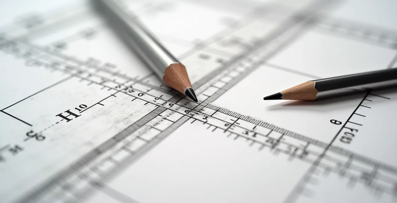
Estimating the spacing of repeating elements in perspective, such as fence posts, windows, or columns, is a common source of inaccuracy. As objects recede, their visual spacing must decrease according to a precise mathematical formula. Guesswork leads to an uneven, unconvincing rhythm. The key to perfect spacing lies in using geometric division rather than intuition.
The most reliable technique is the diagonal method for finding midpoints, often called the “X-method.” To use it, you first define a rectangular plane in perspective (e.g., a section of wall where windows will go). By drawing two diagonal lines from corner to corner, you create an “X.” The intersection of these lines marks the exact perspective center of that rectangle. A vertical line drawn through this intersection will perfectly bisect the plane. This method works because foreshortening makes the rear half of the rectangle appear smaller, so the visual midpoint is not the arithmetic midpoint.
This technique can be repeated to create a series of equally spaced divisions. Once you’ve established the first two posts of a fence, you can create a rectangle using their height and the ground lines. Find the midpoint of this rectangle with the “X” method to place the third post. Then, use the second and third posts to create a new rectangle and repeat the process. This creates a mathematically perfect succession of posts that appear smaller and closer together as they recede. This is the same principle that underpins the use of measuring points in advanced drafting to project consistent intervals into space.
As shown in the construction above, this geometric approach removes all guesswork from the equation. The Winged Canvas art school demonstrates how this diagonal method is a cornerstone of architectural precision, allowing for the accurate placement of any repeating element on any receding plane.
Line Convergence vs. Value Shift: Which Creates More Depth in a Landscape Background?
While both line convergence (linear perspective) and value shift (atmospheric perspective) are crucial for creating depth, they perform different functions and their dominance depends on the intended style and subject. Line convergence creates the geometric structure of space, while value shift creates the illusion of atmosphere and distance. One is not inherently “better” than the other; a professional illustration leverages both in harmony.
Linear perspective uses converging lines to define the spatial relationships between objects. It’s a mathematical system that constructs a believable 3D scaffold. In an urban cityscape, it is paramount. Without correct convergence, buildings will look flat and disjointed, no matter how well they are rendered. It provides the intellectual understanding of depth by showing how objects shrink and conform to a grid as they move away from the viewer.
Atmospheric perspective, on the other hand, mimics the effect of the air itself. As objects get farther away, the light passing through the atmosphere causes them to lose contrast, shift in color (often towards blue), and soften in detail. This value shift creates a more emotional, perceptual sense of depth. In a sprawling natural landscape with distant mountains, atmospheric perspective is often the primary driver of depth, as strong geometric lines may be absent. Combining these two methods yields the most powerful illusion of three-dimensional space.
The following table breaks down their distinct roles, highlighting how a combined approach achieves the most realistic and compelling sense of depth.
| Perspective Type | Primary Effect | Visual Impact | Best Used For |
|---|---|---|---|
| Line Convergence (Linear) | Creates geometric structure of space | Defines spatial relationships precisely | Architectural accuracy, technical drawings |
| Value Shift (Atmospheric) | Simulates air/light effects over distance | Creates mood and believable atmosphere | Naturalistic scenes, emotional depth |
| Combined Approach | Structure + atmosphere working together | Maximum depth with realistic feel | Professional illustrations, concept art |
Ultimately, as a comparative analysis of perspective techniques shows, line convergence provides the skeleton and atmospheric perspective provides the skin. An architect’s blueprint relies almost entirely on the former, while a painter like Turner might rely more on the latter. A concept artist must master both to build convincing worlds.
The Horizon Line Error That Makes Your Buildings Look Like They are Falling Over
One of the most disorienting errors in 3-point perspective is when buildings appear to be tilting or falling over, even when all lines correctly converge to their vanishing points. This issue is almost always caused by a single mistake: placing the two horizontal vanishing points on a horizon line that is not perfectly level. The horizon line represents the viewer’s eye level and must be an unwavering horizontal axis. Any slant, however subtle, will cause the entire world you’ve constructed to tilt with it.
In 1- and 2-point perspective, all vertical lines in the scene remain perfectly vertical on the page, parallel to each other. This anchors the drawing and provides a strong sense of stability. In 3-point perspective, we introduce a third vanishing point (usually below or above the horizon line) to which these verticals converge, creating a more dynamic, “worm’s-eye” or “bird’s-eye” view. The stability once provided by parallel verticals is now transferred entirely to the relationship between the horizon line and the third vanishing point.
The third VP must lie on a line that is perfectly perpendicular to the horizon line. If your horizon line is tilted and your third VP is correctly placed on a vertical center line, the entire geometric system becomes skewed. This creates a subconscious conflict for the viewer, whose brain expects buildings to be grounded by gravity along a true vertical axis relative to a level horizon. The result is a scene that feels unstable and unsettling, as if the ground itself is sloped.
As the visual comparison shows, a building with true 3-point convergence can look dynamic and powerful, while an incorrectly constructed one simply looks wrong. Before drawing any other line, use a T-square or a digital guide to ensure your horizon line is perfectly horizontal. This single act of precision is the foundation upon which a stable, believable world is built.
When to Erase Your Construction Grid: Keeping the Structure Without the Mess?
A perspective grid is an essential tool for building a complex scene, but it can quickly become a confusing web of lines that obscures the final drawing. The professional approach is not to erase everything at the end, but to engage in a process of phased erasure or non-destructive layering. This method treats the grid as scaffolding that is systematically removed as the structure becomes self-supporting, ensuring both accuracy and clarity.
In traditional media, this means using a light hand with initial construction lines and erasing them in stages. Major “scaffolding” lines that block out the largest forms can be removed once those forms are finalized. Finer subdivision lines for details like windows or panels should be kept longer but erased once the details are inked or drawn more heavily. The initial VPs and horizon line guides should be the last to go, and many artists choose to leave them faintly visible as a “process beauty” element that speaks to the drawing’s technical foundation.
In digital workflows, this process is far more manageable and powerful. The best practice is to use separate layers for each stage of construction. A base layer can hold the perspective ruler or grid, often set in a distinct color like light blue. A second layer can be used for rough block-in shapes. A final vector or high-resolution raster layer is then used for the clean lineart. This non-destructive workflow, as demonstrated by artists like Etomo, allows the artist to toggle the visibility of the grid at any time. It preserves the mathematical framework for future edits while presenting a clean, finished piece to a client.
Action Plan for a Clean Construction Grid
- Phase 1 (Block-in): After establishing the main building masses and forms, erase the major “scaffolding” lines that defined their overall volume, but keep your primary VP guidelines.
- Phase 2 (Subdivision): After adding repeating elements like windows, doors, or panels, remove the smaller construction lines (like the “X-method” diagonals) used to calculate their spacing.
- Phase 3 (Detailing): After adding fine details and textures, lightly fade the core perspective grid with a kneaded eraser to 10-20% visibility, so it no longer competes with the final lines.
- Phase 4 (Final Presentation): For a polished look, completely remove all remaining grid lines. Optionally, you can leave the faintest trace as an artistic choice.
- Digital Workflow Tip: An essential digital tip is to use separate, colored layers for each phase: a blue layer for the perspective ruler, a gray layer for rough construction, and a black layer for final lineart.
This structured approach transforms the perspective grid from a messy necessity into a powerful, controlled part of the creative process.
How to Adjust Your Lens Choices When Moving From APS-C to Full Frame?
For an artist who also works with photography, understanding the relationship between sensor size and perspective is crucial. Moving from an APS-C sensor to a Full Frame sensor doesn’t change the laws of perspective, but it dramatically changes the field of view for any given lens. A 35mm lens on an APS-C camera behaves like a 50mm+ lens on a Full Frame, and this “crop factor” has direct parallels in drawing.
The “distortion” seen at the edges of a wide-angle photo on a Full Frame sensor is the same optical phenomenon seen in a perspective drawing with a wide cone of vision. An APS-C sensor effectively “crops” the image projected by the lens, capturing only the central, most distortion-free area. This is why a 24mm lens might look fine on an APS-C body but show noticeable edge stretching on a Full Frame body.
This provides a powerful strategy for drawing, as advocated by artists like Skip Whitcomb. You can simulate the “APS-C crop” to guarantee a distortion-free composition. The technique involves starting your drawing on a much larger piece of paper than your intended final size. You then place your vanishing points extremely far off the page, establishing a very wide, “Full Frame” equivalent perspective grid. You then draw your cityscape within this large grid but compose your final scene by cropping into the central area. This cropped section represents the sweet spot of the “lens,” equivalent to the area an APS-C sensor would capture. It inherently falls within the 60-degree cone of vision, thus eliminating any unnatural distortion while maintaining the correct perspective relationships of the larger, unseen construction.
Why Your Anamorphic Drawing Looks Stretched From the Front but Perfect From the Side?
Anamorphic art, which appears distorted from the front but resolves into a perfect image from a specific oblique angle, is the ultimate demonstration of a core perspective principle: the Station Point (SP). Every perspective drawing, no matter how simple, has one single, ideal viewing position in space—the Station Point—from which all distortion disappears and the illusion of depth is perfect. In a standard cityscape drawing, we aim to minimize the effect of the SP; in anamorphic art, we exploit it.
When you create a standard 3-point perspective cityscape, your goal is to make it look believable from a variety of viewing angles. You achieve this by simulating a Station Point that is very far away from the picture plane. This effectively flattens the cone of vision, making the perspective less extreme and more tolerant of being viewed from positions other than the one true SP.
Anamorphic drawing does the exact opposite. It is intentionally designed with an extremely close and oblique Station Point. The grid is pre-distorted in such a way that the stretched, bizarre shapes on the flat paper will only resolve into a coherent image when the viewer’s eye is placed at that exact, pre-determined SP. According to an in-depth analysis of station point theory, this is why the artwork seems to “magically” snap into place from one angle and looks like an elongated mess from all others. It’s not magic; it’s a deliberate manipulation of geometric projection to create an illusion for a single viewpoint.
Key Takeaways
- Distortion is a solvable problem rooted in the geometry of a 60-degree cone of vision, not random error.
- Precision in perspective comes from using geometric methods like the “X-method” for spacing, not from estimation.
- The strongest illusion of depth combines the structural logic of linear perspective with the atmospheric effects of value shifts.
Manual Drafting vs. CAD: Is Hand-Drawing Still a Hireable Skill in Engineering?
In an era dominated by Computer-Aided Design (CAD), it’s easy to assume that manual drafting is an obsolete skill. While CAD software offers unparalleled precision and efficiency for final technical blueprints, the ability to draw perspective by hand remains a highly valuable—and hireable—skill, particularly in the conceptual phases of design and engineering.
The primary value of hand-drawing lies in its immediacy and intuitive nature. During a client meeting or a brainstorming session, an architect or designer who can rapidly sketch a 3-point perspective view of a concept can communicate ideas faster and more expressively than someone who needs to set up a digital file. This skill for rapid conceptual ideation is irreplaceable. Furthermore, manual drawing allows for artistic control over perspective “cheats” for emotional impact—subtly altering convergence to make a building feel more heroic or dynamic in a way that is often cumbersome to achieve in rigid CAD environments.
Even for artists working digitally, a deep understanding of manual perspective principles is what separates a technician from a true concept artist. Digital tools like Adobe Illustrator’s Perspective Grid can automate the construction of a 2-point grid, but they don’t teach the “why.” An artist who understands the rules by hand knows how and when to break them intentionally. The ability to sketch believable spaces that “feel right” rather than being mathematically perfect is crucial for early-stage concept art, where conveying a mood is more important than absolute precision. This intuitive grasp of how distortion affects viewer perception is a skill honed through manual practice, not software proficiency.
Ultimately, mastering the geometric principles of perspective is not just a technical exercise; it’s a fundamental skill that enhances creative freedom and professional value, whether the final output is on paper or on screen. Begin today by applying these rule-based techniques to your own work to build more believable worlds.