
Stop blaming your software; flawless large-format printing is achieved by mastering the hidden principles of vector rendering, not by following generic advice.
- The ubiquitous “300 DPI” rule is a myth for billboards; viewing distance is the only metric that truly matters.
- Perfect curves and crisp lines are a result of mathematical integrity—placing fewer, more deliberate anchor points and aligning every element to the pixel grid.
Recommendation: Ditch the “rules of thumb” you learned and adopt a quality-obsessed mindset focused on how rendering engines and printers actually interpret your data.
You’ve spent hours perfecting a logo. The curves are smooth, the colors are balanced, and on your screen, it’s a masterpiece. You send it to the client for a large-format banner or a billboard, and the feedback comes back with a sinking feeling: “It looks blurry,” or “Why are the lines so thin?” This is the frustrating reality for many talented designers who hit the invisible wall between screen design and large-scale physical production. The problem isn’t a lack of creativity; it’s a gap in understanding the exacting science behind vector graphics.
Common advice often falls short. You’ll hear refrains like “just use vectors,” “make sure it’s 300 DPI,” or “convert fonts to outlines.” While not entirely wrong, these are platitudes—incomplete fragments of a much deeper truth. They treat the symptoms without diagnosing the disease: a failure to respect the underlying mathematical and rendering principles that govern how a vector file behaves when scaled to extreme sizes. True mastery isn’t about following a checklist; it’s about controlling the very DNA of your artwork.
This is where we move beyond the basics. The key to creating truly scale-proof graphics isn’t in a magic software setting, but in a quality-obsessed approach to your craft. It’s about understanding *why* a sub-pixel anchor point creates fuzz, *why* a perfect digital gradient can create ugly stripes on a physical print, and *why* the number of anchor points on your curve is as important as their position. This guide is built on that principle of exactitude.
We will deconstruct the myths, giving you a precise framework for creating vectors that are not just scalable, but structurally perfect. We’ll explore the science of resolution versus viewing distance, the art of placing perfect anchor points, and the critical pre-press steps that ensure what you design is exactly what gets printed, whether it’s on a business card or a 48-foot billboard.
This article provides a detailed exploration of the core principles required for flawless vector scaling. Below, the table of contents outlines the specific technical areas we will dissect, from resolution myths to the subtle yet critical details of grid alignment and color management.
Summary: The Precision Guide to Flawless, Scalable Vector Artwork
- Why 300 DPI Is a Myth for Billboards (and What Number Actually Matters)
- How to Place Anchor Points Perfectly to Create the Smoothest Possible Curves
- Raster vs. Vector: Which File Type Should You Send for a Logo Embroidery?
- The Color Bit-Depth Error That Creates Ugly Stripes in Your Smooth Fades
- When to Convert Fonts to Outlines: The Final Step Before Sending to Print?
- Why Your Client Sees Thin Lines Instead of Thick Strokes When They Resize Your Logo
- Why Placing a Vector Point at 10.5px Creates Anti-aliasing Fuzz
- Why Misaligning Your Grid by 1 Pixel Destroys User Trust Instantly?
Why 300 DPI Is a Myth for Billboards (and What Number Actually Matters)
The “300 DPI for print” rule is one of the most pervasive and misunderstood maxims in graphic design. While it holds true for items viewed at arm’s length, like magazines or brochures, applying it to large-format printing is not only unnecessary but also wildly impractical. The determining factor for resolution is not the print size itself, but the viewing distance. An observer standing 100 feet away from a billboard has a vastly different perception of detail than someone holding a business card.
The human eye can only resolve a certain amount of detail from a given distance. For large-scale graphics, this means the required dots per inch (DPI) or pixels per inch (PPI) drops dramatically as the viewing distance increases. For a typical highway billboard, the required resolution might be as low as 10-30 DPI. In fact, some research shows that billboards require surprisingly low resolution, with a 14×48 foot sign being perfectly sharp to viewers with just 1.5 megapixels of data. Insisting on 300 DPI for such a project would create a monstrously large file with no discernible benefit to the final quality.
To move from arbitrary rules to calculated precision, you must consider the context of the final product. The critical question is not “What is the DPI?” but “From how far away will it be viewed?” This principle is the foundation of efficient and effective large-format design.
| Print Type | Typical Viewing Distance | Required DPI/PPI | File Size Impact |
|---|---|---|---|
| Business Card | 12-18 inches | 300 DPI | High |
| Poster (Indoor) | 3-6 feet | 150-200 DPI | Medium |
| Trade Show Banner | 10-20 feet | 100 DPI | Low |
| Billboard (Highway) | 100+ feet | 10-30 DPI | Very Low |
| LED Billboard | 200+ feet | 1-5 DPI | Minimal |
How to Place Anchor Points Perfectly to Create the Smoothest Possible Curves
The elegance of a vector graphic lies in its curves, and the quality of those curves is dictated entirely by the placement of anchor points. A common mistake is to use too many points, creating a lumpy, difficult-to-edit path that reveals its imperfections upon scaling. The professional approach is one of minimalism and mathematical integrity: using the absolute minimum number of points to define a shape perfectly.
The gold standard for this is the “Box Method.” This technique dictates that anchor points should be placed only at the extrema of a curve—the northernmost, southernmost, easternmost, and westernmost points. Imagine drawing a perfect circle; you wouldn’t trace it with dozens of points. You would place just four anchor points where an imaginary bounding box touches the circle. This ensures the curve’s handles are perfectly horizontal or vertical, creating a mathematically pure and effortlessly smooth shape. This method results in files that are not only cleaner and smaller but also scale with flawless precision.
This principle of “fewer but better” points is what separates an amateur vector from a professional one. In a case study on logo vectorization, designers who adopted the Box Method reported needing 40% fewer anchor points, leading to cleaner files that scaled flawlessly from business cards to building wraps. Every point must have a purpose. If a point can be removed without changing the shape of the path, it was never needed in the first place.
Raster vs. Vector: Which File Type Should You Send for a Logo Embroidery?
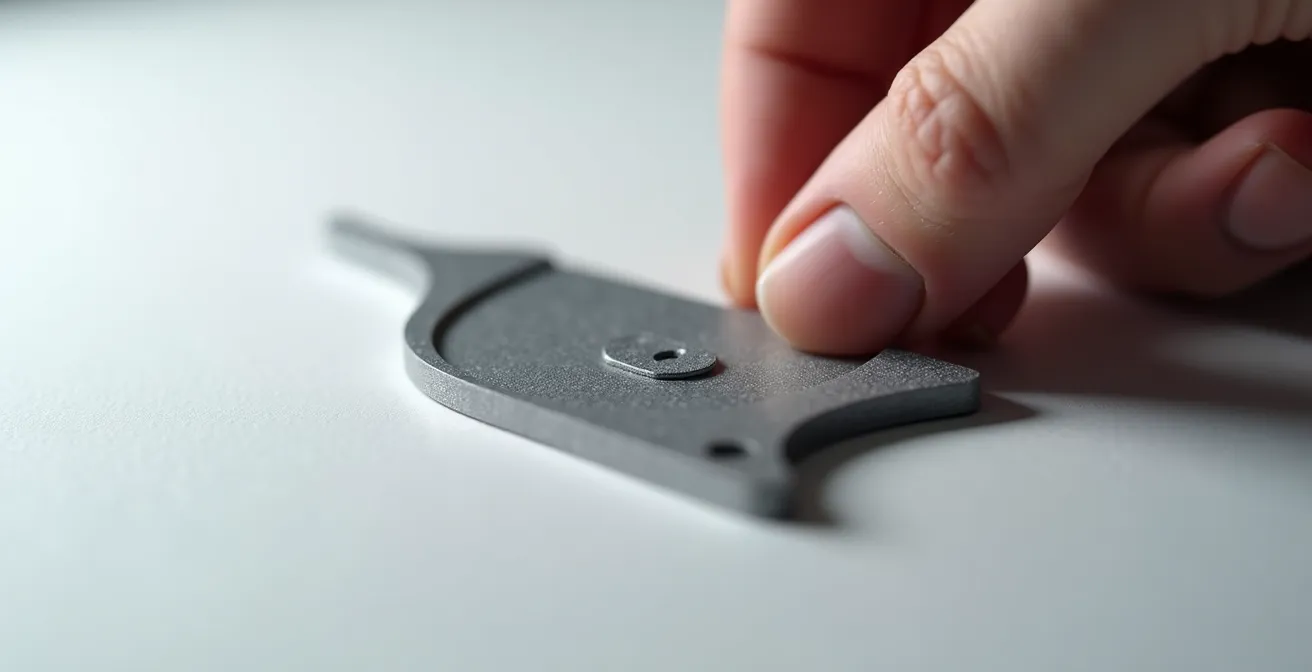
When preparing a logo for embroidery, the temptation might be to send a simple JPG or PNG. However, for a process that translates digital shapes into physical stitches, a vector file (AI, EPS, or SVG) is unequivocally superior. While an embroiderer’s digitizing software can often trace a high-resolution raster image, it’s an imprecise process that leaves room for interpretation and error. A vector file, by contrast, provides a perfect, mathematically defined blueprint.
The digitizer doesn’t feed the vector file directly into the embroidery machine. Instead, they use it as an exact reference to manually redraw the logo in specialized software, assigning stitch types (like satin, fill, or running stitches) to each shape. The clean lines and scalable nature of a vector file allow the digitizer to understand your design intent with absolute clarity. This prevents issues like fuzzy edges or misinterpreted shapes that can occur when tracing a pixel-based image. For this reason, you should always convert fonts to outlines to prevent substitution errors on the digitizer’s end.
However, simply saving as a vector isn’t enough. A complex vector logo with gradients, thin lines, and tiny text will not translate well to thread. The design must be simplified and optimized for the medium. This involves reducing the color palette, thickening strokes, and ensuring all elements are large enough to be legible when stitched. Sending a properly prepared vector file is a mark of professionalism that saves the embroiderer time and ensures the final product is a faithful, high-quality representation of your design.
Action Plan: Preparing Vectors for Flawless Embroidery
- Simplify your vector logo: Remove gradients and reduce colors to a maximum of 6-8 solid colors.
- Thicken all lines: Ensure all strokes are at a minimum of 1mm (0.04 inches) to prevent thread from breaking or pulling.
- Enlarge small text: Make sure any text is at least 4mm in height to maintain legibility when stitched.
- Convert strokes to filled shapes: Use “Expand” or “Outline Stroke” to give the digitizer clear, closed shapes to work with.
- Save in multiple formats: Provide both an editable AI/EPS file and a universally compatible PDF.
The Color Bit-Depth Error That Creates Ugly Stripes in Your Smooth Fades
One of the most jarring flaws in large-format printing is color banding: the appearance of distinct stripes in what should be a smooth gradient. This issue often perplexes designers because the gradient looks perfect on their high-resolution monitor. The problem lies not in the vector itself, but in the mathematical limitations of color representation, specifically related to color bit-depth. A standard 8-bit color space, while sufficient for most screen work, only contains 256 shades per channel. When this limited palette is stretched across a massive physical space, like a 40-foot billboard, the subtle steps between shades become visible, creating the banding effect.
The solution is counter-intuitive: you must introduce a form of intentional imperfection. The most effective technique is called dithering, which involves adding a very subtle layer of monochromatic noise (around 2-3% opacity) over the gradient. This noise breaks up the clean mathematical progression of the fade, forcing the printer’s rendering engine to mix the colors in a more organic way. The tiny, randomized dots are invisible from the intended viewing distance but are highly effective at tricking the eye into seeing a perfectly smooth transition.
Case Study: The Gradient Banding Solution
A design agency printing billboard designs discovered their smooth digital gradients were showing visible banding when produced. Their solution was twofold: first, they began working in 16-bit color depth within Photoshop for gradient creation before importing as smart objects into Illustrator. Second, they applied a 2% monochromatic noise layer over all large gradients. This workflow eliminated noticeable banding in 95% of their large-format print jobs, proving that sometimes a little chaos is necessary for visual perfection.
Working in a higher bit-depth during the design phase (e.g., 16-bit in Photoshop for complex gradient elements) can also provide more color information to work with, further reducing the risk of banding. The final output may still be 8-bit CMYK, but the extra data in the source file helps create a smoother initial gradient. Ultimately, conquering banding requires moving beyond the software’s default settings and actively managing the way colors will be rendered in the physical world.
When to Convert Fonts to Outlines: The Final Step Before Sending to Print?
“Convert all text to outlines” is another piece of advice that is often given without the necessary context. While converting fonts to vector shapes is a crucial step to prevent font substitution errors at the print shop, the timing of this action is critical. Doing it too early in the design process destroys the text’s editability, turning a simple typo correction into a frustrating reconstruction project. The professional workflow treats font outlining as the final, irreversible step before delivery, not a casual part of the design process.
Furthermore, there is a subtle but important technical reason to be precise. As one expert notes, the conversion process itself is not always benign. Live text contains “hinting” data that helps it render sharply, especially at smaller sizes. Converting to outlines can sometimes alter the pure geometry of the letterforms.
Converting fonts to outlines can subtly change character shapes and hinting, especially at small sizes, potentially breaking the perfect geometry of a typeface.
– Typography Expert at Peachpit, The Good Anchor Point and Path – Vector Basic Training
This means for digital use (like websites), text should always remain live for SEO and accessibility. For print, the best practice is to save two versions of the final, approved file: one with live text (for your archives) and a “print-ready” package that includes the outlined version. This ensures both safety and future editability. The decision to outline is a strategic one, based on the file’s destination and lifecycle stage.
| Scenario | Keep Fonts Live | Convert to Outlines | Best Practice |
|---|---|---|---|
| Client Review | ✓ Editable | ✗ Not editable | Send live version with fonts |
| Final Print File | ✗ Risk of substitution | ✓ Guaranteed appearance | Send both versions in folder |
| Web/Digital Use | ✓ SEO-friendly | ✗ Kills accessibility | Always keep live text |
| Small Print Sizes | ✓ Better hinting | ✗ May lose clarity | Test both at actual size |
| Large Format | ✗ Less critical | ✓ Safe option | Outline after approval |
Why Your Client Sees Thin Lines Instead of Thick Strokes When They Resize Your Logo
This is a classic and entirely avoidable file preparation error. A client receives your beautiful logo, resizes it to fit their PowerPoint slide, and suddenly all the carefully weighted strokes have become hairlines or disappeared completely. The culprit is a single, critical setting in your vector software: “Scale Strokes & Effects.” By default, in programs like Adobe Illustrator, this option is often turned off. This means when an object is scaled, the object’s path resizes, but its assigned stroke weight remains a fixed value (e.g., 2 points).
When the logo is shrunk, that 2-point stroke becomes disproportionately thick. When it’s enlarged, the stroke appears comically thin. To a client unfamiliar with vector software, this makes the file seem “broken” and undermines their confidence in your work. The correct procedure is to enable “Scale Strokes & Effects” in the Transform panel or preferences *before* saving the final files for the client. This locks the stroke’s thickness in proportion to the object’s size, ensuring it scales predictably and maintains the design’s integrity.
For ultimate foolproof delivery, especially when sending files to non-designers, a secondary step is to provide a version where all strokes have been converted to filled shapes using the “Expand Appearance” or “Outline Stroke” command. This permanently converts the strokes into compound paths, removing their “stroke” property entirely. While this makes the file non-editable from a stroke-weight perspective, it makes it impossible to scale incorrectly. Providing a simple visual guide explaining this to the client is also a hallmark of a thorough and professional handover process.
Why Placing a Vector Point at 10.5px Creates Anti-aliasing Fuzz
When designing for screens—whether it’s a website, an app, or a digital billboard—the pixel grid is king. The sharp, crisp appearance we associate with high-quality UI and icons is a direct result of aligning vector paths to this underlying grid. Placing an anchor point or a path edge on a fractional pixel value, like X: 10.5px, forces the rendering engine behavior to compromise. A pixel cannot be half-on and half-off; the engine’s only recourse is to use anti-aliasing to display a blend of colors from your shape and its background across the adjacent pixels.
This blending is what creates the “fuzz” or blurriness that cheapens a design. It’s a sign of a lack of precision. Professional digital designers work with “Snap to Pixel Grid” enabled, ensuring that every vertical and horizontal line falls perfectly on a whole pixel coordinate. This guarantees that the rendering engine can display the shape with maximum sharpness and clarity. Indeed, research on screen rendering shows that sub-pixel positioning can reduce the perceived sharpness of UI elements by up to 40% when viewed at 100% zoom.
A UI design team working on icons discovered this firsthand. They were able to reduce icon blur by a staggering 90% simply by enforcing a strict pixel grid alignment policy. They found that intentionally using sub-pixel positioning was only useful in one specific case: creating smooth animation transitions, where the resulting motion blur was actually a desirable effect. For any static element, however, pixel-perfect alignment is the absolute, unyielding rule for achieving a crisp, professional look.
Key Takeaways
- True vector mastery lies in understanding the underlying principles of rendering, not just the software’s surface-level functions.
- Every decision, from anchor point placement to color bit-depth, must be intentional and informed by the final output medium and viewing context.
- Flawless execution requires a quality-obsessed mindset where “close enough” is never acceptable and pixel-perfect precision is the standard.
Why Misaligning Your Grid by 1 Pixel Destroys User Trust Instantly?
In the world of high-stakes design, a single misaligned pixel is not a small mistake; it’s a crack in the foundation of your credibility. To an untrained eye, a 1-pixel error might go unnoticed consciously, but to the subconscious, it registers as a subtle feeling of “off-ness,” of unprofessionalism. For a user interface, a website, or a brand’s visual identity, this tiny imperfection can erode the perception of quality and, by extension, the user’s trust in the product or company. It suggests a lack of care, and if the brand can’t get the small details right, can they be trusted with the big ones?
This is not hyperbole; it’s a reflection of how humans perceive quality. A perfectly aligned grid system creates a sense of order, rhythm, and stability. It guides the eye and makes information easier to process. When an element breaks this grid by a single pixel, it creates visual tension. The user’s brain has to work, even infinitesimally, to process the inconsistency. This is especially true for data visualizations, dashboards, and any interface where precision is paramount. A misaligned button or form field feels cheap and unreliable.
A rigorous grid alignment audit is therefore a non-negotiable part of a quality-obsessed workflow. This involves more than a cursory glance. It requires you to switch to Outline View (Cmd/Ctrl + Y) to see the pure vector paths, free from visual effects. It means zooming to 6400% to inspect intersections and ensure every element snaps perfectly to your baseline grid. It demands verifying that all spacing follows a consistent mathematical progression. This level of exactitude is not pedantic; it is the very definition of professional craftsmanship.
Stop leaving quality to chance. Apply these principles rigorously and begin delivering work that is, by design, flawless at any scale. The precision you demonstrate in your files will be directly reflected in the trust your clients and their users place in you.
Frequently Asked Questions on Vector File Preparation
Why can’t I just send my embroiderer a JPG file?
While embroiderers can work from raster files, vector files provide cleaner edges and allow the digitizer to better understand your design intent. A vector serves as a precise blueprint for them to create the stitch paths, reducing ambiguity and ensuring a more accurate result.
What happens to my vector file during the digitizing process?
The digitizer essentially redraws your logo using specialized software, converting your vector shapes into specific stitch types (satin, fill, running). Your vector file acts as a perfect, scalable reference guide, not a direct instruction that the embroidery machine reads.
Should I outline my fonts before sending them for embroidery?
Yes, always convert fonts to outlines for embroidery. This freezes the text into a vector shape, ensuring the digitizer sees exactly what you intended and completely prevents any font substitution issues on their system.
What is the “Scale Strokes & Effects” setting?
It is a critical checkbox, typically in your software’s Transform panel, that locks the thickness of a stroke to the size of the object. When it’s enabled, a 2pt stroke on a 1-inch object will become a 4pt stroke on a 2-inch object, maintaining its proportional appearance.
When should I use “Expand Appearance” instead of relying on that setting?
Use “Expand Appearance” or “Outline Stroke” as a final step when delivering files to non-designers or for use in older software. This converts strokes into filled shapes, which is a foolproof way to ensure they scale correctly, though it removes the ability to easily edit the stroke weight later.