The secret to mind-bending depth illusions isn’t just following art rules; it’s about mastering the visual ‘cheats’ that hack human perception.
- Anamorphic art relies on a distorted grid that only snaps into focus from a single, secret viewpoint.
- A believable ‘floating’ effect depends on correctly painting the subtle physics of a shadow’s umbra and penumbra.
Recommendation: Stop thinking like a painter and start thinking like a visual magician by focusing on how to manipulate the viewer’s eye, not just the canvas.
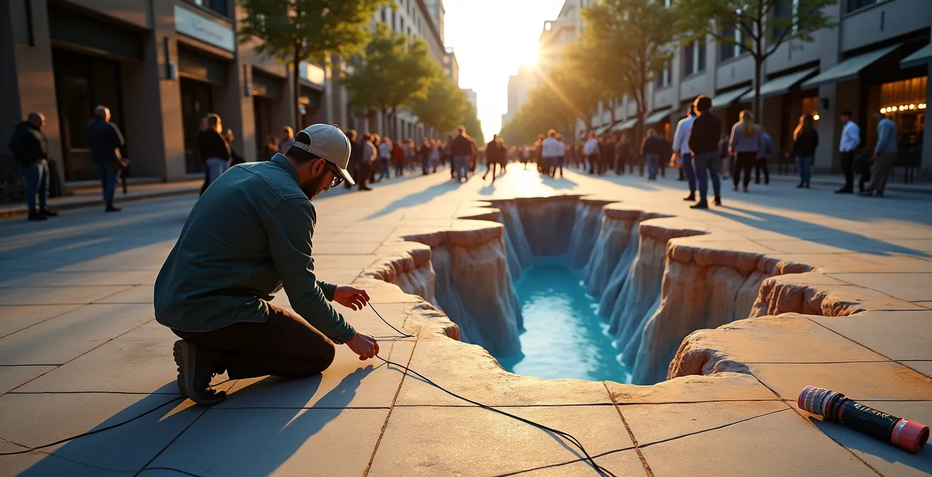
Ever seen a mural of a chasm that makes you hesitant to step forward, or a piece of street art that seems to float in mid-air? It feels like magic, but it’s not. It’s a craft. Many artists learn the basic depth cues—overlapping shapes, atmospheric perspective, and linear convergence—and stop there. They follow the textbook rules, creating art that has depth but lacks that jaw-dropping, “how did they do that?” quality.
The truth is, creating truly convincing illusions on a 2D surface is less about painting what you see and more about understanding what the human brain *expects* to see. It’s a game of perception hacking, a series of delightful deceptions. But if the key isn’t just in the classic rules of perspective, where does the real secret lie? It lies in mastering the specific, often counter-intuitive techniques that turn a flat wall into a portal. It’s about learning the visual alchemy that separates a good muralist from a legendary one.
This guide will pull back the curtain on these secrets. We’ll move beyond the basics and dive into the specific ‘cheats’ and professional tricks used to create powerful anamorphic art, believable floating objects, and compositions that literally break out of their frames. We will explore the science behind the art, revealing how to manipulate light, shadow, and form to become a true master of illusion.
In this deep dive, we’ll explore the hidden mechanics behind masterful 2D illusions. The following sections break down the specific techniques and considerations that will elevate your art from simply deep to truly deceptive.
Summary: Mastering the Art of Visual Deception
- Why your anamorphic drawing looks stretched from the front but perfect from the side?
- How to paint a drop shadow that makes an object appear to float off the wall?
- Overlapping shapes vs. Moving viewpoints: Which depth cue is stronger in static art?
- The composition trick of having elements cross the border to enhance realism
- When to photograph the illusion: finding the exact time of day for outdoor shadows?
- Planar Projection vs. 3D Warping: Which technique is needed for a corner setup?
- Line convergence vs. Value shift: Which creates more depth in a landscape background?
- How to Insure a Mixed Media Installation Made of Perishable Materials?
Why your anamorphic drawing looks stretched from the front but perfect from the side?
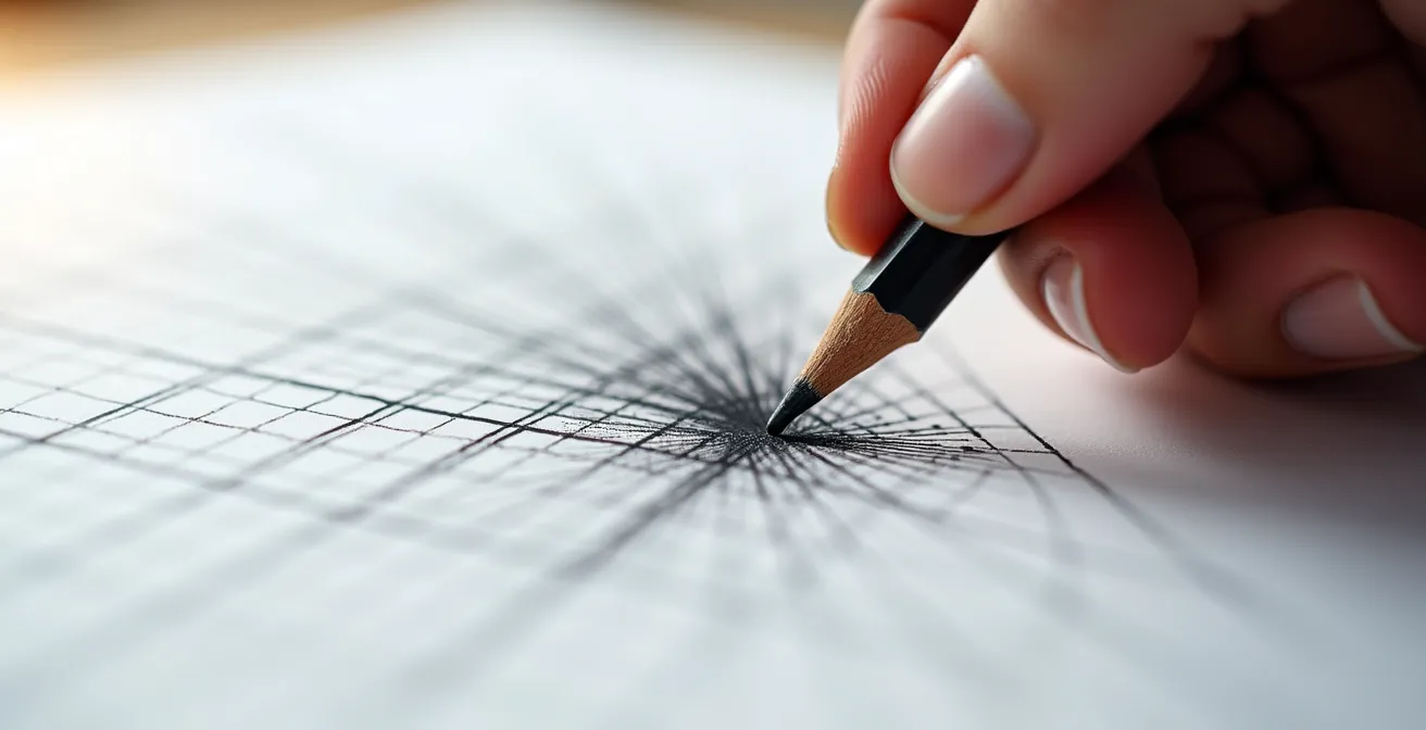
The bizarre, elongated mess you see from the front is the very secret to anamorphic art’s magic. This isn’t a mistake; it’s a deliberate act of perception hacking. Anamorphic illusions are designed to resolve into a perfect, coherent image from only one specific location—the “sweet spot.” From any other angle, the illusion remains broken. This is achieved by projecting a normal image onto a distorted grid. Think of it like stretching a rubber sheet with a drawing on it; the image only looks right when you view it from the correct angle and distance to ‘un-stretch’ it visually.
The process is a fascinating blend of art and mathematics. The traditional method involves a precise grid transfer. It requires patience, but it’s the foundational skill for creating these illusions without digital aids. Here’s a simplified breakdown of that visual alchemy:
- Draw a grid of squares over your reference photo or drawing.
- Extend the center line of your drawing surface to be significantly longer than the reference (e.g., four times the width).
- Draw lines from the corners of your reference grid to the farthest point of this new, extended center line.
- Create a new, distorted grid by drawing vertical lines where the diagonal lines intersect the horizontal ones.
- Painstakingly transfer your image, square by square, from the regular grid to the new, stretched-out grid.
- Step back to the predetermined viewpoint. The magic happens now, as the distorted mess snaps into perfect perspective.
This principle of a single, perfect viewpoint is a powerful tool for engaging the audience. The journey to find the ‘sweet spot’ becomes part of the experience. Artists can even use the broken, multi-perspective views as part of the artwork’s narrative, making the final discovery all the more rewarding for the viewer.
Case Study: Felice Varini’s Architectural Illusions
The Swiss artist Felice Varini is a master of this concept. He creates geometric paintings across three-dimensional spaces, like rooms and building facades. When you walk around the space, you see fragmented shapes and lines scattered across different surfaces. However, by standing in one specific spot, the fragments suddenly align to form a single, perfect geometric shape. Varini intentionally uses the ‘broken’ illusion experienced from non-optimal viewpoints as part of the artistic journey, making the discovery of the perfect viewing position a rewarding finale for viewers.
How to paint a drop shadow that makes an object appear to float off the wall?
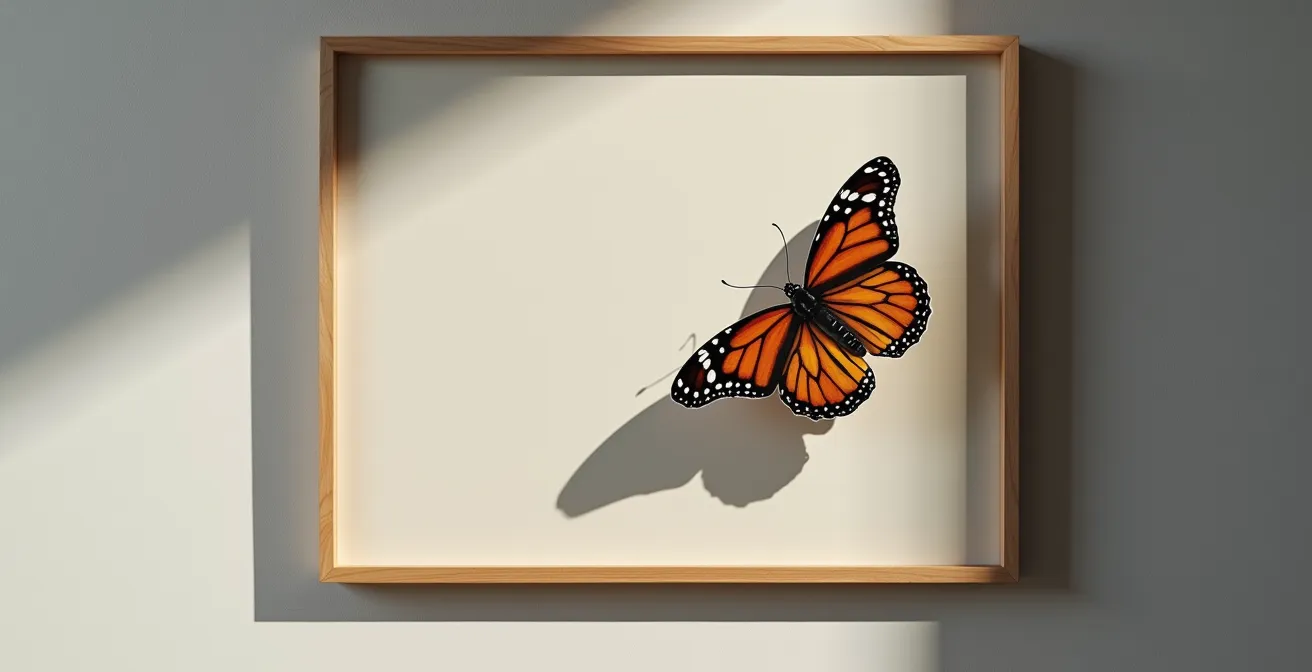
The secret to making an object look like it’s levitating isn’t just painting a dark blob underneath it. It’s about mastering the subtle physics of a cast shadow. A truly convincing shadow tells the brain that an object is detached from its surface, and the key is understanding its components. While you can get lost in the science, artists have a secret: you only need to focus on two parts to create the illusion. According to research, cast shadows have three distinct parts, but for artistic purposes, the Umbra and Penumbra are what matter.
The Umbra is the darkest, most central part of the shadow, where the light source is completely blocked. It should have a relatively sharp edge. The Penumbra is the softer, lighter edge of the shadow, where the light source is only partially obscured. To create a ‘floating’ effect, the shadow must be physically detached from the object, and the penumbra needs to be soft and diffused. The farther the object is from the surface, the larger and softer its penumbra will be. A hard, dark shadow connected to the object’s base will anchor it firmly to the ground; a soft, detached shadow will set it free.
The psychology behind this is powerful. Our brains are wired to interpret shadows as indicators of position and contact. As experts Casati and Cavanagh point out, this is a fundamental visual cue we use to ground objects in reality.
In paintings, most shadows originate at a character’s feet or an object’s base, to signal that the depicted elements are located at some specific spot, anchored on the ground, and are not floating above it
– Casati & Cavanagh, Journal of Vision – The Art of the Float
Therefore, to make an object float, you must intentionally break this rule. You paint the shadow where it *would* be if the object were airborne, creating a small gap of light between the object and the start of its shadow. This small gap is the secret signal to the viewer’s brain that says, “This object is not touching the wall.”
Overlapping shapes vs. Moving viewpoints: Which depth cue is stronger in static art?
In the world of static art, like a mural or a canvas painting, there’s no contest: overlapping shapes are the most powerful and fundamental depth cue you can use. While the changing perspective of a moving viewpoint (motion parallax) is a potent cue in the real world or in virtual reality, it’s entirely absent in a fixed image. For a muralist, relying on the viewer to move in a specific way is a gamble; relying on the simple, brute-force logic of one object being in front of another is a certainty.
The power of overlapping, also known as interposition, is one of the first visual rules we learn. If a tree covers part of a house, the house is farther away. It’s a simple, binary piece of information that requires no complex calculation from the brain. It’s so primal that it often overrides other, more subtle depth cues. You can have errors in perspective or scale, but if your overlapping is clear and deliberate, the illusion of space will hold. Beginning artists often forget this, placing objects side-by-side in a “line-up” composition, which instantly flattens the image.
To maximize depth, you should actively look for opportunities to create layers by overlapping elements. Have a foreground element partially obscure something in the middle ground, which in turn obscures something in the background. Each overlap is another clear signal of spatial relationship. This is far more reliable than trying to suggest depth through subtle shifts in size or value alone, though those cues are excellent complements. Overlapping provides the skeleton of your spatial composition; other cues add the muscle and skin.
The composition trick of having elements cross the border to enhance realism
One of the most playful and effective secrets for creating a startling sense of realism is the “frame break.” This is a trompe l’oeil technique where an element of the painting appears to cross the boundary of the frame or painted border, entering the viewer’s space. This simple trick shatters the fourth wall of the artwork, suggesting that the painted world is not a self-contained window but an actual space that can spill out into our reality. It’s a powerful tool for a muralist, who can use architectural features like corners, ledges, or door frames as natural borders to break.
This can be achieved in several ways. An object within the composition can cast a shadow that falls “outside” the painted area and onto the real wall. A painted figure’s hand or foot might extend over the edge of the mural’s border. Or, as seen in many classical still lifes, a piece of fruit or a flower petal appears to rest on the literal edge of the frame. The effect is an immediate and surprising jolt of three-dimensionality that a purely contained composition can rarely match.
This technique works because it creates a direct conflict between what the viewer knows (it’s a flat painting) and what they see (an object interacting with the real world). This cognitive dissonance is engaging and memorable. The different approaches to this “frame break” can be used for various effects, from subtle depth enhancement to a full-blown immersive installation.
The table below compares some of the most common frame-breaking techniques you can employ in your work to create this powerful illusion.
| Technique | Description | Visual Effect | Best Use Case |
|---|---|---|---|
| Spill-Over | Object or shadow extends beyond painted border | Creates immediate depth | Still life paintings |
| Wrap-Around | Artwork continues onto canvas sides | Eliminates frame boundary | Contemporary installations |
| The Crop | Figure cut off abruptly at edge | Implies continuation beyond view | Portrait and figure work |
When to photograph the illusion: finding the exact time of day for outdoor shadows?
For a street artist creating an outdoor illusion, the sun is both your primary light source and your most unpredictable partner. The success of your illusion, especially one that incorporates painted shadows, often depends on how those fake shadows interact with the real ones. To truly sell the effect, you must photograph your work when the natural light aligns with your painted light source. This requires planning; it’s not something you can leave to chance. The secret weapon for the modern muralist is a sun tracking app.
The quality of light dramatically affects the appearance of shadows. As a general rule, direct, hard light from a clear sun will create sharp, defined shadows, while overcast or diffuse light will result in softer, less defined shadows. For a high-impact trompe l’oeil, you often want the long, dramatic shadows of the “golden hour”—the first hour after sunrise and the last hour before sunset. This is when the sun is low in the sky, stretching shadows and revealing texture.
A professional workflow involves more than just guessing. It’s a pre-planned operation to ensure your artwork is captured in its most magical state. This is where you combine technology with traditional observation to become a true master of light.
Your Action Plan: Professional Shadow Planning for Outdoor Illusions
- Download sun tracking apps: Sun Surveyor, PhotoPills, or The Photographer’s Ephemeris (TPE) are industry standards.
- Input your exact mural location and the planned date of your photoshoot into the app.
- Use the app’s Augmented Reality (AR) feature on-site to visualize the sun’s path and where shadows will fall throughout the day.
- Plan your painted light source to align with the sun’s direction during the golden hour for the longest, most dramatic shadows.
- Mark the intended positions of your painted shadows at different times with chalk before committing to paint, testing the effect.
Remember to also consider seasonal variations. The winter sun is lower in the sky, creating longer shadows even at midday compared to the summer. By meticulously planning the photoshoot, you ensure that the final image captures the illusion perfectly, preserving the magic long after the real light has changed.
Planar Projection vs. 3D Warping: Which technique is needed for a corner setup?
When your canvas is no longer a simple flat wall but a complex surface like a corner, the old rules of planar projection start to break down. A simple grid stretch (planar projection) works for a single plane viewed at an angle. But for a multi-plane surface, like the two walls and floor of a corner, you need a more powerful secret: 3D warping. This technique is essential to maintain a seamless illusion across intersecting surfaces.
3D warping involves creating a virtual 3D model of your physical space. You then “unwrap” this 3D model into a flat 2D template (a process known as UV unwrapping). This is where you paint your design. Finally, you use software or a projector to “re-wrap” your flat design back onto the 3D surfaces of the corner. This ensures that every line and shape aligns perfectly across the breaks in the planes when viewed from the ‘sweet spot’. The result is an illusion that seems to ignore the room’s physical geometry entirely.
This method offers a level of precision that is nearly impossible to achieve by hand-drawing across corners. While more technically demanding, professional installations using projector-based workflows achieve perfect alignment when the projector’s lens position exactly matches the intended viewing point. This is the secret to those gallery installations where a perfect circle seems to float in the corner of a room, painted across two walls and the floor.
Professional Workflow: 3D Warping for Corner Installations
Recent studies comparing projection methods confirm that for multi-plane surfaces, 3D warping techniques are superior. An effective workflow involves creating a 3D model of the corner space, UV unwrapping it to create a flat template, painting the design on this template, and then re-applying it to the model to preview the effect from the exact viewing angle. This digital rehearsal, often using a projector for the final transfer, ensures that complex installations achieve the highest possible accuracy and impact.
Line convergence vs. Value shift: Which creates more depth in a landscape background?
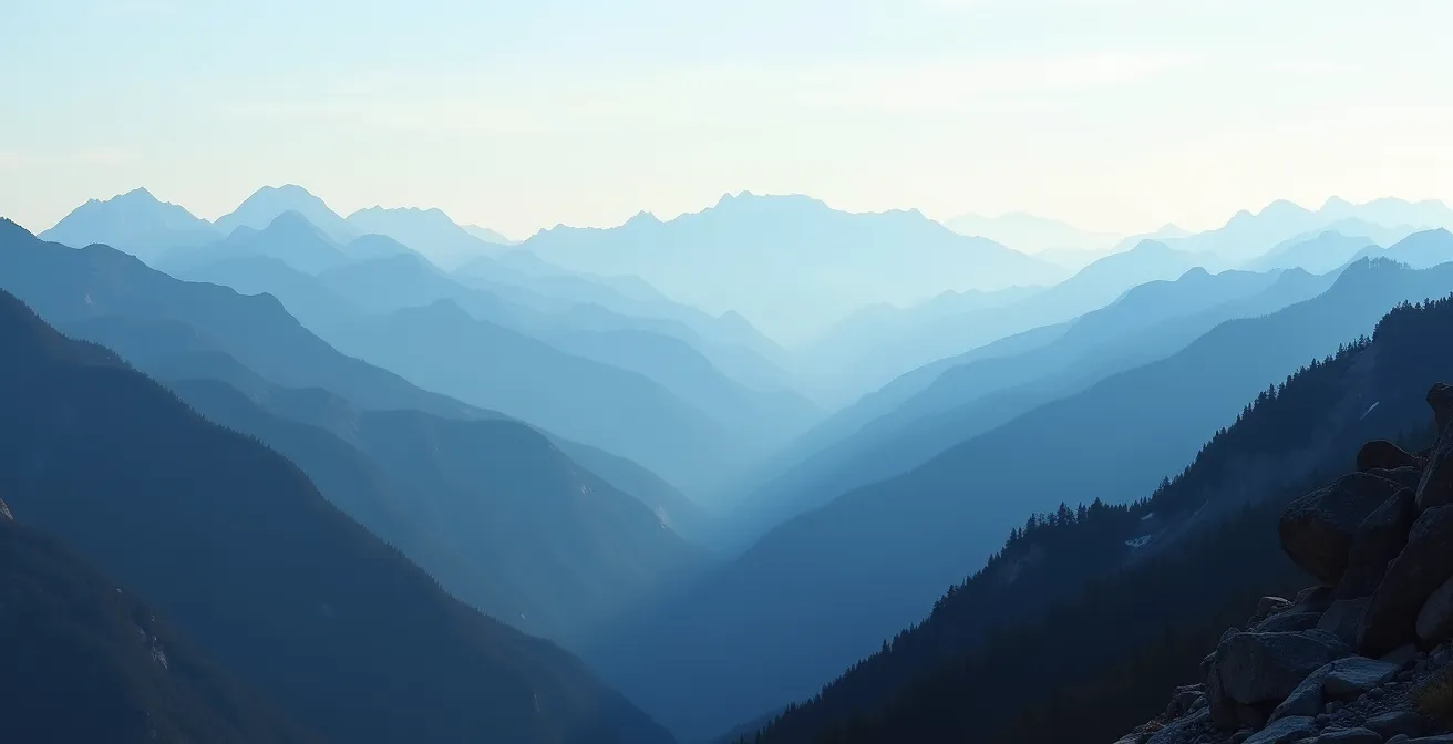
In the contest between line convergence and value shift for creating depth in a landscape, the winner depends entirely on the environment. There is no single “stronger” cue; the secret is knowing which one to emphasize. For a sprawling, natural landscape mural—think mountains, fields, or seascapes—the undisputed champion is value shift, more commonly known as atmospheric perspective. This is the effect where distant objects appear lighter, less detailed, and bluer than closer objects due to particles in the atmosphere.
Line convergence, the principle that parallel lines appear to meet at a vanishing point, is incredibly powerful in urban or architectural scenes. Roads, buildings, and railways provide strong leading lines that forcefully create a sense of deep space. In a natural landscape, however, these strong parallel lines are often absent. Here, the subtle and gradual lightening of tones and colors as they recede into the distance does the heavy lifting. As one expert notes, “The contrast between the dark and light areas decreases, as does the amount of detail, as an object is farther away.” This compression of values is what gives a mountain range its sense of vastness.
The trick is to use both, but to let the environment dictate the dominant player. In a scene of a road winding through mountains, you’d use the strong line convergence of the road’s edges, but you would amplify the depth by applying a dramatic value shift to the successive mountain ranges.
This table from a recent analysis helps clarify which cue tends to dominate in different types of environments, providing a strategic guide for your compositions.
As illustrated in a comparative analysis of depth cues, the context of the scene determines which technique will have the most significant impact.
| Environment Type | Dominant Depth Cue | Secondary Cue | Visual Impact |
|---|---|---|---|
| Urban/Architectural | Line Convergence | Value Shift | Strong structural depth |
| Natural Landscapes | Value Shift (Atmospheric) | Size Diminution | Vast distance impression |
| Mixed Environments | Both Equal | Overlapping | Complex layered depth |
| Abstract Spaces | Value Compression | Color Temperature | Emotional depth |
Key Takeaways
- Anamorphic illusions are not mistakes; they are distorted images designed for a single, perfect viewing ‘sweet spot’.
- A floating effect is achieved by detaching the shadow from the object and using a soft ‘penumbra’ to signal distance.
- For static art like murals, overlapping shapes is a more powerful depth cue than any other.
- Breaking the frame—having elements cross the painted border—is a powerful trick to shatter the 2D plane and enhance realism.
- Planning for natural light using sun-tracking apps is a professional secret to perfectly photographing outdoor illusions.
How to Insure a Mixed Media Installation Made of Perishable Materials?
Creating a breathtaking illusion is one challenge; protecting it is another, especially when your medium is designed to decay. For artists working with perishable materials like unfixed chalk, ice, food, or living plants, standard art insurance often falls short. The secret to navigating this world lies in understanding a single concept: “Inherent Vice.” This is the insurance term for the natural tendency of an object to self-destruct or degrade due to its own material properties. Most standard policies explicitly exclude it.
So, how do you protect work that is meant to change or disappear? The key is meticulous, almost forensic, documentation. You cannot insure against the natural melting of an ice sculpture, but you can insure it against a refrigeration failure. You can’t insure against the wilting of a flower installation, but you can insure it against vandalism or damage during transport. To do this, you need to provide an insurer with a complete dossier that proves the value and intended state of the artwork at its creation, and clarifies which risks are accidental versus intentional.
This requires a shift in thinking from artist to archivist. You must create a bulletproof record of the work’s existence and intent. This documentation is your primary tool in securing a specialized “Ephemeral Art” policy or adding a “Named Perils” endorsement to a standard one.
The Challenge of ‘Inherent Vice’ in Contemporary Art
The concept of ‘Inherent Vice’ is a major hurdle for artists using non-traditional materials. It refers to the natural tendency of materials like unfixed chalk, food, ice, or living plants to degrade over time. Standard fine art policies almost universally exclude this risk. For this reason, artists working with perishable materials often need to seek out specialist ‘Ephemeral Art’ policies. These policies or endorsements might cover specific, preventable risks—like a power outage causing an ice sculpture’s refrigeration to fail—while still acknowledging that the natural, intended deterioration of the piece remains an uninsurable part of its conceptual identity.
Now that you’re armed with these secrets, from the geometric precision of anamorphic art to the professional realities of insuring your work, you can approach any 2D surface with the confidence of a true visual alchemist. The next step is to take these concepts off the page and onto the wall, transforming your creative vision into a mind-bending reality.