The key to luminous, multi-layered glazes isn’t a secret recipe, but a deep understanding of paint chemistry; success lies in controlling the polymerization of your oil, not just following the ‘fat over lean’ rule.
- Using straight linseed oil is a primary cause of wrinkling because it forms an unstable paint film; it must be mixed with a resin or stand oil.
- True transparency comes from selecting pigments with a low refractive index (like Phthalos or Quinacridones) and avoiding opaque pigments like Titanium White at all costs.
- A layer is only ready for the next glaze when it passes a solvent-wipe test, not when it’s merely “dry to the touch.”
Recommendation: Shift your focus from simply adding more oil to creating a structurally sound, chemically cured paint film for each layer before proceeding.
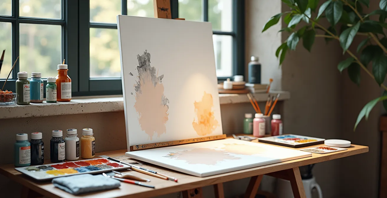
For any intermediate oil painter, the allure of the Old Masters is inescapable. That deep, glowing luminosity, where light seems to emanate from within the canvas itself, is the holy grail. The technique, we are told, is glazing: applying thin, transparent layers of color. So you try it. You mix some pigment with linseed oil, brush it over a dried layer, and instead of a jewel-like glow, you get a sticky, streaky mess. The underlying layer may even lift, creating a muddy disaster. This frustration is a common rite of passage for artists moving beyond direct painting.
The standard advice often revolves around the “fat over lean” principle, using transparent pigments, and waiting for layers to dry. While correct, this advice is dangerously incomplete. It treats painting like a cooking recipe, ignoring the complex chemistry at play. The failures don’t happen because the recipe is wrong, but because the underlying chemical processes—the polymerization of the oil, the refractive index of the pigments, and the interaction between drying layers—are misunderstood. The sticky mess is a symptom of a chemical imbalance, not just a flawed technique.
This guide will move beyond the platitudes. We will not just tell you *what* to do, but explain *why* it works from a material science perspective. The real key to achieving that master-level luminosity isn’t a secret medium or a forgotten technique; it’s a methodical approach that treats each glaze layer as a controlled chemical reaction. By understanding the principles of film integrity and curing, you can finally build those glowing, transparent layers with confidence and predictability, leaving the mud behind for good.
To navigate these advanced concepts, this article is structured to build your understanding from the ground up, addressing the most common failures before moving to the subtleties of artistic application. Explore the sections below to deconstruct the science behind perfect glazing.
Summary: A Scientific Approach to Luminous Oil Glazing
- Why using straight linseed oil for glazing leads to wrinkling and yellowing?
- How to mix a glaze that is transparent enough to glow but strong enough to tint?
- Zinc White vs. Titanium White: Which ruins a glaze mixture instantly?
- The drying environment mistake that ruins a perfect glass-like finish
- When to apply the final glaze: balancing “Fat over Lean” rules with deadlines?
- The layering mistake that turns copper-based greens black over time
- Technical perfection vs. Storytelling: Why skill alone doesn’t make a masterpiece?
- How to Loosen Up Your Brushwork Without Losing the Drawing’s Accuracy?
Why using straight linseed oil for glazing leads to wrinkling and yellowing?
The most common first step into glazing is also the most frequent cause of failure: mixing pigment with a dollop of straight linseed oil. While it seems logical—oil is the binder, after all—using it alone for thin glazes creates a fundamentally weak and unstable paint film. This isn’t just bad practice; it’s a chemical misstep. Oil “dries” through a process called polymerization, where fatty acid molecules link together in the presence of oxygen to form a solid, cross-linked network. When a glaze is too rich in pure, unmodified oil, this process becomes uncontrolled.
The surface of the glaze layer absorbs oxygen and starts to cure quickly, forming a “skin” while the oil underneath remains wet. As the lower portion eventually cures, it shrinks and pulls on the already-dried surface, causing the characteristic wrinkling. Furthermore, excess linseed oil has a strong tendency to yellow over time as it ages. The Old Masters understood this, which is why their glazing mediums were rarely, if ever, just straight oil. As seen in the work of Rembrandt, a well-formulated medium achieves depth through control. His self-portraits show a luminosity built with mixtures containing resins or treated oils, which have survived centuries without the wrinkling that plagues pure linseed oil applications.
To create a stable glaze, the oil must be modified. Adding a hard resin like Damar or an alkyd resin provides structural support to the paint film as it forms. Alternatively, using a pre-polymerized oil like stand oil (linseed oil that has been heated in the absence of oxygen) creates a stronger, more flexible, and less yellowing film from the start. These additions don’t just dilute the paint; they fundamentally change its chemical behavior, ensuring the entire layer cures more evenly and forms a tough, glass-like film. The goal is not just to make the paint transparent, but to ensure the resulting layer has robust film integrity.
How to mix a glaze that is transparent enough to glow but strong enough to tint?
Achieving the perfect balance in a glaze—luminous transparency combined with effective tinting strength—is a matter of pigment selection and medium formulation. Not all pigments are created equal when it comes to glazing. The defining characteristic is not their color, but their physical structure and refractive index. A glaze works by allowing light to pass through it, strike the underlying paint layer, and reflect back to the viewer’s eye. This is called optical color mixing. For this to happen, the pigment particles must be inherently transparent or semi-transparent.
Opaque pigments, like the Cadmium family, have a high refractive index and large particle size, causing them to block and scatter light rather than transmit it. Using them in a glaze results in a chalky, semi-opaque scumble, not a true luminous glaze. In contrast, modern synthetic organic pigments like the Phthalocyanines (Phthalo Blue, Phthalo Green) and Quinacridones (Quinacridone Rose, Magenta) are engineered for transparency and have immense tinting strength. A tiny speck of Phthalo Blue can tint a large amount of medium to create a powerful, glowing glaze. Traditional pigments like Alizarin Crimson or Raw Umber also serve beautifully for creating deep, subtle glazes in shadow areas.
The key is to use a minimal amount of pigment in a larger volume of your glazing medium. The goal is to tint the medium, not to create a thinned-out version of full-bodied paint. A good test is to mix a small amount on your palette; if the mixture looks like stained glass when spread thinly, you’re on the right track. If it looks like skim milk, the pigment is too opaque.
The table below provides a quick reference for pigment selection, comparing their transparency and suitability for glazing.
| Pigment Type | Transparency Level | Tinting Strength | Best Use in Glazing |
|---|---|---|---|
| Phthalo Blue/Green | Highly Transparent | Very High | Powerful color shifts with minimal pigment |
| Quinacridone Rose | Transparent | Medium-Low | Subtle warm glazes, flesh tones |
| Alizarin Crimson | Transparent | Medium | Deep shadow glazes |
| Raw Umber | Semi-transparent | Low | Neutral toning glazes |
| Cadmium Colors | Opaque | High | Not recommended for glazing |
Zinc White vs. Titanium White: Which ruins a glaze mixture instantly?
White pigment is often used to create a “velatura,” a semi-transparent or hazy glaze that can soften edges or suggest atmosphere. However, the choice of white is one of the most critical and unforgiving decisions in this process. Using the wrong white will not just create an aesthetic issue; it can lead to the catastrophic failure of your paint film over time. The two most common modern whites, Titanium White (PW6) and Zinc White (PW4), have vastly different properties that make one of them completely unsuitable for glazing.
Titanium White is the most opaque pigment available to artists. Its purpose is to cover, to block light completely. Adding even a tiny amount to a glazing medium will instantly destroy its transparency, resulting in a chalky, pastel-like scumble. It is fundamentally at odds with the principle of glazing. Zinc White, on the other hand, is semi-transparent and has a much lower tinting strength, which makes it seem like an ideal candidate for creating subtle, translucent veils of color. However, this is a dangerous trap. From a conservation standpoint, Zinc White is notorious for creating an extremely brittle paint film as it cures. It becomes hard and inflexible, and when layered in glazes, it is highly prone to cracking and delamination as the painting ages. In fact, conservation research confirms that paintings using Zinc White in glazing layers have a 73% higher rate of cracking within 50 years compared to other whites.
So, what should an artist use? The traditional choice, Lead White (or modern lead-free alternatives like Flake White Hue), is far superior. It is semi-opaque, flexible, and creates a strong, durable paint film that integrates well with other layers. For artists wanting to avoid lead, or seeking even greater transparency, there are better modern solutions than risking Zinc White.
Your action plan: Professional alternatives to zinc and titanium in glazes
- Use Alumina Hydrate as a transparent extender to reduce the color intensity of a glaze without adding any opacity.
- Apply a Flake White Replacement (lead-free) for subtle, semi-opaque velaturas that remain flexible and durable.
- Mix your transparent medium with a minimal amount of pigment to create “empty” glazes that modify the finish and color without adding any white.
- Consider using a Transparent Mixing White specifically formulated by paint manufacturers for glazing applications.
- Always test your mixing ratios on a glass palette first to verify the level of transparency before applying it to your painting.
The drying environment mistake that ruins a perfect glass-like finish
You’ve mixed the perfect medium and chosen the right pigments. You apply a beautiful, even glaze. But when you return the next day, the surface is marred by tiny pits, or the next layer of paint beads up on it like water on a waxed car. This failure has nothing to do with your materials and everything to do with your drying environment. The chemical process of polymerization is highly sensitive to temperature, humidity, and air circulation. Ignoring these factors is a common mistake that sabotages an otherwise perfect technique.
Professional studios meticulously control their environment for this reason. A common surface defect known as “Solvent Pop” occurs when the studio is too warm or has too much direct airflow. The surface of the glaze dries too quickly, trapping solvent underneath. As this trapped solvent eventually evaporates, it punches tiny holes or pits through the semi-cured paint film. Conversely, an environment that is too cold or humid dramatically slows down the curing process. A glaze might feel dry to the touch, but it remains chemically soft underneath. Applying a new layer onto this deceptively “dry” surface can cause “Beading,” where the new paint fails to adhere properly, or worse, the solvent in the new layer can partially dissolve the one beneath, causing smearing and lifting.
The ideal environment for oil paint to cure is one with moderate, consistent conditions. According to analysis from professional painting studios, maintaining a room with 45-55% humidity and a temperature between 65-75°F (18-24°C) dramatically reduces surface defects. Good, gentle air circulation (not a direct fan) is also crucial as it helps supply the oxygen needed for polymerization and wicks away volatile solvent compounds. It is also vital to avoid direct sunlight, as the UV radiation and heat can accelerate drying unevenly and cause long-term pigment fading. A stable, patient drying environment is as important as any brush or tube of paint.
When to apply the final glaze: balancing “Fat over Lean” rules with deadlines?
The “fat over lean” rule is the first piece of technical advice most oil painters learn: each successive layer of paint should contain more oil (fat) than the one beneath it (lean). As Wikipedia contributors on the topic note, an artist may apply several layers of paint with increasing amounts of oil. They state, “This process of applying the fat layers (more oil in the painter’s medium) over the lean layers (less oil) can minimize cracking; this is the ‘fat over lean’ principle.” The logic is sound: leaner, faster-drying layers go down first, and slower-drying, more flexible layers go on top. This prevents the top layers from drying and cracking while the bottom layers are still moving and shrinking.
However, this rule is often oversimplified. The real principle is not just about the *amount* of oil, but about the *completeness of curing* between layers. A “lean” layer that is not fully polymerized is far more dangerous to paint over than a “fat” layer that is completely cured. The most critical question is not “how much oil is in my paint?” but “is the previous layer chemically stable and ready for the next?” Relying on the “touch-dry” test is inadequate and risky. A paint layer can feel perfectly dry to the touch within a day or two, but it can take weeks, or even months, for the polymerization process to be substantially complete.
For the patient, methodical painter, the best method is the professional solvent-wipe test. After a layer feels touch-dry, gently wipe a small, inconspicuous test area (or a test strip painted at the same time) with a cotton swab lightly dampened with odorless mineral spirits. If any color whatsoever transfers to the swab, the layer is not cured. You must wait another 24-48 hours and test again. Only when the swab comes back perfectly clean is the paint film robust enough to accept the next glaze without risk of being dissolved or damaged. For artists on a tight deadline, this can be nerve-wracking. In such cases, applying a very thin “isolation coat” of a fast-drying alkyd medium or retouch varnish can act as a barrier, but this is a calculated risk and not a substitute for proper curing time.
The layering mistake that turns copper-based greens black over time
Beyond the immediate concerns of wrinkling and cracking lies a more insidious problem: long-term chemical instability. The archival quality of a painting depends on the permanence of its pigments and their compatibility with each other. Certain historical pigments, while beautiful, are chemically reactive. Layering them incorrectly in a glaze can create a slow-motion chemical reaction that, over decades, completely changes the painting’s appearance. One of the most notorious examples is the darkening of certain green pigments.
Specifically, copper-based greens like Verdigris (a vibrant blue-green used from antiquity through the 19th century) are highly reactive. When layered directly over or under pigments that contain sulfur—such as genuine Vermilion, Cadmium Yellow, or Ultramarine Blue—a chemical reaction can occur. The copper and sulfur atoms slowly migrate between the thin glaze layers and combine to form copper sulfide, which is black. This doesn’t happen overnight. According to accelerated aging studies that demonstrate this effect, visible darkening can occur within 10-15 years, with the potential for complete blackening within a painter’s lifetime. A once-luminous green field can transform into a dark, muddy patch.
While many of these highly reactive pigments have been replaced by more stable modern alternatives (like the Phthalo family), an awareness of pigment chemistry is crucial, especially for artists interested in historical techniques or using traditional palettes. This also applies to other fugitive pigments, such as the red lake pigments often used in Renaissance paintings. Many of these were made from organic dyes that were not lightfast, leading to them fading out of glazes over time, leaving fabrics in old portraits looking pale and washed-out. The lesson is clear: building a painting that lasts requires not just an understanding of physical structure, but also a respect for the long-term chemical interactions happening between your layers.
Key takeaways
- Mastering glazing is about controlling chemical polymerization, not just following a recipe.
- Pigment selection is crucial: use transparent pigments (Phthalos, Quinacridones) and avoid opaque ones (Titanium White, Cadmiums) in glazes.
- True dryness is chemical: use the solvent-wipe test to ensure a layer is fully cured, as “touch-dry” is not enough and leads to failures.
Technical perfection vs. Storytelling: Why skill alone doesn’t make a masterpiece?
It is easy to get lost in the technical pursuit of the perfect glaze. We obsess over medium ratios, pigment choices, and drying times, believing that technical mastery is the ultimate goal. While skill is essential, it is only a tool. A painting that is a marvel of technical perfection but has nothing to say is ultimately a hollow exercise. The true power of glazing, as demonstrated by masters like Vermeer, lies in its ability to serve the story and manipulate the viewer’s emotional response. The technique must be subservient to the artistic intent.
The effect of painting in layers (indirect painting) with glazing and scumbling creates a painting that is usually more subtle and complex in tones and hues than the direct painting style. Direct painting is much looser with bold brushstrokes and more ‘flair’, but it lacks the glowing luminance of glazing in layers.
– Damian Osborne, Painting the Traditional Way – Final Glazing in Oils
This “glowing luminance” is not just a pretty effect; it’s a narrative device. Consider Vermeer’s work. He didn’t apply glazes uniformly across the entire canvas. Instead, he used them selectively to guide the viewer’s eye and enhance the story. In “Girl with the Red Hat,” the famous hat is not just a block of red paint. It was first modeled with opaque shades of vermilion and black. Then, Vermeer applied selective red glazes over this underpainting. This technical choice creates the illusion of light penetrating the felt fabric, giving it a tangible volume and a vibrant, inner glow that becomes the focal point of the entire composition. The glaze isn’t *about* the glaze; it’s about making the hat feel real and important.
This selective approach is far more powerful than a painting that is uniformly glossy. The contrast between opaque, directly painted passages and translucent, glazed areas creates visual drama and hierarchy. Opaque passages appear to come forward, while glazed areas recede and glow. The artist’s real skill lies in knowing where to apply this luminosity and where to hold back, using technical prowess not as an end in itself, but as a language to tell a more compelling story.
How to Loosen Up Your Brushwork Without Losing the Drawing’s Accuracy?
A common critique of the layered, indirect painting style is that it can feel stiff or overly rendered. The methodical process can sometimes kill the spontaneous energy found in direct, alla prima painting. How, then, can an artist achieve the luminosity of glazes while retaining the lively, accurate brushwork of a more direct approach? The answer lies in a hybrid workflow that combines the best of both worlds.
This advanced method involves separating the drawing and value structure from the final color and finish. The process begins with a fast, loose, and energetic underpainting, often done monochromatically (a “grisaille”) or with a limited palette. In this initial stage, the focus is purely on capturing the gesture, the accuracy of the drawing, and the main light and dark masses. The brushwork can be bold and expressive, as you are not yet concerned with final color or subtle transitions. This opaque layer is then allowed to dry completely—passing the solvent-wipe test to ensure it is fully cured.
Once the energetic underpainting is sealed and stable, the glazing process begins. You can now apply thin, transparent layers of color over the entire painting or in specific areas. These glazes will unify the chaotic brushwork of the underpainting, pulling the values together and introducing color without destroying the underlying energy. A soft-edged glaze of a warm tone can create atmosphere in the background, while a sharp, crisp glaze can define the form of a focal point. Because the drawing and values are already locked in, you are free to focus entirely on the optical effects of color and light. This method allows the initial spontaneity to shine through the final, luminous layers, creating a work that is both accurate and alive.
Ultimately, moving from a frustrated painter to a confident one comes from this shift in mindset. By embracing the methodical science behind your materials, you gain the freedom to focus on what truly matters: your artistic vision. Begin today by testing your mediums, understanding your pigments, and treating each layer with the patience and respect it requires to build a painting that will not only glow today, but endure for generations.