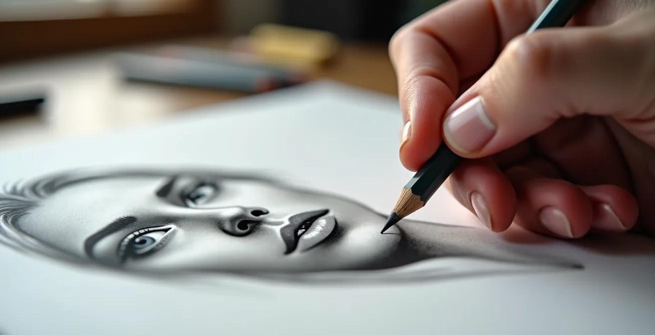
The secret to velvety, smooth skin tones isn’t the blending stump, but mastering how hard graphite interacts with the paper before you even think about shading.
- True smoothness comes from conditioning the paper’s “tooth” with hard pencils first, creating a perfect foundation.
- Layering soft pencils too early is the primary cause of “graphite shine”—an irreversible, metallic finish that destroys realism.
Recommendation: Stop smudging away your details. Start building your values from the paper’s surface up with controlled pressure and a hard graphite base.
Every portrait artist has faced it: the frustrating transition from a promising line drawing to a muddy, uneven mess. You spend hours carefully shading, only to end up with a skin texture that looks more like sandpaper or polished metal than living flesh. The common advice is always the same: use a blending stump, get softer pencils, or just keep smudging until it looks smooth. But this often leads to a flat, lifeless drawing with a greasy, reflective sheen, especially in the darks. The details are lost, the values become dirty, and the portrait loses all its vitality.
This struggle arises from a fundamental misunderstanding of how graphite works. The goal isn’t to grind pigment into the paper with brute force or friction. The real technique, used by professional artists, is far more precise and controlled. It treats the paper not as a passive background but as an active partner in creating value. It’s a method that relies on structure, control, and an understanding of the medium’s physical properties.
What if the key to luminous, smooth skin was not in the blending, but in the preparation? What if the secret was to use harder pencils more, not less? This guide breaks down the professional methodology for achieving flawless graphite skin tones. We will move beyond the myth of smudging and explore a systematic approach that gives you complete control over your values, eliminates unwanted shine, and produces clean, realistic results every time.
For those who prefer a more interactive learning experience, the following video from expert artist Lachri offers live demonstrations and a wealth of pencil drawing tips that complement the techniques discussed in this article. It’s a great way to see some of these principles in action.
This article will guide you through the essential stages of this professional process. We’ll start with the crucial role of your paper, build a foundational understanding of value creation, and then uncover the most common layering mistakes before moving on to advanced techniques for creating depth and mood.
Summary: A Guide to Realistic Graphite Skin Tones
- Why smooth bristol board rejects soft graphite layering?
- How to build a value scale from 1 to 10 using only one H pencil?
- Cross-hatching vs. Smudging: Which creates more volume in architectural drawing?
- The layering mistake that makes your darks reflect light like a mirror
- How to use a kneaded eraser to draw with light instead of shadow?
- Why a 2-inch thumbnail sketch saves you $100 in wasted oil paint?
- Line convergence vs. Value shift: Which creates more depth in a landscape background?
- Why Your Underpainting Color Determines the Final Mood of the Piece?
Why smooth bristol board rejects soft graphite layering?
The quest for smooth skin tones begins not with a pencil, but with the paper. Many artists choose smooth bristol board, believing its slick surface is ideal for blending. However, this is a common misconception that leads to frustration. The secret to smooth graphite application lies in the paper’s “tooth”—the microscopic texture of peaks and valleys on its surface. Soft graphite pencils (like 4B or 6B) deposit large, flaky particles. On a very smooth surface with little tooth, these particles have nothing to grip onto. They sit on top, smear easily, and quickly fill what little texture is available, preventing any further layering.
This is why initial layers of soft graphite on smooth bristol can feel slick and uncontrollable. The paper essentially rejects the medium. A vellum surface, which has a more pronounced tooth, provides a much better grip. According to Strathmore Artist Papers’ technical specifications, vellum surfaces are rated as ‘very good’ for graphite adhesion precisely because their texture grabs and holds the dry media particles. To achieve a smooth finish, you must work *with* this tooth, not against it. The solution is to condition the paper’s tooth with hard graphite first. By applying light layers of a 2H or 3H pencil, you gently fill the valleys of the paper without flattening the peaks. This creates a more uniform surface that is primed and ready to accept subsequent, softer layers of graphite in a controlled, even manner. This foundational step is the non-negotiable secret to building deep, smooth, non-blotchy values.
Your Action Plan: Conditioning the Paper Tooth
- Start with a base layer using a 2H or 3H pencil, applying it with light, even circular motions to gently fill the paper’s texture.
- Build a micro-texture by lightly cross-hatching with an H pencil, further evening out the tonal foundation without applying pressure.
- Use a previously used blending stump (with only graphite residue) for the initial, very light skin tone pass, unifying the hard graphite base.
- Layer softer grades (HB, then B) only after this hard pencil foundation is firmly established and even.
- Maintain extremely light pressure throughout all stages to preserve the paper’s tooth for as long as possible, allowing for more layers.
By treating the initial layer as a surface primer rather than the final shade, you shift from fighting the paper to collaborating with it.
How to build a value scale from 1 to 10 using only one H pencil?
The belief that a wide range of values requires a wide range of pencils is another myth that complicates the drawing process. In reality, mastering value control with a single hard pencil, like an H, is a foundational skill that unlocks incredible precision. It forces you to understand that value is created not by the pencil’s grade alone, but by a combination of two factors: pressure and stroke density. Learning to manipulate these variables gives you the ability to create a full 10-step value scale from a single, versatile tool. This exercise is the ultimate training in control and subtlety, essential for rendering the delicate transitions of skin.
This is achieved by systematically varying how hard you press and how closely you place your marks. A minimal “ghost touch” with sparse hatching will produce a value of 1 (the lightest tone), perfect for the subtle curve of a forehead. As you increase pressure slightly and make your marks (whether lines or small circles) closer together, you build up to the mid-tones. A firm pressure with dense, overlapping layers can achieve a surprisingly dark value of 8 or 9. This single-pencil technique demonstrates that deep, rich tones don’t require soft, messy graphite; they require methodical application and a deep understanding of the medium.
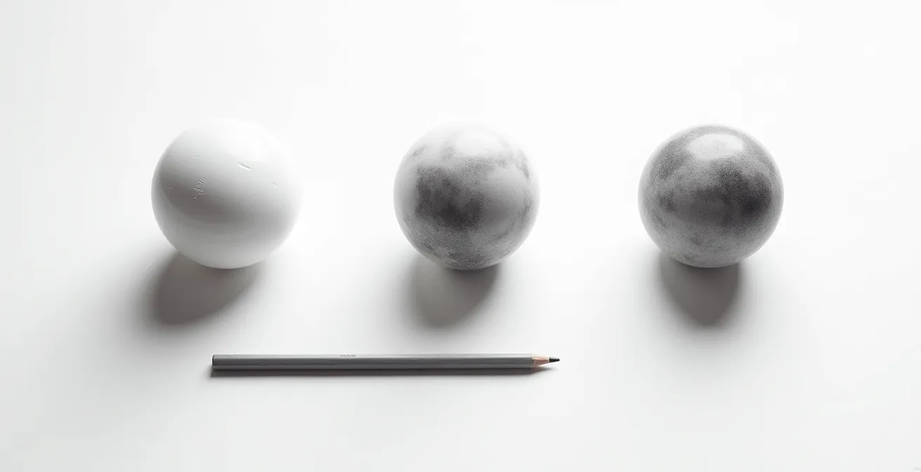
The illustration above demonstrates this principle perfectly. A single sphere is rendered with a complete range of values, all created with one pencil grade by varying pressure and the density of strokes. This approach ensures a consistent texture and avoids the jarring shifts that can occur when switching between very different pencil grades. The table below provides a practical matrix for this technique.
This matrix, explained in a comprehensive guide to graphite grades, acts as a roadmap for creating distinct values. By practicing this, you train your hand and eye to work in harmony, building the muscle memory needed for photorealistic results.
| Pressure Level | Stroke Density | Resulting Value (1-10) | Best Application |
|---|---|---|---|
| Minimal (ghost touch) | Sparse hatching | 1-2 | Highlights, forehead curve |
| Light | Medium circulism | 3-4 | Light mid-tones, cheekbones |
| Moderate | Dense crosshatch | 5-6 | Mid-tones, side planes |
| Firm | Overlapping layers | 7-8 | Deep shadows, under chin |
| Maximum | Multiple passes | 9-10 | Core shadows, nostrils |
Ultimately, this exercise proves that control, not a vast collection of tools, is the true path to creating a convincing range of tones.
Cross-hatching vs. Smudging: Which creates more volume in architectural drawing?
While the title references architectural drawing, the principle is universal and even more critical in portraiture: structured shading creates form, while smudging destroys it. Smudging is a subtractive process at its core; it averages out values and obliterates the subtle textures and directional marks that describe a three-dimensional surface. It flattens form and creates a “dirt cloud” where a clear shadow transition should be. Cross-hatching and its cousin, circulism, are additive and far superior for building volume. These techniques involve laying down a series of controlled, overlapping marks that follow the contours of the subject.
By building tone with deliberate strokes, you are not just darkening an area; you are sculpting it. The direction of your hatch marks can describe the curve of a cheekbone or the turn of a jawline, reinforcing the underlying structure of the face. Circulism, which involves building tone with tiny, overlapping oval marks, is particularly effective for skin. Professional drawing analysis suggests that this technique is ideal for creating skin texture because it mimics the slightly irregular, non-linear nature of skin’s surface. Unlike smudging, which creates a uniform, unnatural smoothness, circulism builds a rich, organic texture that feels alive.
The key is to keep the marks small and the pressure light, allowing the tones to emerge gradually. This “optical blending” means the individual marks become invisible from a normal viewing distance, merging into a seamless whole. This method preserves the paper’s tooth, allows for many layers, and gives the artist complete control over the final value. While smudging offers a quick path to a seemingly smooth area, it’s a dead end. It locks you out of further layering and robs your drawing of the very thing that creates realism: structural form.
Choose structure over speed. The volume and life you bring to your portraits will be the ultimate reward for your patience and precision.
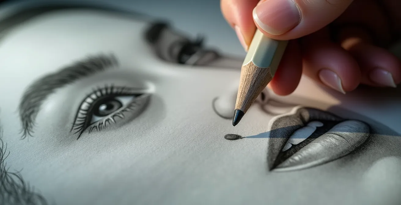
The layering mistake that makes your darks reflect light like a mirror
One of the most disheartening problems in graphite drawing is “graphite shine” or “burnishing.” This occurs when you apply heavy pressure with soft graphite pencils to achieve a dark value. The soft, waxy graphite platelets are flattened and polished against the paper, creating a smooth, metallic surface that reflects light like a mirror. This completely destroys the illusion of a deep shadow and makes the drawing look cheap and amateurish. The darkest darks, which should absorb light, instead create distracting glare. This is the single biggest layering mistake artists make.
The cause is a combination of two things: applying soft pencils too early and using excessive pressure. You cannot force a dark value. It must be built up methodically. The solution lies in layering from hard to soft and using a sharp point with minimal pressure. Master artist J.D. Hillberry, in his tutorials on realism, developed a technique specifically to combat this issue. As he explains in his demonstrations on avoiding glare, he reserves charcoal for the absolute darkest accents because it’s a matte medium that does not reflect light. For pure graphite work, he emphasizes a protocol of building up darks slowly.
The correct process involves establishing your base tones with harder pencils (2H, F), which don’t have enough binder to cause shine. Then, you gradually introduce sharper, darker pencils (2B, then 4B) only in the areas that require them. The key is to use the weight of the pencil itself, not heavy hand pressure, to deposit the graphite. Each layer should be a light, almost feathery application. Another professional trick is to apply a light spray of workable fixative between layers. This provides extra “tooth” for the next layer of graphite to adhere to and helps seal the lower layers, preventing them from being polished. By avoiding pressure, you keep the graphite particles sitting on top of each other in a multi-layered, light-absorbing structure, rather than a single, flattened, reflective sheet.
Patience is the only tool that can create a truly deep, matte black. Let the layers, not your pressure, do the work.
How to use a kneaded eraser to draw with light instead of shadow?
For most, an eraser is a tool for correction—a way to undo mistakes. For the advanced graphite artist, it is a primary drawing tool. This is the principle of subtractive drawing, where you are not adding shadow but rather lifting it away to reveal light. Instead of drawing the darks, you establish a mid-tone ground and then “draw” the highlights back in. A kneaded eraser, which can be molded into any shape, becomes your most versatile and subtle instrument for this process. It can be shaped into a fine point to lift out a specular highlight in an eye, or a sharp chisel edge to define the bright plane of a cheekbone.
This technique completely reverses the typical workflow. An artist might begin by covering the entire portrait area with a smooth, even layer of 4H or 2H graphite, blended gently with a chamois cloth to create a uniform value of 3 or 4. From this mid-tone foundation, the entire drawing is “sculpted” out of the graphite. Darker shadows are added in carefully, but the majority of the form and highlights are created by lifting the graphite off the paper. This method is incredibly powerful for creating soft, luminous skin tones because the transitions are perfectly smooth by default. You are not trying to blend two values together; you are simply reducing the amount of a single, even value.
This approach requires a significant mental shift. You must constantly think about the light source and render form by pulling light out of the shadows. As demonstrated in one popular online tutorial, some artists use their erasers for as much as 50% of the entire drawing process. Tools like the Tombow Mono Zero, an ultra-fine mechanical eraser, offer surgical precision for lifting out tiny pores, wrinkles, and hair highlights. By combining a kneaded eraser for broad, soft lifts and a detail eraser for sharp highlights, you gain a level of control that is impossible to achieve through additive shading alone.
Stop thinking of erasing as failure. Start thinking of it as sculpting with light.
Why a 2-inch thumbnail sketch saves you $100 in wasted oil paint?
The title’s reference to oil paint highlights a universal truth for all artists: planning saves resources. In graphite, the most valuable resource isn’t the pencil; it’s your time and your expensive, high-quality paper. Diving directly into a large-scale portrait without a plan is a recipe for disaster. A tiny, two-inch thumbnail sketch is the single most effective tool for preventing hours of wasted effort. This small “notan” or value study is not about detail; it’s about mapping out your composition and establishing your entire value structure in minutes.
In this small space, you can quickly block in the major shapes of light and shadow, identify your lightest lights and darkest darks, and ensure they are placed correctly to create a balanced and dynamic composition. It’s a low-stakes environment to test your entire strategy. Does the lighting create a compelling mood? Are the value relationships creating a sense of depth? You can solve these major compositional problems in five minutes in a thumbnail, whereas discovering them three hours into a final drawing can be demoralizing and often unfixable. Professional portrait artists report that for a 15-hour graphite portrait, an initial 30-minute session dedicated to value studies is a critical investment.
This small-scale planning also allows you to test your no-smudge layering strategy. You can quickly see if your choice of pencils will achieve the desired darks without burnishing or if your transitions feel smooth. It’s a dress rehearsal for the main event. By establishing a clear roadmap for your values before you even touch your final sheet of paper, you eliminate guesswork. You are no longer discovering the drawing as you go; you are executing a well-formulated plan. This confidence translates into more decisive, cleaner mark-making and a far more successful final piece.
Don’t draw for hours to find your composition. Find your composition in minutes so you can draw for hours with purpose.
Line convergence vs. Value shift: Which creates more depth in a landscape background?
Linear perspective, with its converging lines, is the classic tool for creating depth. But in portraiture, where lines are subtle, a far more powerful technique exists: atmospheric perspective. Borrowed from landscape painting, this principle states that objects in the distance appear lighter, less detailed, and cooler in color. Applying this to the human face in a three-quarter view can create a stunning and convincing illusion of three-dimensional space. The key is to use value shifts and edge control to make parts of the face recede while others advance.
Instead of treating both sides of the face equally, you treat the far side as if it were miles away in a landscape. This means the far cheekbone, the corner of the jaw, and the temple on the far side should be rendered with lighter values and softer edges. The sharpest contrast, darkest values, and “found” or hard edges should be reserved exclusively for the features closest to the viewer, such as the nearest eye, the tip of the nose, and the near-side cheekbone. This value shift does more to create depth than any linear element ever could.
Case Study: Atmospheric Perspective in a Portrait
In a detailed 6-hour graphite portrait demonstration by Lachri Fine Art, the artist masterfully applies this landscape principle to a face. The eye on the far side of the three-quarter view is drawn with significantly less contrast and softer edges than the near eye. The cheekbone on the far side gently fades into a softer value, while the near cheekbone is defined with a crisp, highlighted edge. This deliberate manipulation of value and edge quality makes the near side of the face “pop” forward, creating a powerful sense of volume and turning the head in space.
This technique requires a conscious decision to sacrifice detail on the far side of the face for the sake of the overall illusion. A “lost edge,” where the jawline softly blends into the neck, can be more effective at creating depth than a hard, continuous line. It’s a sophisticated approach that moves beyond simply copying what you see and into the realm of artistically interpreting form to enhance reality.
Don’t just draw the face; orchestrate the values to guide the viewer’s eye through its three-dimensional space.
Key Takeaways
- The foundation of smooth graphite is not blending, but conditioning the paper’s tooth with light layers of hard pencils first.
- Avoid graphite shine by layering from hard to soft with minimal pressure, building darks slowly instead of forcing them.
- Treat your eraser as a primary drawing tool, lifting highlights from a mid-tone ground to “draw with light.”
Why Your Underpainting Color Determines the Final Mood of the Piece?
In painting, the underpainting—the initial layer of color—sets the mood for the entire piece. A warm underpainting creates a warm painting, while a cool one creates a cool painting. In monochrome graphite drawing, the equivalent of the underpainting is the paper itself. The color and temperature of your drawing surface is not a neutral variable; it is an active choice that will fundamentally determine the final mood and feeling of your portrait. A bright, cool white paper will create a drawing with high contrast and a clinical, contemporary feel. The highlights will be stark and the overall mood can feel more formal or even harsh.
In contrast, an off-white, cream, or ivory-toned paper provides a natural warmth. This immediately sets a softer, more classical, and often more inviting mood. The highlights are never pure white, which can be more true-to-life for skin tones, and the entire value range is harmonized by the warm undertone of the paper. This choice is so impactful that studies of paper choice influence show that cream-toned paper can create a perception of up to 20% more warmth in identical graphite drawings compared to bright white. This is a massive shift in mood achieved before a single mark is made.
This concept of a tonal ground can also be created by the artist. As discussed with subtractive drawing, applying a light, even layer of graphite to a white sheet creates a gray “underpainting” that unifies the entire piece. The choice of material for the darkest accents also functions like an underpainting choice. This is articulated perfectly by a renowned expert in the field. In a tutorial on his drawing process, J.D. Hillberry explains his material choices:
I am using charcoal for the background and graphite for the subject… It has enough tooth to create dark values yet is smooth enough for very delicate textures
– J.D. Hillberry, Learn to Draw – Graphite Pencil Drawing Tutorial
This demonstrates a conscious choice to use a warm, matte black (charcoal) to complement the cooler, slightly shinier graphite, creating a sophisticated push-and-pull between the subject and background. Your first choice—the paper—is your most important brushstroke.
Your portrait begins the moment you choose your paper. Choose wisely, for this single decision will color every value and shape the final emotion of your artwork.